


#Amorepacific:log

Beyond 'More is Better': Balancing Information Surplus and Choice Scarcity
Until a Product Sells | #4. Designing the Conditions for Choice, Between Promotions and UX
Columnist
Hyunjin Park OSULLOC e-Commerce Sales Team
Editor's Note
The things that don’t show up clearly in the numbers, but that we’re actually deciding every single day.
This series is about how those moments are made. I’ll unpack, one by one, the choices I make every day: which products to show first, how to address customers, and how to guide them through to a purchase.
How Situations Change our Actions
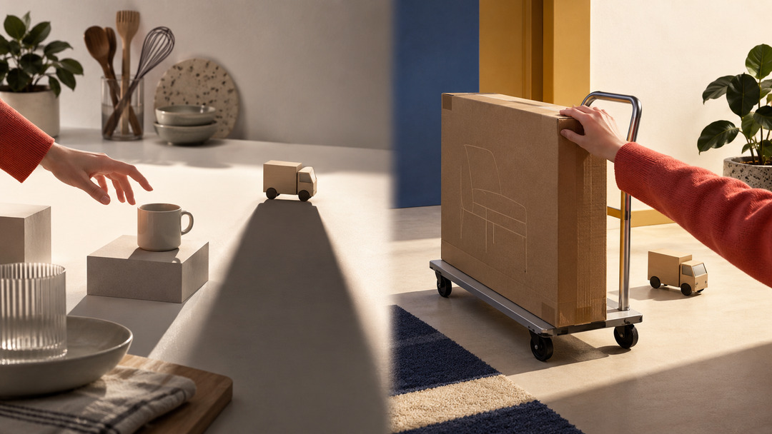
A few days ago, I was buying a KRW 8,000 household item online and stopped just before paying. The price itself didn’t bother me, but the moment a KRW 3,000 shipping fee was added, it somehow felt like a waste. I checked how much more I’d need to spend to get free shipping, and ended up adding something to my cart I hadn’t really planned to buy. In effect, I spent more than KRW 3,000 to save KRW 3,000 on shipping. A few months earlier, though, when I bought furniture, it was different. The item cost far more, and the shipping ran to tens of thousands of won, but I paid without much thought. Tens of thousands of won was fine; KRW 3,000 felt like a waste. Considering the numbers alone, it’s pretty strange behavior.
A concept called “mental accounting,” described by the behavioral economist Richard Thaler, explains this kind of strange behavior. Rather than treating all money as the same, people split it up in their minds and judge it by purpose and situation, almost as if they were keeping separate accounts. Even the same amount takes on a different value depending on what we decide to spend it on.
I wasn’t seeing that KRW 3,000 as simply KRW 3,000 either. The shipping fee on a KRW 8,000 item felt like “money vanishing into something that isn’t even a product.” Meanwhile, I was willing to accept tens of thousands of won to bring a big piece of furniture all the way home, thinking that I was paying for a service called “delivery.” It wasn’t because the absolute numbers were different. It was because the names I’d given those numbers were different.
When you run an online store, you come across this kind of contradictory behavior all the time. I used to think that customer behavior followed predictable formulas. I assumed, among other things, that a free-shipping threshold would raise average order value, that too many choices would make purchase decisions harder, that the fewer the steps to checkout, the better, and that offers needed to be easy to spot. I don’t think these assumptions are entirely wrong. However, as I kept working, a question began to attach itself to each of those formulas.
Is It Helpful to Show More Options?
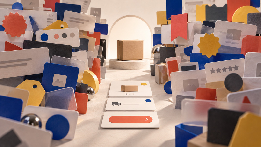
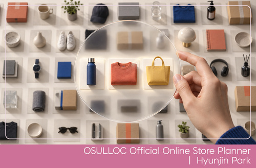
When I first started to design promotion pages, I focused on what to add. New products needed announcing, and bestsellers needed to stand out, since so many customers look for them. Discount coupons felt like a shame to leave out, and information changed from period to period, updated by promotions and bonus points. If you considered each information, every item had a reason to be shown. So I ended up adding another product, explaining another offer, and putting up another banner. The more I shared, leaving nothing out, the more helpful the page seemed to become.
Then suddenly, I found myself looking at it the other way around. Were we giving customers more useful information, or were we just giving them more to take in and weighing them down instead? Adding one piece of information to the screen doesn’t stop at one more line of text. New information competes for the user’s attention with what’s already there. Once banners and products of similar importance start piling up, everything is emphasized, and yet the information people actually need gets lost.
London, too, faced a similar problem in the early 1930s. At the time, the city’s Underground network was growing more complex, and the early map was essentially a geographic one, faithfully reproducing real terrain and distances. However, once the map was drawn to scale, the center, packed with stations, became far too crowded, while the outskirts took up a great deal of space. The more accurately the map showed reality, the harder it became for passengers to find the routes they were actually looking for. That was when Harry Beck, who had drawn electrical schematics, proposed a new kind of map. He largely gave up on representing actual geography and distance. He straightened the lines into horizontals, verticals, and diagonals at fixed angles, and set stations at roughly equal intervals even where the real distances between them varied.
As a geographic map, it was less accurate than what came before. Yet passengers actually had an easier time getting around. For someone riding the Underground, the actual distance between stations didn’t matter much. What mattered more was which line to take, where to change, and which direction to go. Beck had removed information that was unnecessary for the map to do its job.
When I came across this story, I thought of our promotion pages. It suddenly struck me that showing customers everything I know might not necessarily give them the most accurate, most helpful experience. What matters isn’t sharing every piece of information a customer might need, but making what they need at the moment of deciding clearly visible.
So Should We Offer Fewer Choices?
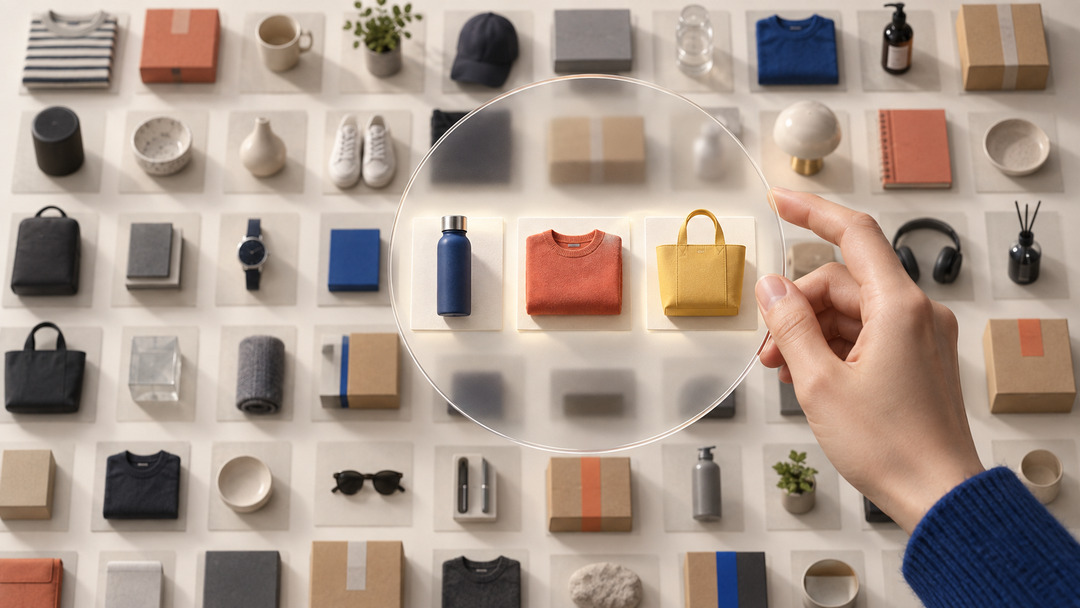
After that, the question I asked when looking at a page changed a little. Rather than “This is important too, so let’s include it,” my first thought became “What information does the customer need to make a decision?” For example, it isn’t hard to show a customer shopping for a gift as many OSULLOC gift sets as possible. But when ten products become twenty, the customer gets twice the choice and, at the same time, twice as many things to compare.
There’s an experiment on this that comes up often in behavioral science. In a grocery store, researchers set out 24 varieties of jam in one condition and 6 in another. When more varieties were on display, more people stopped to look, but the share who actually made a purchase was higher when a limited selection was shown. When you first hear about this study, the conclusion seems simple. So you just show fewer products.
For a while, I thought much the same. I figured it made for a better experience to show fewer products and offer a few criteria, such as “Gifts in the KRW 30,000 range,” “Good gifts for parents,” and “Sets recommended for tea newcomers.” In practice, it works quite well at a brand-owned online store like OSULLOC’s. That’s because it can give customers who’ve already narrowed their search to OSULLOC a set of criteria for finding the tea or gift that suits them. But when I looked at shopping platforms, another question came up. If fewer choices make for a better experience, shouldn’t platforms with vast numbers of products be the least convenient services of all?
However, one reason I go to online platforms as a consumer is because they offer so many products. I expect that if I search, I’ll find almost anything. Brand-owned online stores and platforms offer customers different values to start with. At a brand-owned online store, what matters is making it easy to find the right product within the brand, whereas on a platform, the value is being able to compare many brands and products in one place. That’s why platforms don’t cut the number of products. Instead, they build search and filters, show reviews and rankings, and add recommendations. They leave the choices as they are and reduce the work of shifting through them all.
Even within the same OSULLOC online store, the criteria customers need differ. A customer buying tea they regularly enjoy wants to find the product quickly. By contrast, a customer choosing a gift needs criterion for comparing budget, size, and the recipient’s taste. For a customer new to tea, a description that helps them understand flavor and aroma may need to come before the product name.
So in the gift section, too, rather than counting products, I now think first about what customers will base their choice on. I check whether they need price ranges or gift sizes, or whether we should break things down by tea type or taste. What mattered wasn’t whether there were few choices or many, but how much unnecessary comparing it took to reach the product they wanted.
Moments When Inconvenience Is Needed
Another UX principle comes up as often as the one about choices. We should reduce the “friction” customers run into when they buy. Customers shouldn’t have to dig through menus several times to claim a coupon. It isn’t a good experience, either, to have a customer order a pre-order item alongside other products and only discover after paying that even the rest of the order will ship late. Cutting that kind of effort is the right call.
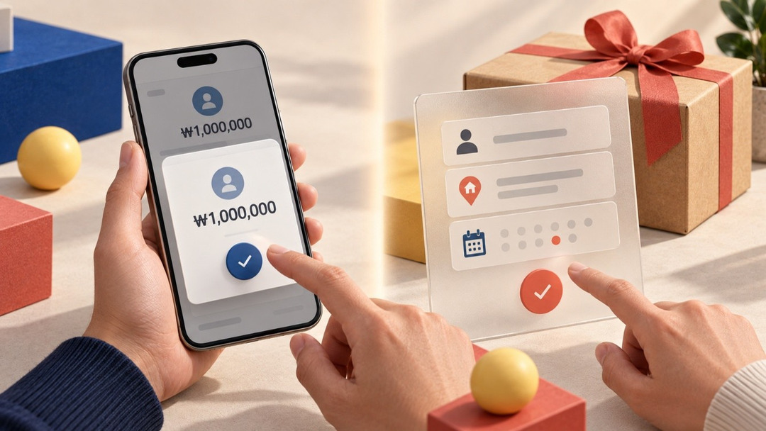
Not all friction is bad, though. When you transfer KRW 1,000,000 in a banking app, and one last confirmation screen appears, you don’t necessarily feel that’s bad UX. It adds a click, but because you can double-check the recipient and the amount, it’s reassuring. Gifts are similar. If I’m ordering tea for myself, I may want to check out as fast as possible. But if it’s a gift for someone important, taking one more look at the delivery address, the recipient, and the ship date isn’t merely a nuisance. The same click can be an obstacle at one moment and, at another, a safeguard against mistakes. What matters here isn’t whether there’s friction, but why it’s needed.
At the OSULLOC online store, too, it’s good to take away questions like “Where do I get this coupon?” However, that doesn’t mean we need to take away questions like “Would this person like a nutty tea or a fragrant one?” That question can be part of choosing a gift with someone in mind. Instead, our role is more about helping customers easily understand and compare the difference between the two.
That’s why these days I take the phrase “we need to reduce what customers have to think about” a little differently, too. It seems to me that good UX doesn’t mean making customers stop thinking altogether — it’s closer to keeping them from spending energy on things that aren’t worth thinking about.
I Now Ask Different Questions of Good Examples
When I first started working on the official online store, I’d immediately note down any good feature I spotted on other services. Oh, this is a good way to show products. This is about the right free-shipping threshold. So this is when to open first-come, first-served perks. And naturally, that led to “What if we tried this too?” I still look at a lot of other shopping sites and platforms. But now, when I find a good feature, rather than bringing it over right away, I ask a question first. Why did they do it this way here?
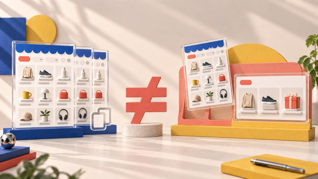
For one service, cutting the number of products may be a good choice; for another, keeping plenty of choices and providing filters may work better. In some processes, you should cut a click, but when facing a choice that’s hard to undo, you might deliberately leave a confirmation step in place.
On the surface, these are opposite approaches to UX. Look a little closer, though, and they’re all connected to what the people using that service came to do. So when benchmarking another service, the most dangerous moment may be the moment you bring over the result and miss the reason it came about. Knowing lots of good examples wasn’t enough on its own. We could only make a choice that suits us once we’d understood which customers, and in what situations, those examples had become good experiences.
Attaching Conditions to the Right Answers
When I started out, I thought being a good planner meant knowing lots of right answers. I felt that planning would get easier someday if I built up, one by one, answers to questions like which offers drive purchases, how many products are best to show, and how many checkout steps are appropriate.
However, as I kept working, rather than learning more “right answers”, I began attaching conditions, one by one, to the right answers I already knew.
From “The bigger the offer, the better”
to “The offer has to be meaningful to this customer right now.”
From “The fewer the choices, the better”
to “Choosing has to be easy.”
From “The fewer the clicks, the better”
to “The fewer the unnecessary clicks, the better.”
Even the same person weighs different things when buying a tin of tea to drink today and when choosing a gift for someone else. When the purpose changes, what counts as a good experience changes too.
In episode 3, I talked about how numbers leave questions rather than answers. Through my work, I’m learning something similar about UX. Numbers needed questions, and UX needed context. So these days, rather than collecting more right answers, I seem to be asking under what conditions a right answer holds true. And perhaps planning isn’t about discovering one perfect right answer, but about choosing the best answer for now in each set of conditions, and then checking it.
In the next and final episode, I’ll talk about how we’ve sold a product by forming hypotheses, making choices, getting things wrong, and changing course again. About the countless choices we’ve made over and over until a product sells.
 |
Hyunjin Park |
|
|
OSULLOC e-Commerce Sales Team
OSULLOC Official Online Store Planner
 |
|
-
Like
0 -
Recommend
0 -
Thumbs up
0 -
Supporting
0 -
Want follow-up article
0