#Creative Story
2024.01.03
Mamonde Rebranding Design
Written by
We Ah-in, Chae Seung-won Brand Creative Team 4


Have you noticed the transformation of Mamonde this October? The entirely revamped Mamonde aims to evolve into a beauty brand that “creates one's natural beauty through hyper flora technology and boundless innovation.” Launched in 1991, Mamonde pursued an image of independent and autonomous women, reflecting the values of the time. While inheriting this heritage, it has been rebranded as a new beauty brand for 2023, capturing the contemporary aesthetics.

Despite high brand recognition, Mamonde has needed more resonance with contemporary consumers. The main focus of this rebranding was to completely reinvent the brand while maintaining its core DNA. I would like to introduce the intense deliberations and studies undertaken for Mamonde's new brand identity.
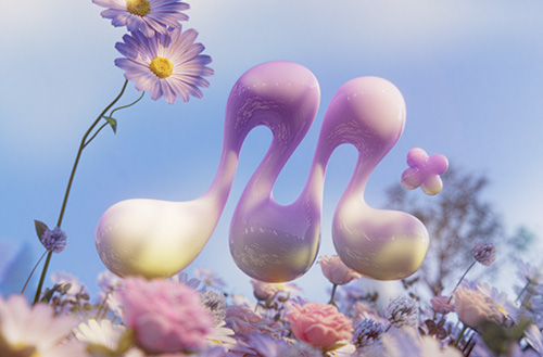
Blooming into Beauty with Hyper Flora
Hyper Flora signifies Mamonde's unique skin solution, combining efficacious ingredients derived from flowers with skincare-boosting components to create the ultimate synergy. Based on 32 years of consistent flower research at Amorepacific Botanical Garden and its research center, Mamonde has newly established the ‘Hyper Flora’ technology, a unique ingredient combination method.
The origin and technical principles of ‘Hyper Flora,’ which began with flowers, represent the core concept of the new Mamonde. It epitomizes the brand's attitude of viewing assets from the past through a new lens and creating innovative changes through various attempts. This became the core keyword of the rebranding design, completing a visual language system that permeates the brand.

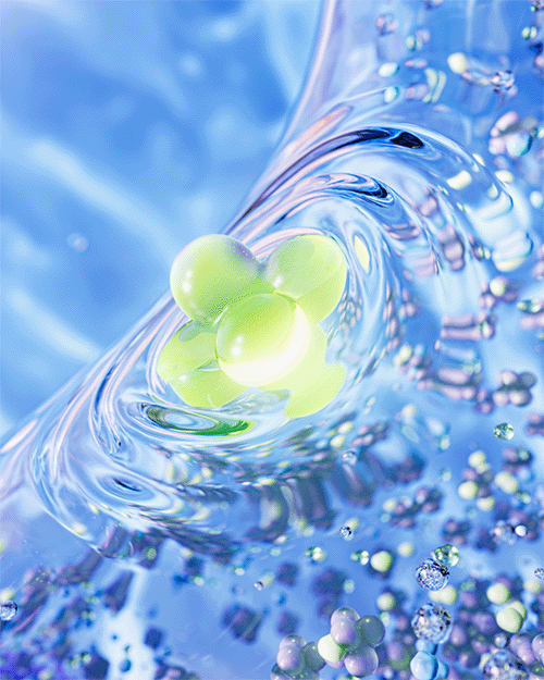
This rebranding design's first goal was to communicate the concept of Hyper Flora to the customers.
An important concept that could be perceived as complex was encapsulated engagingly and intuitively within a three-chapter video. The shapes scattered among various flowers combine to form a new, three-dimensional flower.
The culmination of the Hyper Flora journey symbolically encompasses the brand message of ‘breaking the boundaries of beauty and enabling individuals to flourish in life in their ways.’


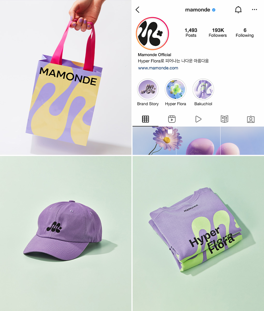
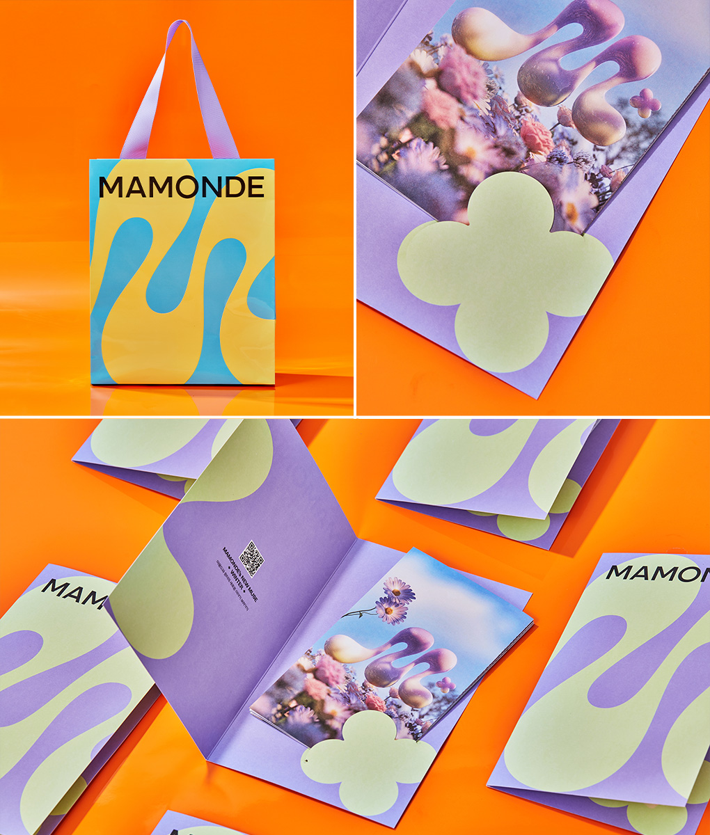
New Symbol, SUPER GRAPHIC
Mamonde's symbol is a crucial element that showcases the brand's new identity and evolution. The brand's initial “M” is rhythmically shaped with a four-leaf “flora” design. Breaking away from the typical monogram form, it creates a unique, organic line structure, visually implementing Hyper Flora and expressing Mamonde's dynamic energy of freedom and diversity.


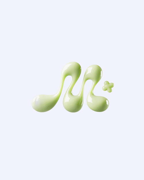
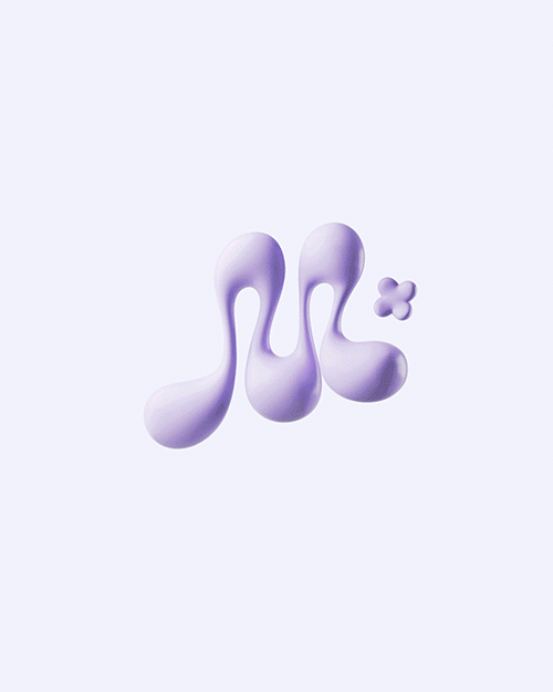
The Mamonde-specific graphic, extended from the symbol, is defined as ‘Super Graphic.’ As a dynamic organism, not fixed or confined, Super Graphic symbolizes Mamonde's steady growth and diverse changes. Through Super Graphic, a vital design element and symbol of the brand, we aim to present Mamonde's new trend filled with accessible and creative beauty.
This Super Graphic of Mamonde not only expresses the unique characteristics of each product in package design but also traverses various outcomes such as brand visuals and content, showcasing free forms and new changes.
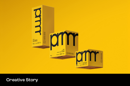
Brand Identity Embodied in New Product Design
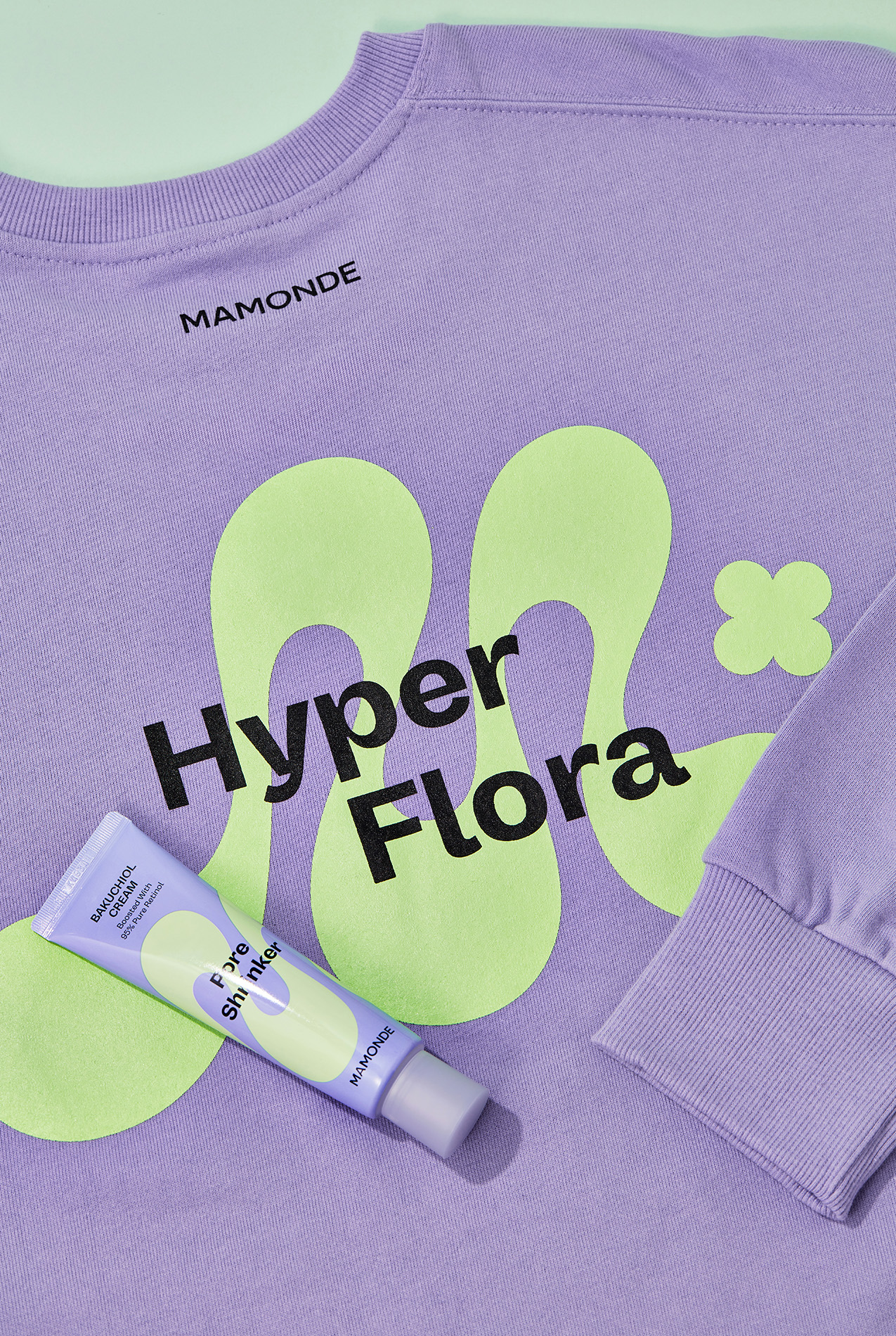
The Pore Shrinker Bakuchiol Cream was launched as the first product, marking a new beginning for the brand. This product contains pure retinol and emphasizes early anti-aging functions for people in their twenties and thirties. Born anew based on the value of ‘breaking the boundaries of beauty and enabling individuals to flourish in life in their ways,’ it leverages Mamonde's consistent sincerity in flower research and Hyper Flora technology over 32 years.
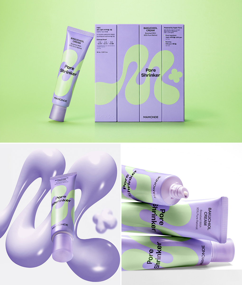
01 A New Way to Express Hyper Flora
The Super Graphic of the M-pattern, extended from the symbol, serves as Mamonde's distinctive design asset, consistently conveying the brand's identity. Using Super Graphics in product design, it unfolds freely without constraints of front and back spaces, stimulating the viewer's imagination diversely. The navigating color represents the flora ingredient Bakuchiol, and the boosting color signifies high-efficiency ingredients like retinol, which are matched to convey a youthful and vibrant image.
Visually, it also evokes the main benefit of pore elasticity, maximizing visual effects with voluminous 3D images of various textures and creating a hyper-mood universe through bold compositions.

02 Challenge to Break Boundaries
In the packaging, the Super Graphic is freely spread on the front, minimizing explanatory language and placing it on the back. A simple and attention-grabbing layout emphasizes the primary efficacy and product name, making it easy for consumers to recognize the functionality. Through various attempts, including universal design features like Braille for different product types to accommodate diverse consumers, vegan-certified ingredients that exclude animal-derived materials, and green packaging using FSC-certified paper and soy ink, we plan to create designs for everyone.
We look forward to your continued support and anticipation for Mamonde as we strive to cultivate its presence in a boundless and vibrant manner in the future.

-
Like
6 -
Recommend
0 -
Thumbs up
8 -
Supporting
2 -
Want follow-up article
0