#Creative Story
2025.06.09
5 LIKE
3,268 VIEW
-
-
- 메일 공유
-
https://stories.amorepacific.com/en/amorepacific-brand-identity-renewal-of-amorepacific-plastic-reduction-campaign
Brand Identity Renewal of Amorepacific Plastic Reduction Campaign
LESS PLASTIC, WE ARE FANTASTIC #1
Written by
Duyeon Kim, Nari Cheon Creative Strategy Team


Amorepacific has always strived to make a more beautiful world, grounded in a deep empathy with customers, society, and nature. Since becoming the first domestic beauty company to declare an environmental responsibility principle in 1993 and initiating the “Pacific Green Movement,” we have carried out various 4R (Reduce, Recycle, Reuse, Return) activities to minimize unnecessary plastic use. To drive new changes in the process of making, purchasing, using, and disposing of plastic products, Amorepacific is running the “LESS PLASTIC, WE ARE FANTASTIC” campaign, encouraging everyone to practice plastic reduction together. Now in its second year, this campaign is gradually gaining recognition through the activities of the “Fantastic Crew,” who lead plastic reduction efforts.
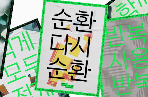
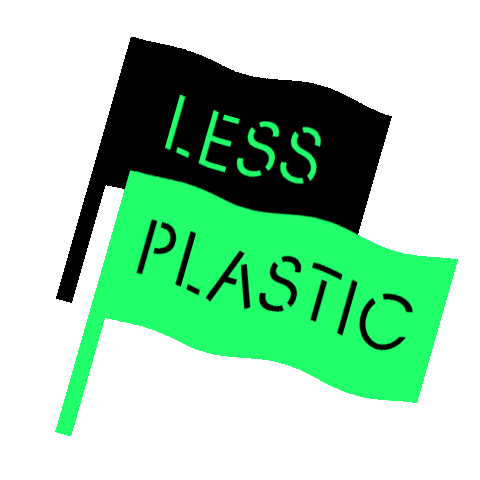
LESS PLASTIC, WE ARE FANTASTIC
We were tasked with renewing the brand identity (BI) of Amorepacific’s plastic reduction campaign, “LESS PLASTIC, WE ARE FANTASTIC.” This project went beyond simply redesigning a logo—it was a process of considering how to deliver our message as clearly and concisely as possible. We also sought to break away from the typical atmosphere of environmental campaigns and capture a more compelling mood.
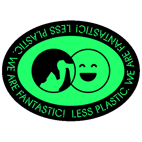
For the campaign logo, we prioritized alignment with the corporate activity identity direction currently being organized around the APHQ typeface. We aimed to create a simple yet powerful form and color scheme to enhance visibility and attention in mobile environments.
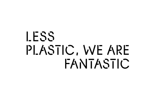
We removed all elements that made the existing logo appear complex—arrows, dot patterns, and line text—and designed it with clean simplicity using only black color with the APHQ typeface.
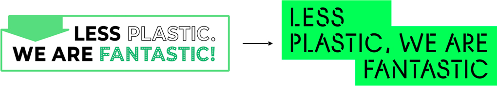
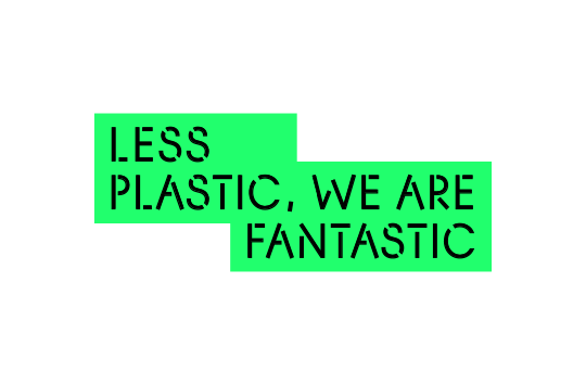
Since the campaign logo is in sentence format, line breaks were essential to prevent it from becoming too long. We changed the previous two-line arrangement to three lines and used boxes to separate “LESS PLASTIC” and “WE ARE FANTASTIC” visually, making the long sentence more straightforward to read. The arrangement was designed to resemble a chat conversation, also conveying the meaning of a campaign that everyone creates together. The bright green color of the boxes was judged to be more suitable for campaign promotion that would primarily take place online.
Visual Separation of Long Sentences
Focus on Core Words
Additionally, we arranged the three lines so that the two words “LESS” and “FANTASTIC” would stand out at the top and bottom, aiming to convey the core message that runs through this campaign most effectively: that using “LESS” is “FANTASTIC.”
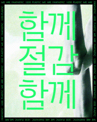
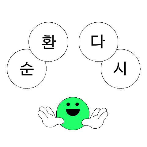
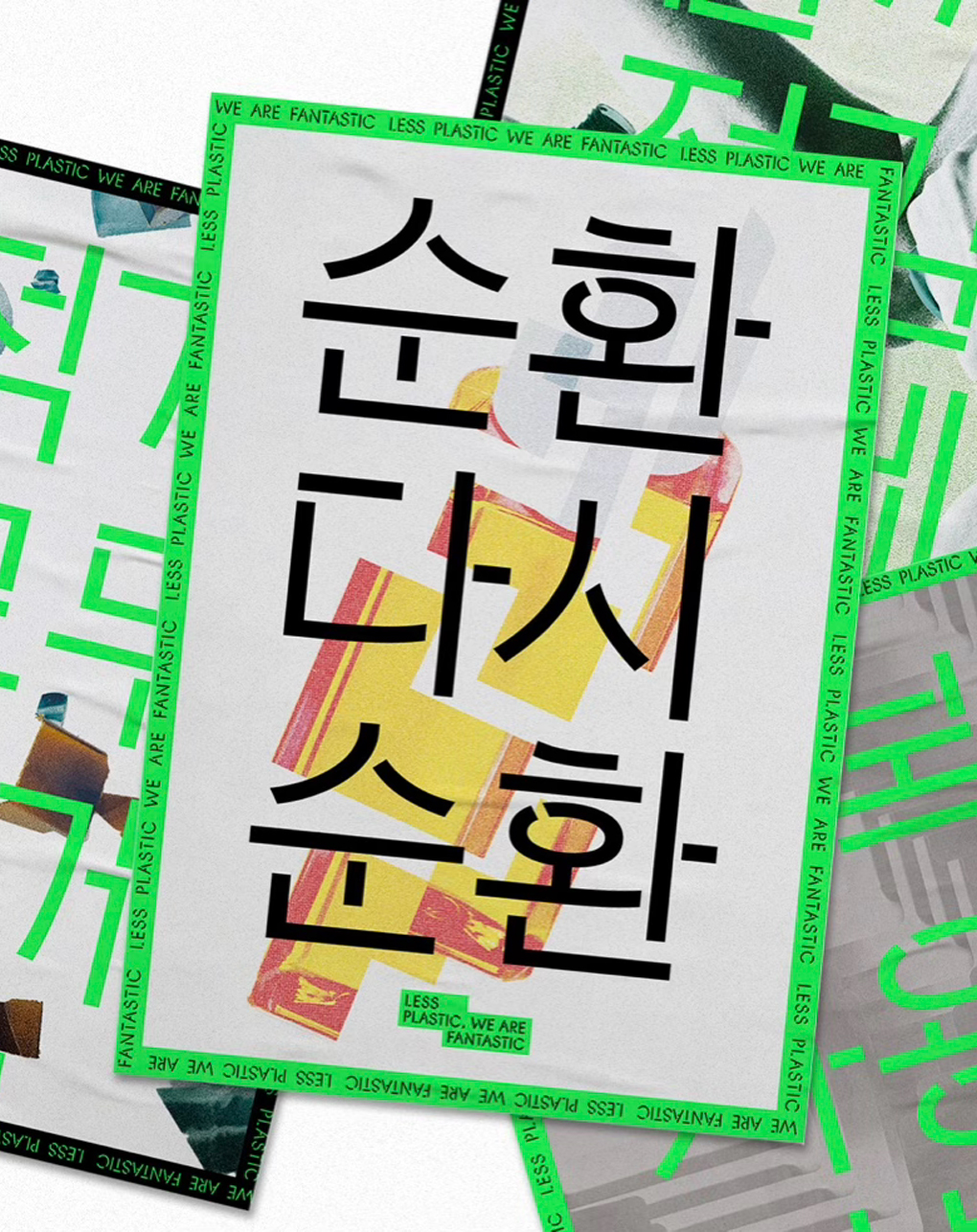
We also created key visuals to promote the campaign alongside this redesigned logo. We extracted core keywords from Amorepacific’s plastic reduction activities represented by the 4Rs and created slogans with a structure that repeats these words. We combined this with infinitely repeating motion graphics to function as impactful messaging.
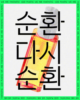

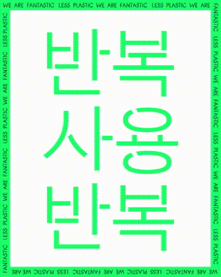
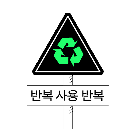
“Cycle Again Cycle” We repeatedly showed plastic containers separating and coming back together to illustrate the process of plastic recycling and circulation.
“Less Everyone Less”- We repeatedly showed plastic pieces gradually diminishing to express the reduction of plastic.
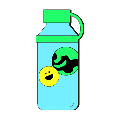
“Reuse Again Reuse” We depicted refill pouches repeatedly stacking up to fill the screen, conveying continuous reuse.
“Together Reduce Together” We expressed the message of everyone working together to reduce plastic.
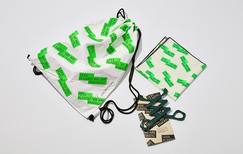
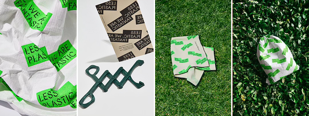
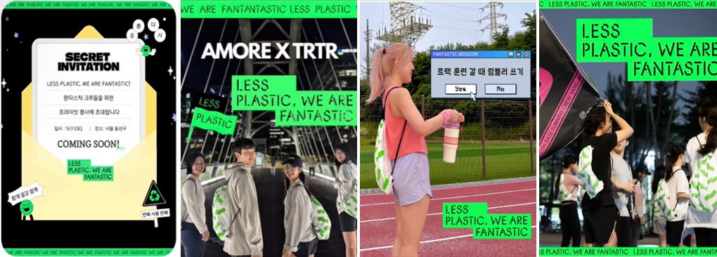
FANTASTIC GOODS
The merchandise consisted of four items in total: handkerchiefs, string bags, t-shirts, and litter pickers (for plogging). Thanks to the communication team’s thoughtful consideration of eco-friendly items, we were able to focus smoothly on the design work. Since string bags are the main item used in crew activities, we created a pattern from the LESS PLASTIC logo to enhance the visibility of the neon-colored campaign logo. Looking at activity photos of crew members wearing the merchandise, we were pleased to see that it stood out as intended. We also designed the remaining merchandise items to ensure the LESS PLASTIC campaign’s brand identity appeared consistently throughout.
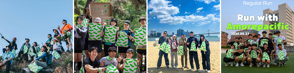
We also developed stickers for the Fantastic Crew to use in their Instagram stories. These featured neon key colors and were composed of lively, bouncing motions and graphics. They were designed to enable the Fantastic Crew to document and share their activities engagingly.


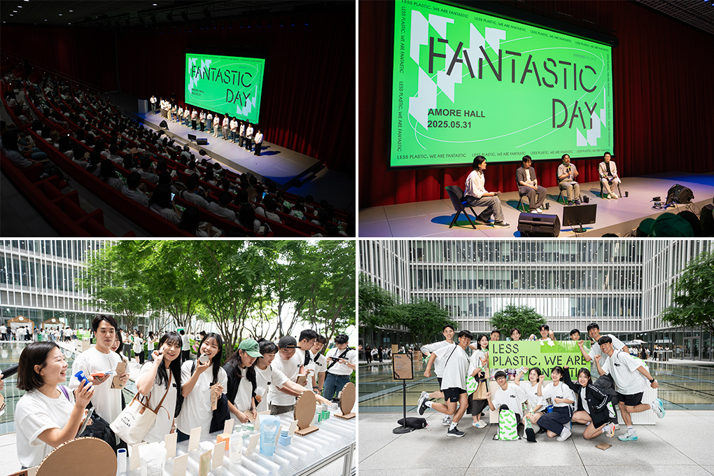
FANTASTIC DAY
Moreover, we developed key visuals for the plastic-free festival “Fantastic Day,” held at Amorepacific headquarters on May 31st in celebration of World Environment Day on June 5th.
We designed visuals for a meaningful gathering where the “Fantastic Crew,” who have led plastic reduction efforts, came together to share their activities and commit to practicing plastic reduction in their daily lives.
We created the main graphics for FANTASTIC DAY, where all crew members gathered together, using patterns that applied the APHQ typeface and box graphic motifs from the campaign logo.

This concludes our introduction to the BI renewal project for the ‘LESS PLASTIC, WE ARE FANTASTIC’ campaign.
Realistically, completely avoiding plastic use is difficult. That’s why activities that reduce plastic consumption, ensure proper collection, and extend the usage life of plastic, preventing it from being left on Earth unnecessarily, are crucial. Please join Amorepacific’s beautiful journey toward plastic reduction. Now, toward reducing plastic and creating a beautiful world. Less Plastic. We are Fantastic!
In the next column, we will introduce an exhibition planned as part of Amorepacific’s plastic reduction campaign, “LESS PLASTIC. WE ARE FANTASTIC!” The exhibition was conceived from the idea that materials that have served their purpose and are discarded can still present beauty through a new perspective.
Stay tuned for the column about the Next Space team’s “Sustainable is Beautiful” exhibition, which reinterprets the meaning of sustainability and beauty.
-
Like
1 -
Recommend
1 -
Thumbs up
1 -
Supporting
1 -
Want follow-up article
1