Columnist
Nakin Kim espoir BM Team
#INTRO
Face colors aren’t fun... or are they?!
Before taking on the face category, I’d been working with a much broader color spectrum in eye and lip makeup. During that time, I had the freedom to experiment with different formulas and shades, proposing colors that were rarely seen before and watching customer reactions firsthand.
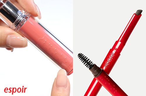
Fortunately, these experiments earned consistent love from our customers. Colors with distinct personalities—like Hey Bestie, Chillin' Chillin', Vampy, and Feelin' Tipsy—continued to evolve across different product lines even after their initial development, establishing themselves as reference colors within espoir.
Our ‘Hey Bestie’ maintained across textures and formats
Source: espoir official imagery
But as I spent more time developing face products, my focus naturally shifted. Instead of the bold color play I’d enjoyed with lips, I found myself concentrating more on the precision of skin tones and the perfection of formulas. Then one day, a thought struck me:
“Why couldn’t we explore color expansion in face products again?”
That question served as the starting point for this color-play project.
1 Wedding Peach—The First Experiment in Face Color Play
‘Wedding Peach,’ which I covered in the Be Glow lineup development story, was our first color play venture in the face category. This high-luminosity pink foundation, inspired by wedding makeup, did raise some initial concerns: “Will people actually use this?” But after launch, it quickly spread through makeup shops and established itself as a go-to shade for professional use.
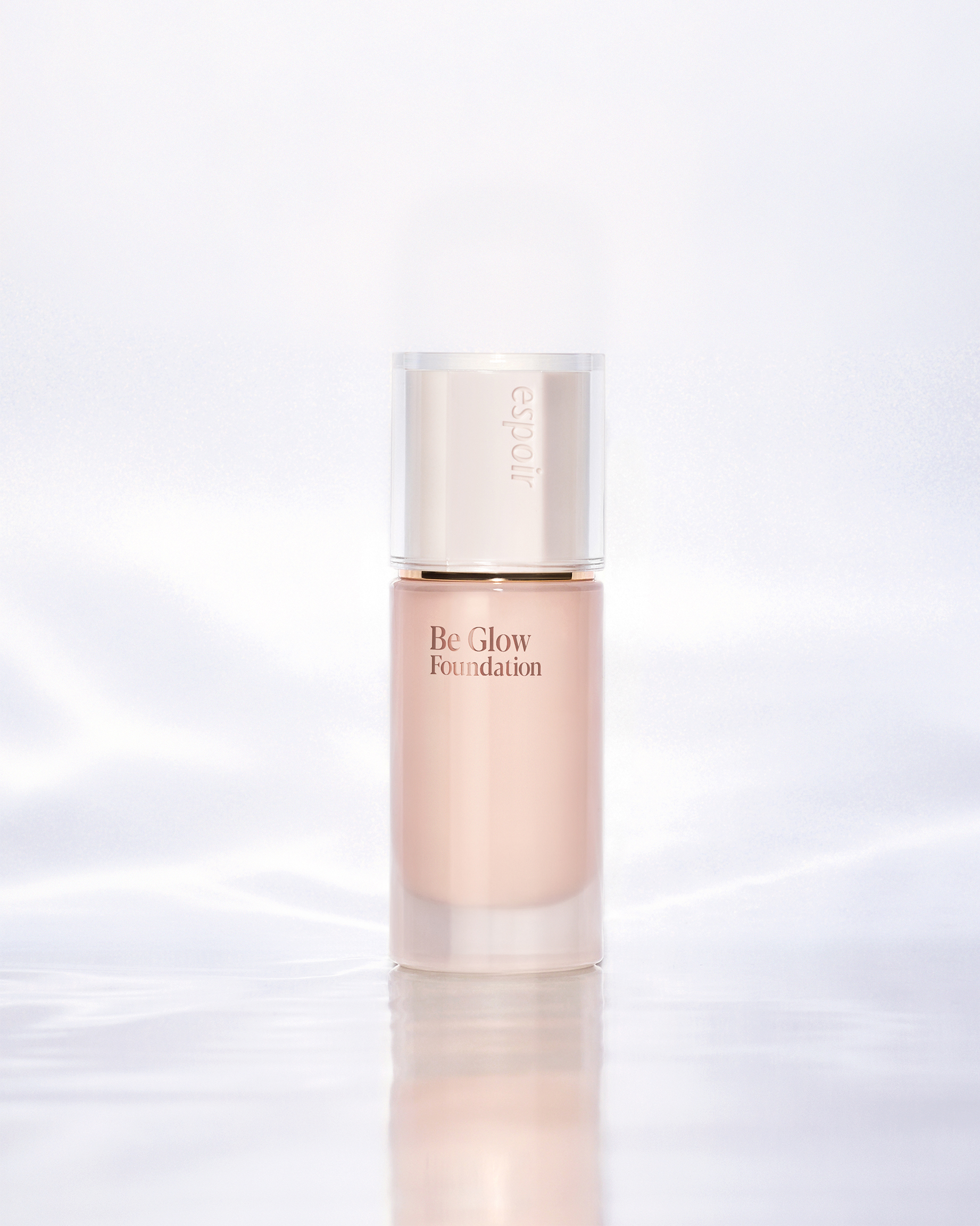
Wedding Peach was the first case to prove that color could hold its own power in face makeup, too.
2 Dooboo Color—A Direction Revealed by High-Luminosity Trends
The Dooboo color in Be Velvet Foundation emerged from the recent rise in preference for high-luminosity shades. While No. 22 Petal had been steadily maintaining second place in sales behind No. 21 Ivory, we noticed No. 20 Vanilla overtaking it—a shift that showed customers’ desired skin expression was moving toward “brighter, cleaner tones.”
Based on this data, we determined we should offer a high-luminosity foundation close to white—something you couldn’t easily find in other brands. Initially, we considered the name ‘Fair,’ but after Wedding Peach’s success, we thought it would be better to go with a kick color approach, considering both the planning direction and buzz potential.
The image that came to mind the moment I saw the actual color was ‘dooboo’ (tofu). Considering its intuitiveness, familiarity, and even the then-trending concept of ‘tofu-like complexion,’ we finalized the shade name as Dooboo. For the English name, we chose Dooboo over Tofu to capture the rhythmic feel of its pronunciation and add a touch of charm to the spelling.
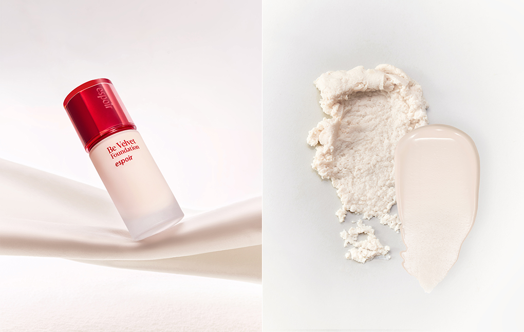
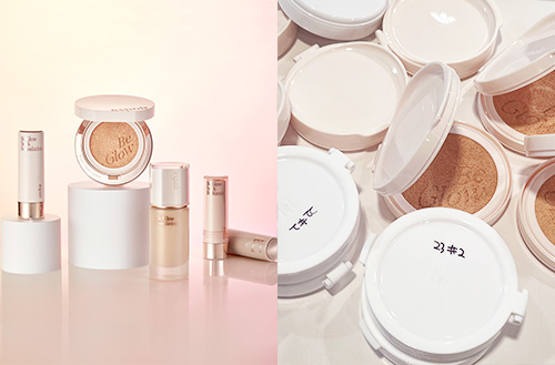
An unprecedented high-luminosity white foundation, ‘Dooboo’
Source: espoir official imagery
The response after launch was immediate. The needs of customers seeking a high-luminosity white base became crystal clear, and the name ‘Dooboo’ naturally sparked viral interest. From launch, Dooboo captured over 30% of total sales, establishing itself as a key brand color. Today, it’s actively used in shops not only as a standalone shade but also for mixing and highlighting purposes.
3 21P Peachy Ivory Color—The ‘Korean Radiance’ Japanese Customers Were Looking For
Be Velvet Cover Cushion’s No. 21P Peachy Ivory is our first country-exclusive shade, developed specifically for the Japanese market. Initially, we began development by referencing the Ochre (オークル) family, which had long been central to Japan’s base makeup market.
However, conversations with Japanese influencers shifted our perspective on the market situation. Ochre colors were already being offered extensively by Japanese brands, and what Japanese customers actually expected from K-beauty leaned more toward bright, radiant cool-toned expressions. Based on this feedback, we determined that the Japanese market needed a Korean-style, bright, vibrant pink ivory.
Following that direction, we mixed ivory and pink in a 6:4 ratio, creating a peachy pink ivory that was difficult to find in the Japanese market. The result aligned perfectly with Japanese customers’ expectations, selling out on Qoo10 the first day of launch.
Peachy Ivory was a case where local needs and our brand’s color philosophy naturally came together and expanded, reinforcing my conviction that color play was possible in the face category, too.
4 US Olive Undertone Expansion—A Development Approach Collaborating with Real Users
Be Velvet Cover Cushion expanded up to No. 45 for the US market, incorporating olive undertones with No. 28.5 Ginger Olive and No. 34.5 Golden Olive. However, both colors remained in the mid-luminosity range, and feedback consistently came through US channels and customer VOC: “We need olive tones available in high and low luminosity as well.”
Olive undertones are particularly challenging to formulate—if the balance of yellow, red, and green is even slightly off, the color can look muddy or ashy. To develop these more accurately, we chose to involve American influencers who actually have olive undertones.
After receiving feedback on initial samples, we invited the influencers directly to our research center in Korea to work on color formulation together. This allowed us to directly verify the subtle sensitivity differences in olive tones across luminosity changes and establish realistic tone standards.
The olive colors developed through this expansion haven’t launched yet, but we expect them to play an essential role in embracing the diverse skin tones within the US market. We plan to share this development process with customers through the upcoming ‘True Olive Shade’ campaign.
#OUTRO
Every Stage of Product Development Begins with Consideration and Empathy
With this column, I’m bringing together my product development stories from throughout 2025 into one cohesive narrative. From the braille makeup development that started from an inclusive perspective, to the Be Glow lineup development aimed at curating glow, the Be Velvet Cover Cushion shade expansion targeting global markets, the Happy Crush Collection development that began with preference exploration, and now this face color play—writing these columns has been both an opportunity to share diverse experiences and a time to organize the history of the various branding and product development activities I’ve undertaken. In that sense, it’s been a personally meaningful and fulfilling experience.
The keyword running through all these experiences ultimately came down to deep consideration for customers and the question of how relatably we could address those considerations through our products. And I was able to confirm once again that in areas like face makeup, where minor differences lead to significant results, even more careful observation and approach are necessary.
Moving forward, I’ll continue to broaden the spectrum of empathy and keep exploring from multiple angles so that customers can naturally understand the new beauty we’re proposing.
Thank you for following my product development stories as espoir’s BM with such interest.
 |
Nakin Kim |
|
|
Amorepacific
|
|
-
Like
0 -
Recommend
0 -
Thumbs up
0 -
Supporting
0 -
Want follow-up article
0