#Creative Story
2024.01.31
ODYSSEY Design Stories Part2. Chapter V
Part 2. ODYSSEY Chapter V Brand Design
Written by
Kim Bitnuri Brand Creative 3 Team

Overview
I believe you are familiar with ODYSSEY, a men's skincare brand that has been beloved for almost 30 years. After eight years, ODYSSEY has launched a new line, ODYSSEY Chapter V. Chapter V carries forward the narrative of ‘voyage’ and the asset of ‘fragrance’ inherent in the original ODYSSEY while also reflecting the values and lifestyles of modern men. To this end, we have encapsulated, both in the products and across the brand, the story of a persona who seeks sensory experiences and embarks on new chapters of life. I am excited to introduce the brand design process for Chapter V, which, while contemporary to everyday life, encapsulates classic values.

Background
Since 1996, ODYSSEY has provided premium men's skincare, and its primary user base has matured alongside the brand's long history. Consequently, it became necessary to communicate ODYSSEY's appealing story and quality to Millennial users, injecting new vitality into the brand. We wanted to retain the original narrative – a fragrance journey towards masculinity – while conveying it with a fresh sensibility. Our first step was to identify a new persona.
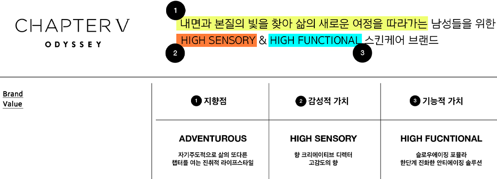
‘A man in his 30s who is adept at self-expression through brands and who, possessing a refined sensibility, perceives skincare not as a tedious routine but as a ritual.’ This summarizes the new brand persona, one that resonates with our brand and creative teams. As the persona took shape, so did the values and aspirations the brand needed to convey. Naturally, the brand design evolved to communicate these unique philosophies and emotional and functional values.
Brand concept
- Sensory Experiences Conveyed Through Ingredients and Fragrances Encountered on an Endless Journey
CHAPTER V is a name laden with multiple meanings. It commemorates the launch of ODYSSEY's fifth line, marking a new chapter in life. Most importantly, it embodies the theme of ‘a journey towards beautiful fragrance.’ In fact, Homer's immortal classic, ‘The Odyssey,’ is at the heart of the ODYSSEY brand. As a cornerstone of Western spiritual history, this epic narrates the journey and adventures of the Greek hero Odysseus.

We believe that the essence of our theme is best represented in “Chapter V” of this book. In this chapter, Odysseus chooses to embark on a perilous journey home despite the opportunity to enjoy eternal life and comfort. ODYSSEY's Chapter V reinterprets this narrative in a contemporary context, proposing a life that seeks new and sensory experiences even in everyday life. In this way, Chapter V aims to help users embark on a journey to discover new sensations through delicately refined ingredients and fragrances.

Logo Design
In designing the logo, we aimed for a contemporary and delicate sensibility with a touch of classic flair. The foundation was based on the geometric and relaxed original ODYSSEY logo. However, while the original logo imparted a solid and classical impression with its simple and bold forms, Chapter V added details to convey a more subtle and refined feel. The thinner and lighter typeface reveals the contemporary androgynous persona of our times. In sections where lines intersect, we introduced space as if allowing air to flow, reducing visual weight to create a nuanced yet distinctive impression.
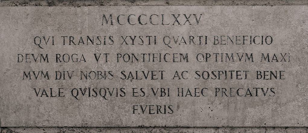
The Roman-era ‘Capitalis Monumentalis’ lettering, used for inscriptions on monuments, inspired the ‘V’ in ODYSSEY Chapter V.
Source: Gabriella Clare Marino on Unsplash
In contrast, the Roman numeral ‘V’ following CHAPTER retains the ornamental strokes seen in ancient Roman characters, adding a classic touch. This also serves as a means to present ‘V’ as ‘Five.’ Strategically, we emphasized the Chapter V logo more significantly to heighten the recognition of ODYSSEY's new line launched after eight years. Moreover, to clearly demonstrate its roots in ODYSSEY, we decided to display the ODYSSEY logo below it.
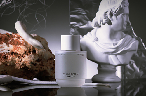
Bottle Design
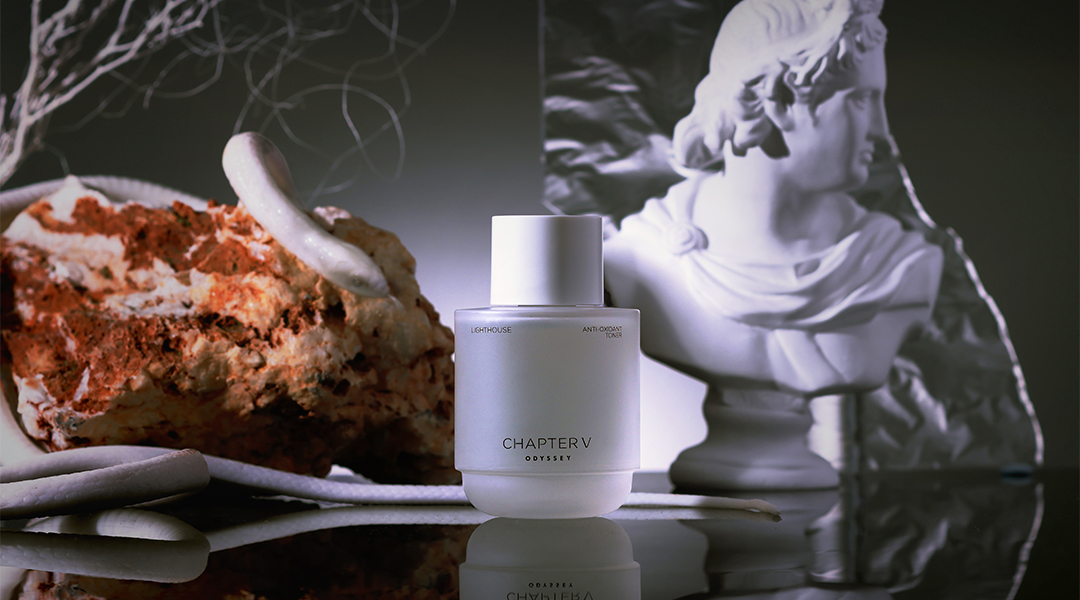
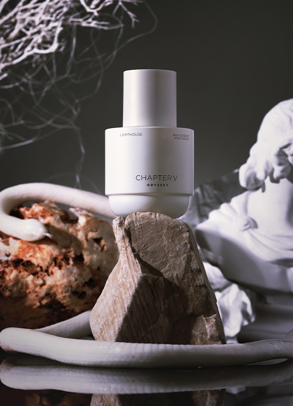
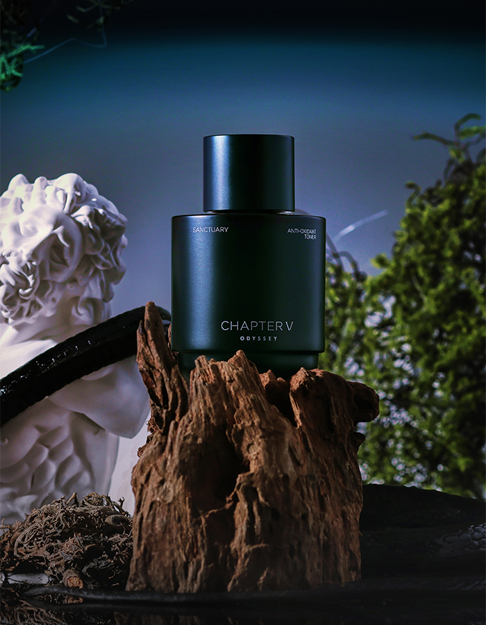
In the bottle design, too, we maintained the theme of embodying a classical essence and origin in a contemporary expression. During the motif exploration process, we proposed the symbol of a lighthouse, metaphorically guiding users of Chapter V on their journey in search of new sensations. The lighthouse, functional and modern in form, fits well into the everyday spaces inhabited by Chapter V's persona, effectively revealing its practical value. It also symbolizes the sea-and-navigation theme that has been part of ODYSSEY for 30 years. Note that we geometrically simplified the lighthouse's form.

To maximize the emotional value of fragrance for our discerning target audience, we adopted design codes commonly used in perfume bottles. This was to create an experience akin to handling a perfume bottle, whether admiring the product on a desk or using it. Thus, we designed the container with a larger cap and a low center of gravity typical of perfume bottles, a matte CMF reminiscent of plaster sculptures, and a graphic layout with poetic whitespace.
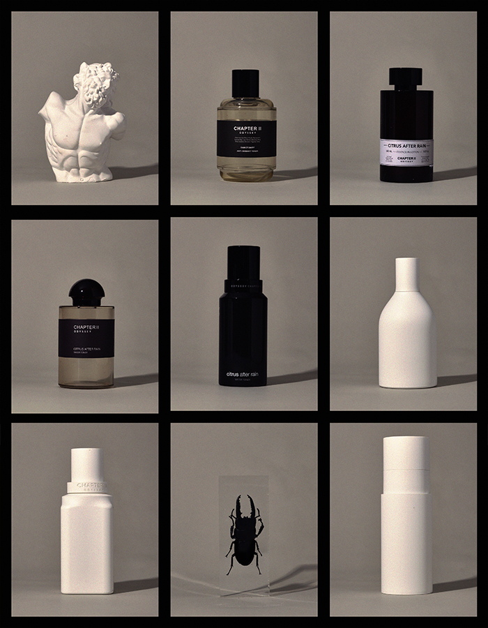
Various bottle shapes were proposed with keywords such as perfume and navigation.
The dozens of concepts that were not selected will remain in the ODYSSEY brand archive.
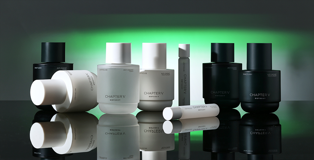
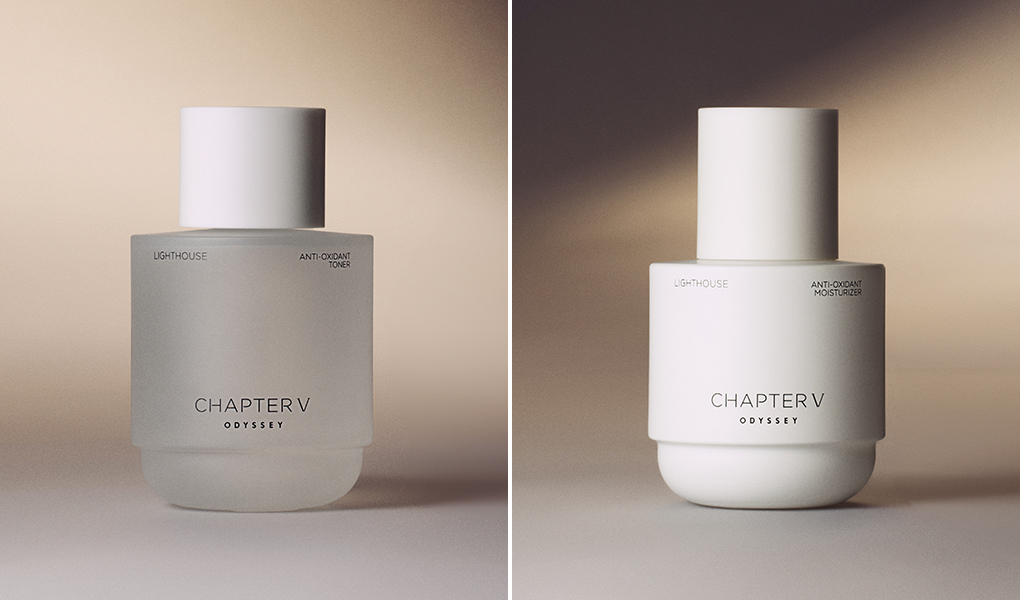
The characteristics of each line were expressed through color. Chapter V, themed around two fragrances, was launched as ‘Lighthouse’ and ‘Sanctuary’ lines, encapsulating the brand's narrative of navigating uncharted worlds.
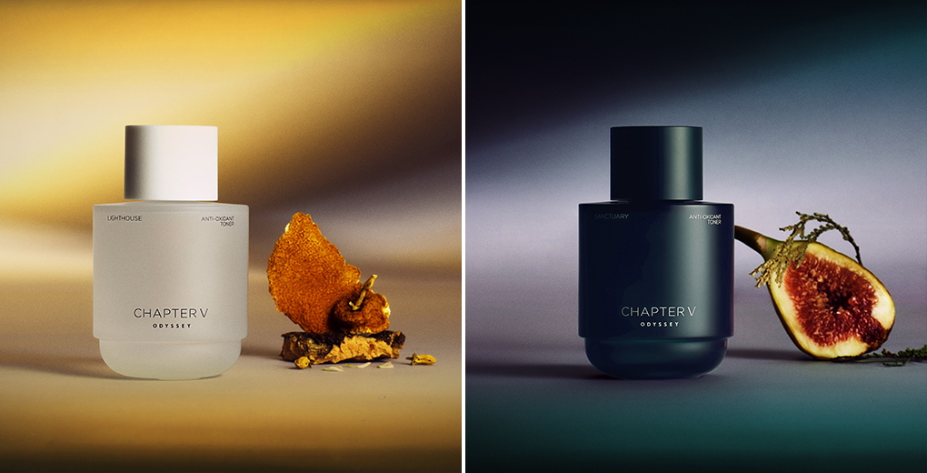
The ‘Lighthouse’ line, symbolizing the light of a new journey with its sweet yet profound neroli and woody scents, uses a white similar to that of a blank canvas, representing a narrative that starts from nothing and embodies light. The ‘Sanctuary’ line, signifying the inner space reached through navigation and encapsulating tranquil forests and meditative scents, is presented in a blackish-green, portraying the image of a forest shrouded in dawn mist, both solemn and mystical.

Package Design
The themes of adventure and navigation find a contemporary expression in the design of the set box, drawing visual inspiration from a ticket grasped in hand while boarding a ship bound for somewhere. The perforation on the front of the set box symbolizes the punching of a ticket, a mark of departure.

The set box's wide margins and theme colors, along with its natural matte texture, resonate with the poetic lyricism felt in the container. To express the emotional function of fragrance, we highlighted the top, middle, and base notes on the front, akin to a perfume bottle. We aimed to convey a consistent theme and visual and tactile sensations through the container, set box, and package design, offering users an immersive experience.
Visual
In the visuals, we aimed to awaken new sensations through light imbued with the narrative of Chapter V and spaces both unfamiliar and mystical. Here, too, we combined modern composition with classic themes. The intense beams penetrating the visuals represent the guiding light leading the persona on their journey. Dramatic props reminiscent of Greek epics and classical lighting underscore the brand's classical roots while showcasing contemporaneity through structural and geometric compositions.

Reimagining the most classic brand while preserving its legacy is a challenging yet worthwhile endeavor. The meticulous planning and execution by the marketing team, along with the collaboration of related departments in delivering the product to the user, made the birth of ODYSSEY Chapter V possible.
Just as Homer's ‘Odyssey’ has been reproduced in contemporary forms for over 3,000 years without losing its original message, we hope the ODYSSEY brand will continue communicating across generations in various ways, transmitting unchanging values.
-
Like
3 -
Recommend
2 -
Thumbs up
0 -
Supporting
0 -
Want follow-up article
0