#Creative Story
2024.01.26
ODYSSEY Design Stories
Part 1. ODYSSEY Classic Design Renewal
Written by
Lee Sung-yub Brand Creative 3 Team

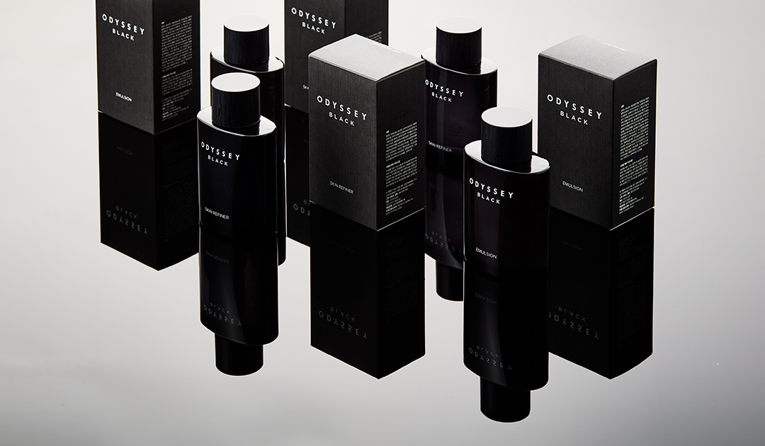
Starting in 1996, with the slogan “A Fragrance Journey Towards Masculinity,” ODYSSEY had been cherished for its long-standing fragrance heritage, and it recently underwent two significant transformations. Now, we have reimagined ODYSSEY Black and Romantic's classic designs and crafted ODYSSEY Chapter V, a new sub-brand line launched after eight years. Although the aims and positioning of these two lines differ, we aspire to share the thoughtful process behind continuing the brand's original nautical story and olfactory assets.
*The ODYSSEY nautical story will be presented in Parts 1 and 2.
Overview

In a male cosmetics market traditionally dominated by an unilateral emphasis on the typical masculinity, ODYSSEY embarked on a journey in the premium men's cosmetics segment, introducing a new direction in masculinity with a persona that embodied the artistic flair of pianists and painters through skincare infused with the sensibility of perfumes. In 2023, out of respect for ODYSSEY's pioneering legacy and heritage, we fine-tuned the designs of Black and Romantic.
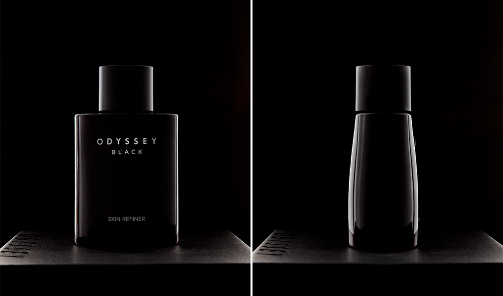
The product designs of ODYSSEY Black and Romantic feature curves reminiscent of undulating waves and a gradient echoing the deep sea, derived from the ‘sail’ motif inspired by the brand's ‘nautical’ story.
Despite numerous ADs over time, the originality evident in the exterior design, maintaining the iconic silhouette, has left an indelible impression on customers. Hence, we aimed to uphold the products' design heritage, redefining the overall sculptural proportions and altering the graphic layout through delicate tuning, ensuring that the brand image evolves with time.
Also, we unified the packaging of the two lines to enhance operational efficiency, harmonized the design language to strengthen visual branding, and differentiated the details considering the pricing positioning of each line. Additionally, we redesigned the cap to significantly reduce plastic use and increase recyclability, aligning with contemporary demands.
Cap Design
Central to this AD, the cap design began with studying shapes suitable for the classic products' design concept. From nautical motifs like harbors, bollards, yachts, and sails to basic shapes harmoniously blending into daily spaces, we explored the optimal solution by checking the sculptural proportions between the cap and container through sketching, modeling, and mock-ups.

Considering the contemporary context of skincare products, we opted for modern and straightforward basic shapes, instead of emphasizing a solid presence for both the container and cap. This approach aimed to showcase the brand's new direction in response to contemporary demands.
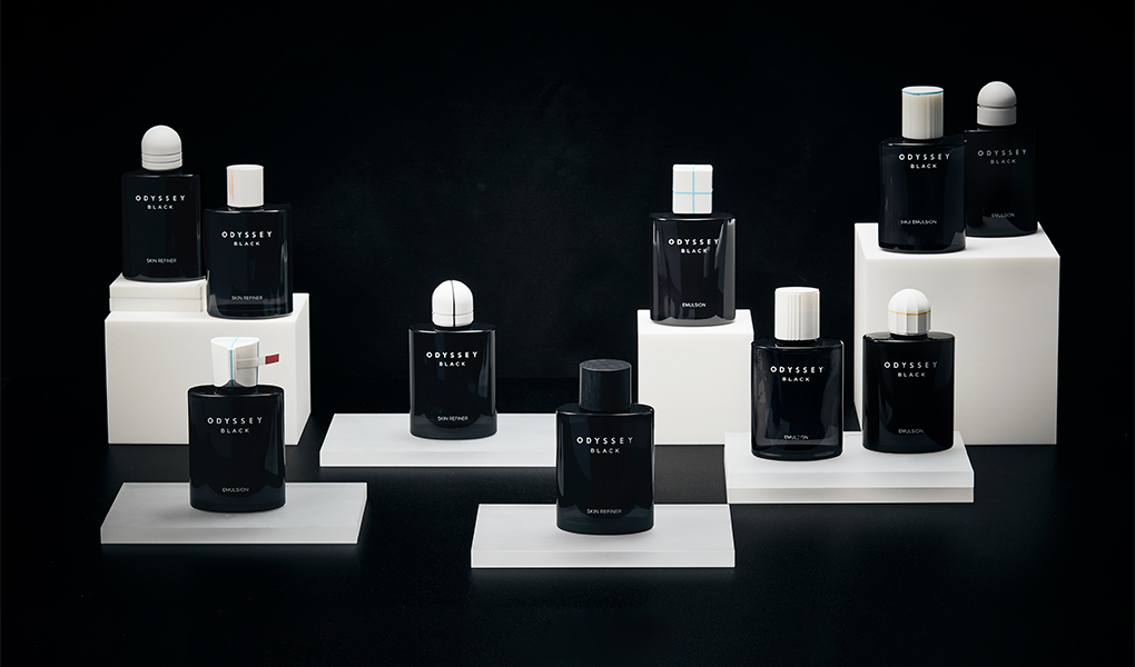
By considering the screw length of the container's neck and the overall height of the container, we found the most harmonious proportion between the container and cap. From a development perspective, we carefully adjusted the cap's locking strength, allowing users to experience an enhanced tactile quality.

Cap Design – Finishing
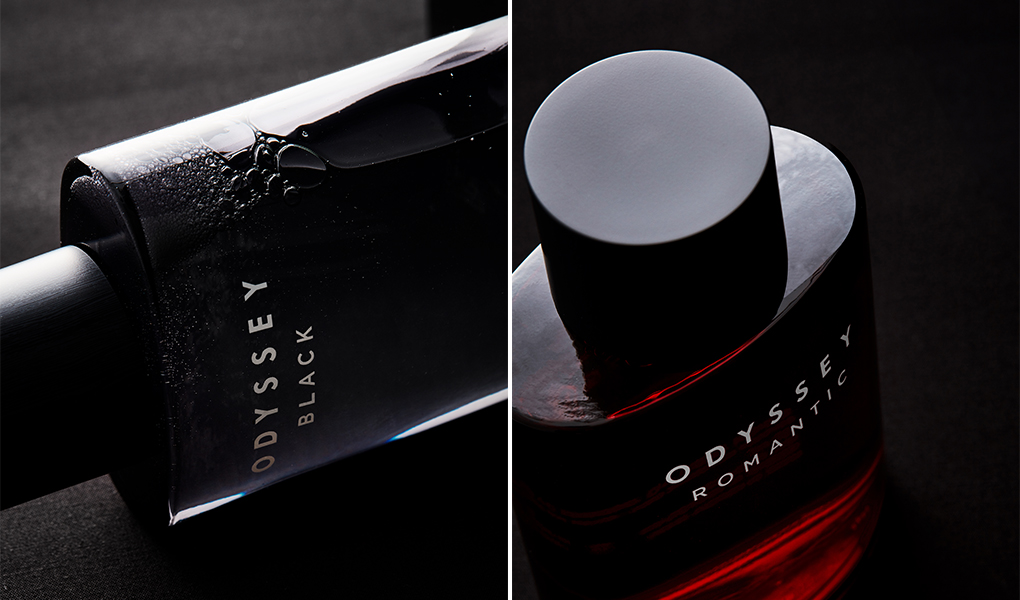
While the design language of Black and Romantic was unified, their differing price positioning necessitated a distinct approach for each line. Hence, we accentuated a sophisticated feel for the higher-end Black line by applying a premium wood pattern. We utilized transfer printing on injection caps to achieve a subtle pattern on the smooth surface and meticulously tested multiple shades to finalize the color scheme.

Graphics
Since its launch, ODYSSEY Classic has subtly evolved its front graphics to respond to the times with contemporary creativity. This time, we carefully adjusted the layout of the product front, considering the importance of the brand name, line name, and type name. The original front graphic layouts of Black and Romantic were designed considering the similar proportions of the cap and container, applying different layouts and post-processing to differentiate the lines while conveying the luxury of premium men's skincare.

With the new AD rollout resulting in changed proportions between the cap and container, we applied appropriate font sizes, positions, and weights for the front graphics. We aligned the graphic layouts of Black and Romantic for solid visual cohesion and changed the foil stamping to white to enhance visibility both online and offline, imparting a modern impression.
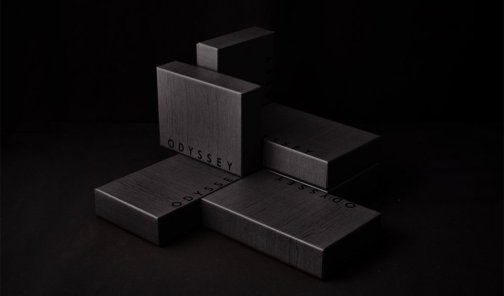
Sets
For the set packaging, we employed the same wood pattern as for the caps to enhance the luxurious feel, thus introducing a striking change in layout and boldly positioning BI for a young and refined look. We designed the set box to serve as a mini podium for product display in offline channels like MBS or supermarkets and as a backdrop for the product on online channels.

In renewing products of a brand with a long history, we reflected deeply on those who have shaped its story, immersing ourselves seriously in carrying forward our legacy. With the same spirit as at the launch, we hope the newly attired ODYSSEY Classic continues smoothly sailing on its ‘Fragrance Journey Towards Masculinity.’
-
Like
3 -
Recommend
0 -
Thumbs up
1 -
Supporting
0 -
Want follow-up article
0