#Creative Story
2023.06.14
20 LIKE
7,280 VIEW
-
-
- 메일 공유
-
https://stories.amorepacific.com/en/design-renewal-of-sulwhasoo-first-care-activating-serum-vi
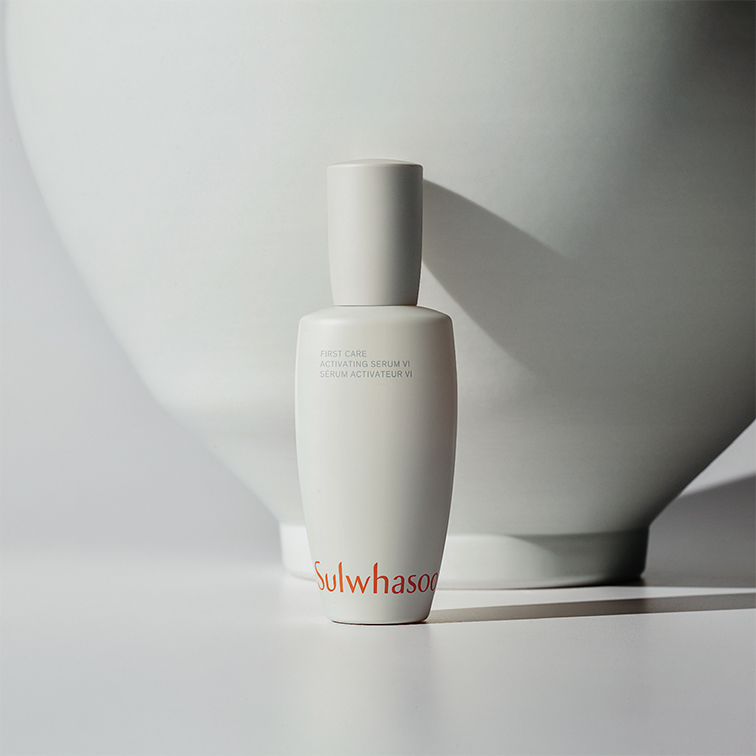
Design Renewal of Sulwhasoo First Care Activating Serum VI
Columnist | The column introduces our creative activities in different areas such as brands, products, spaces, and services.
Design Renewal of Sulwhasoo First Care Activating Serum VI
The Story Behind First Care Activating Serum
The Story Behind First Care Activating Serum

Columnist Park So-yeun
Sulwhasoo BD Team, Amorepacific
Sulwhasoo BD Team, Amorepacific
Hello, everyone! It’s Park So-yeon from the Sulwhasoo BD Team at Amorepacific. Many of you have already noticed Sulwhasoo’s new design. First Care Activating Serum VI was released back in March as the first product that signals the start of this transition. We are all well aware of the journey towards beauty that began with a drop of camellia oil. Inheriting the time-honored heritage as the very first and the best-in-class leader, Sulwhasoo reinvented itself in 2023 like a flower in full bloom. Today, I’d like to talk about the challenging process we have been through as we prepared for Sulwhasoo’s renewal and also the behind-the-scenes story about the design.
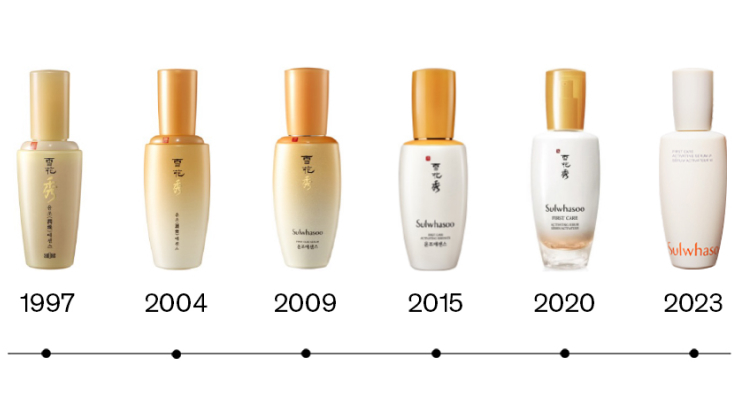
In the past year, Sulwhasoo underwent a major design change. The purpose of the renewal was to reinterpret the brand’s iconic identity with modern design language and to derive design elements like the form, colors, and graphics that have been chosen based on Sulwhasoo’s pioneering spirit, which marks the beginning of the brand from the past into the present. Most importantly, we wanted to fully express the identity of First Care Activating Serum.
The moon jar, the source of our inspiration
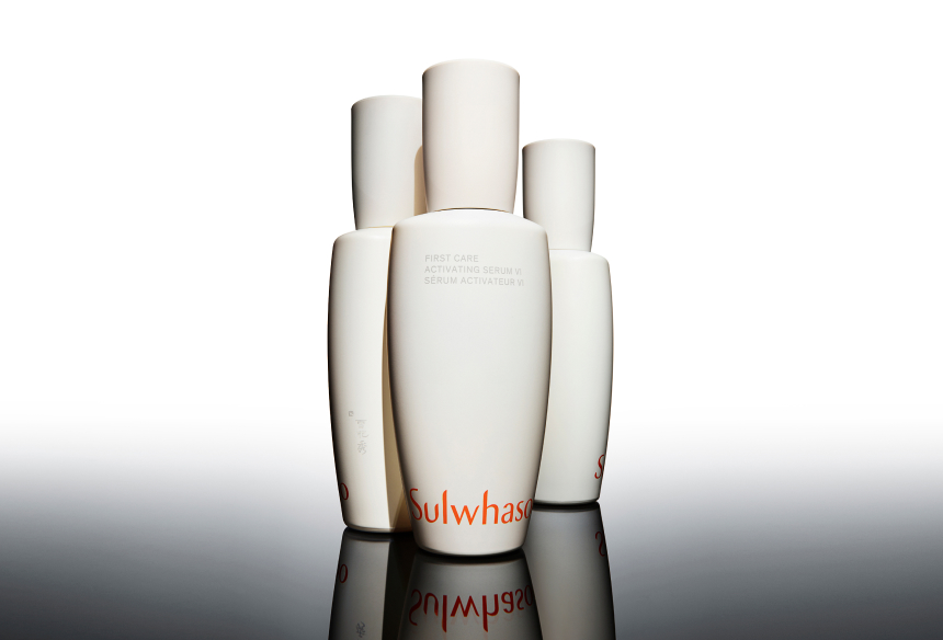
It was a daunting challenge to make a sea change in the flagship product of a brand that has secured long-term customer loyalty rooted in the identity that has been built up in many layers over generations. We wanted to show the direction that Sulwhasoo will take while at the same time revealing its powerful presence. We put the moon jar, which was the source of Sulwhasoo’s design heritage and inspiration from its inception, at the heart of the brand’s world view. We then reorganized the brand, so it communicates the moon jar concept throughout the brand intuitively through products, space, and visuals. That is, we reinterpreted the modern, priceless, desirable, and artistic quality that paradoxically characterizes the moon jar, the essence of Korean aesthetic, from Sulwhasoo’s perspective.
Starting with First Care Activating Serum, all Sulwhasoo products will have a borderless design applied that is centered around the shape of the moon jar, which transcends the boundaries between tradition and modernity, and language and space reflecting our inspiration from Korean paintings and calligraphy.
Starting with First Care Activating Serum, all Sulwhasoo products will have a borderless design applied that is centered around the shape of the moon jar, which transcends the boundaries between tradition and modernity, and language and space reflecting our inspiration from Korean paintings and calligraphy.
Creating a tranquil aesthetic
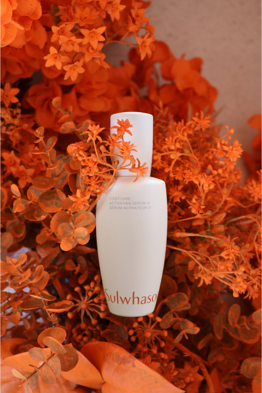
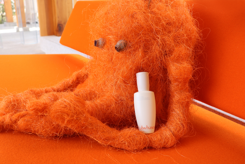
Through this project, we wanted to reinvent First Care Activating Serum into something that captures the aesthetics of silent movements infused with powerful vitality all while remaining quiet and tranquil, instead of simply pursuing some form of extravagant aesthetic. We sought to imply elegance and serenity in life while minimizing decorations for the First Care Activating Serum bottle designed by paying homage to the shape of the moon jar. The beauty of the curves on the bottle symbolizes the harmony that embraces everything.
As for the bottle design, which inherits the graceful curves of the moon jar, we not only considered the visual form, but also the stable grip when held inside the hand. The smooth bottle surface reminiscent of the glazed surface of porcelain makes you appreciate the moderate aesthetic and sophisticated beauty simultaneously.
After undergoing extensive trial and error as we tried to make the cap and bottle, made of different materials, appear to be a single objet d’art, we were able to transform the artistic quality of the moon jar created by a craftsman, who put in many hours of hard work, into an industrial product. As a result, we managed to deliver a satisfactory outcome.
Inheriting tradition through contemporary design
How can you apply the extraordinary Korean traditional culture and heritage to Sulwhasoo? We ruminated on the best way to pass on and accept such culture and heritage in the most Sulwhasoo way possible as a leading beauty brand of Korea.
As such, we decided to apply the unique meaning of Sulwhasoo in the layout for First Care Activating Serum VI. When you look at the artworks of our ancestors who loved art and enjoyed painting and making calligraphy work, you can see that they wrote text both vertically and horizontally. Inspired by such moderation amid free expression in traditional art, we placed the Korean and English product names alongside the mandatory information in both vertical and horizontal formats on the front and back side of the product in a way that achieves harmony.
To match this pattern, we utilized the beauty of Hangeul in a more meaningful way. We carefully adjusted the font size and the of each letter or character on the packaging where we had to use Korean, English and Chinese simultaneously. We put the Korean brand name and the product name vertically and made them lead the overall layout. We also made sure the back side of the product carrying the product information appears as part of a painting or calligraphy work different from a typical back side of a beauty product.
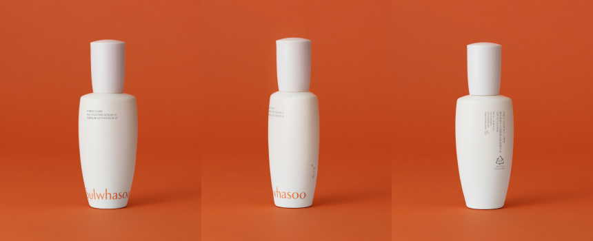
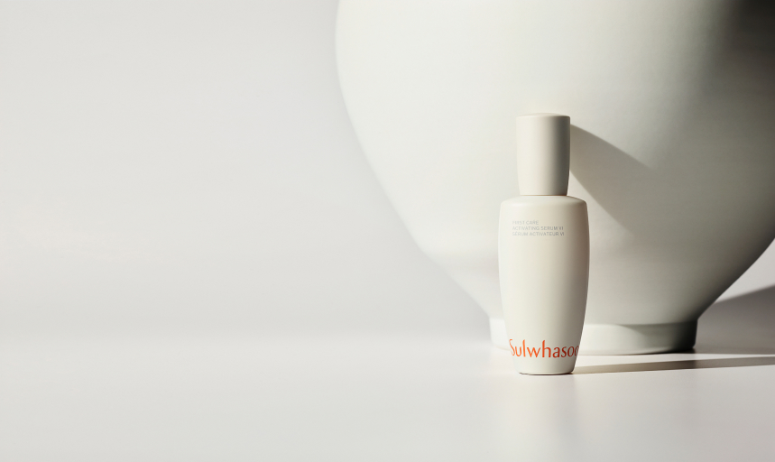
The most eye-catching element of the First Care Activating Serum VI is the brand logo at the bottom. We placed the logo boldly in the signature brand color, earthy amber, at the bottom of the front side of the bottle, giving it a strong presence. This was intended to make customers recognize the BI first when they see the logo on the product. This such attempt is an expression of our willingness to demonstrate Sulwhasoo’s pioneering spirit across the world, and is a declaration of our new contemporary design.
We also removed all unnecessary elements in order to make the shape of the bottle itself stand out and to secure as much blank space as possible. We wanted to echo the aesthetic of the moon jar accentuated by elegant curves in a vast white space as the simple aesthetic of First Care Activating Serum.
We also removed all unnecessary elements in order to make the shape of the bottle itself stand out and to secure as much blank space as possible. We wanted to echo the aesthetic of the moon jar accentuated by elegant curves in a vast white space as the simple aesthetic of First Care Activating Serum.
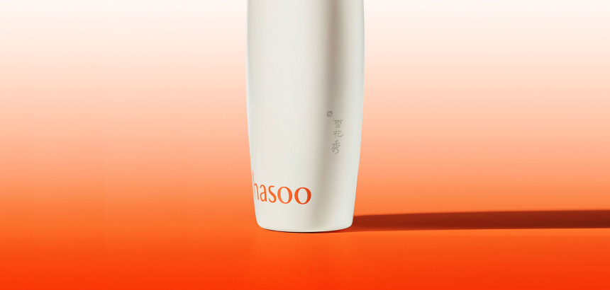
Another meaningful change found in the renewed design was the rediscovery of Sulwhasoo’s Chinese symbol. The Chinese symbol of Sulwhasoo is the primary asset of the brand. Considering its meaning and the iconic quality, we thought that we should use it in a more special way, deviating from the conventional style of placing it on the front side of the product. It is said the potters in the Joseon dynasty stamped their seal in unnoticeable areas of the pot to finish it off, for example, the bottom of the pot, as their way of verifying the quality of their work. The seal that reveals the identity of the artist was used in harmony with the pot, albeit being small, which acted as the crowning stroke that makes the work complete in harmony with the empty space. From this, we got the idea of placing the Chinese symbol of Sulwhasoo on the side of the bottle as if we were stamping a seal on each of the finest products we've made with all our heart. This symbolizes the last ritual we perform before delivering the product to customers. As such, the Chinese Sulwhasoo symbol is the legacy that grants a product the brand’s heritage, which we tried to use in a more valuable, artistic manner. It inherits the well-established heritage of Sulwhasoo, with elegance and vigor.
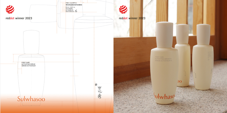
There was recently some great news about Sulwhasoo. First Care Activating Serum VI won the prestigious Red Dot Design Award in the Product Design category. 1 The judges said when discussing the new design, “With maximum reduction, the design succeeds in creating a strong presence through its fine accents on high-quality material while subtly conveying the art-historical past.” This marks a significant milestone for Sulwhasoo as it signals the global recognition of our commitment to carry on and reinterpret the very Korean aesthetics and tradition that the brand pursues.
About the nature of Sulwhasoo
The public perception of Sulwhasoo and people’s expectations of the brand may be contrary to the direction we intend to take in the future. It would be a difficult decision and a real challenge to accept something new instead of something familiar to you that you are more comfortable with. However, it is a change that somebody has to bring for us to reach new heights.
Creating beauty in the spirit of art and heritage. That is our philosophy and belief at Sulwhasoo. We consider ourselves innovative artists in the world of beauty. We will offer a new experience in aesthetics to customers using our sense of art and creativity as the medium and provide inspiration so everyone in the world can create their unique beauty building on their own heritage. We will preserve the unparalleled tradition by following the nature of Sulwhasoo with pride as a leading brand of Korea going beyond the past and into the future. That is the destiny of Sulwhasoo and is something we believe that we can do better than anyone else.
It was a pleasant experience introducing the story behind the First Care Activating Serum design renewal project in this section, and I am personally honored to be allowed to contribute to NewsSquare. Thank you.
1Red Dot Design Award: It is a renowned global design award organized by Design Zentrum Nordrhein Westfalen in Germany. It is known as one of the three largest design competitions in the world alongside iF Design Award in Germany and International Design Excellence Awards (IDEA) in the US.
-
Like
15 -
Recommend
2 -
Thumbs up
2 -
Supporting
1 -
Want follow-up article
0