#Creative Story
2023.11.02
Arita's Time, Space, and People
Written by
Kang Yoo-sun Creative Strategy Team

Arita: Time
The first discussions around the development of Arita began in the fall of 2004. Back then, the company was not named Amorepacific, but rather, ‘Taepyeongyang.’ And it was that subsequent winter when the earnest planning to create a typeface exclusive for ‘Taepyeongyang’ commenced. Thus began the journey of the Taepyeongyang exclusive typeface, which was introduced to the world as ‘Arita Dotum’ in October 2006, a distant 17 years ago. By 2012, the English font Arita Sans was developed, followed by Arita Buri in 2013 and the Chinese font Arita Heukche in 2017. Over these 17 years, Arita has grown from a mere seed into a robust tree with a thick trunk.
But what exactly is this ‘Arita’ font, painstakingly developed over such a long span? Before diving into its story, I'd like to address the intricate process of creating a body text typeface. Recognizing the meticulous labor and dedication behind each letter that emerges on the monitor with every keyboard tap isn't straightforward.
I'll refer to the typeface you are currently reading as a body text font. Unlike headline fonts with distinct characteristics, crafting a body text font that reads smoothly without any hitches requires extra care. Ahn Sang-soo, who oversaw the entire design of the Arita font family, likened the endeavor to developing rice seed varieties. Rice, a staple we consume daily, appears similar at a glance, but in reality, it's categorized into myriad varieties. Consider this analogy: a drink in a clear glass allows us to focus on the beverage, while one in an ornate goblet captivates our attention even before we sip.
Instead of a headline font that dramatically showcases the features of a company, we resolved to create a body text font that anyone can effortlessly use — akin to delicious rice or crystal-clear glass. Given that Arita is a free font, our direction leaned toward designing the most practically usable typeface rather than emphasizing ornate characteristics that might limit its scope.
A font design begins with crafting a unique ‘expression’ for the characters. With familiar body text fonts in our visual repertoire, bestowing a new body text font with a distinct personality demands deep contemplation. For Arita's Korean font, this contemplation began with ancient Korean script. It hearkened back to when Korean was still in its Hunminjeongeum phase, discovering the ‘straight Kiyeok.’ The script then captured the tactile sensation from when Korean was written with a brush. Following establishing core concepts, decisions about character height, spacing, and word intervals were made. Only after these foundational choices were made and the proportional width system was organized could the essential set of 2,350 Korean characters be derived. Once composed and reviewed, the culmination of designing a body text font with 11,172 Unicode characters was nearly complete. After finalizing the design, relentless printing and output tests were conducted, followed by a meticulous visual inspection to ensure no errors, finally generating the usable font file.
Expanding such painstakingly crafted body text fonts to language families beyond Korean and then releasing them for free is relatively uncommon. Only a few domestic companies can achieve this feat.
Arita: Space
The development of Arita holds a significant place in the annals of Hangul typography. During its creation, there was a discourse on referring to the Hangul serif typefaces traditionally known as Myeongjo and Batang as ‘Buri,’ and the sans-serif typefaces known as Gothic as ‘Dotum and MinBuri.’ This nomenclature soon became the standard for Hangul typography. It's a rare feat, both domestically and internationally, to nurture the development of a typeface for over a decade. Corporate typefaces, often devised as ephemeral ventures, are frequently abandoned post-development, making long-term undertakings that include updates exceptionally scarce.
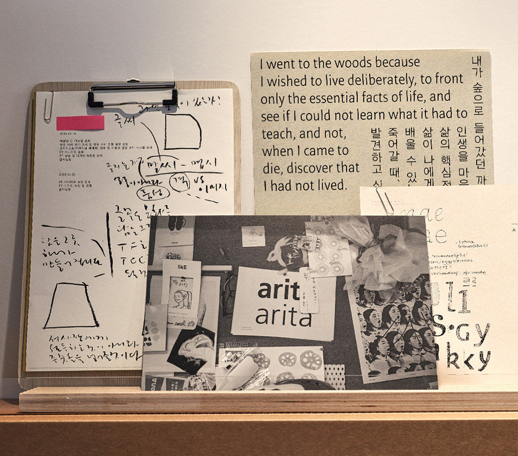
We felt a pressing need to document the invaluable history — for ourselves and the legacy of Hangul typography. This led to the introduction of the book ‘Arita Font Journey’ in 2020. By 2023, an exhibit centered around Arita finally opened its doors at Amore Seongsu. This project had been proposed long ago but had been adrift, with neither a fixed timeline nor venue. The project began with crafting an apt title for the exhibit.
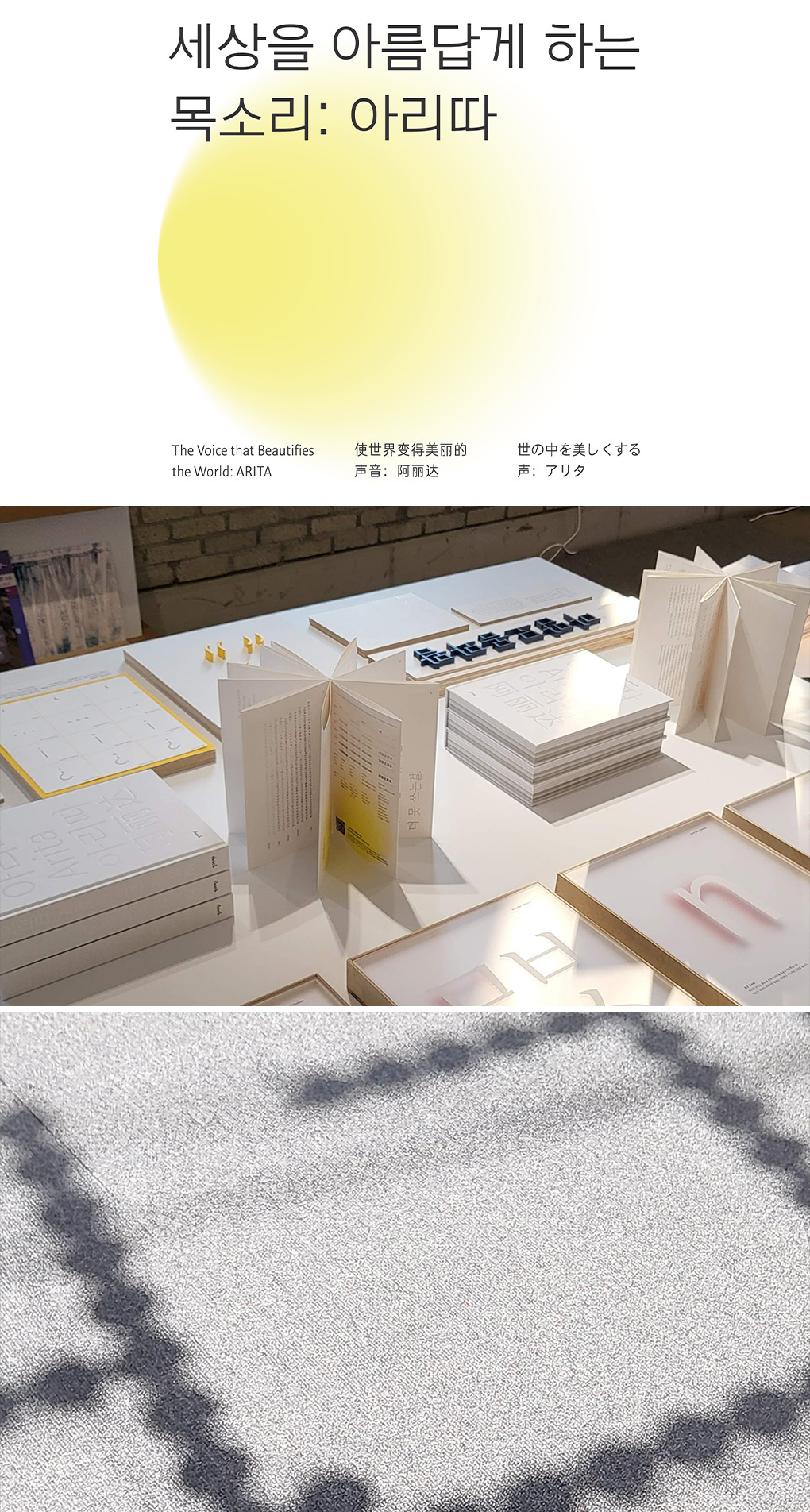
Hunminjeongeum, the initial name for Hangul, translates to ‘the righteous sound that educates the people.’ Embedded within this name is the profound love King Sejong bore for his subjects. Similarly, Arita began as a venture for the public good. While the voice, often unseen, might not be immediately recognizable, it carries an allure that renders the speaker captivating. A calm and composed voice not only pleases the ear but also instills trust in the message and imparts a comforting impression to listeners. Font functions as a voice for written words. Marrying the spirit of Hunminjeongeum with the voice of Amorepacific — Arita — and layering in our company's vision, we christened the exhibit ‘Voice Beautifying the World: Arita.’
Following the determination of the exhibit's title, a graphic motif epitomizing the soft-spreading, wholesome voice of Arita was realized. Concurrently, discussions on promotional strategies commenced, the exhibit layout and furnishings were finalized, merchandise was produced, and interviews were filmed. Everything unfolded simultaneously, guided by a tight schedule. Everyone involved in the exhibit was industriously on the move.
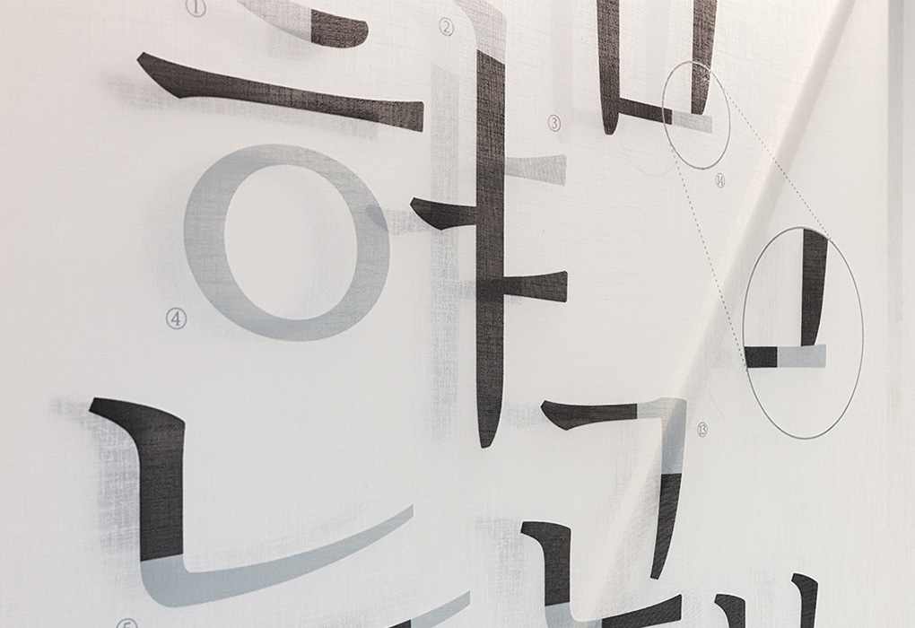
This setting was designed to offer an auditory-visual experience of Arita that the book could not encapsulate. We prominently displayed the structural diagram of Arita font, crafted Arita using three-dimensional acrylic blocks to showcase features that eluded recognition upon casual observation, and even created a video capturing voices of various demographics reading words written in Arita. In addition, interview footage exploring Arita's past, present, and future was presented to enhance visitors' comprehension of the exhibit. Considering the high proportion of foreign customers at the Amore Seongsu exhibit space, we also curated a space dedicated to Hangul exploration. Han Jae-jun's Hangul structural blocks illuminated the structure and design intentions of Hangul, and books on Hangul typography and learning were also available. A comfortable space by the window was transformed into a window seat, inviting visitors to read and trace the Arita font by hand.
Beyond the introductory space for Arita, the works of participating artists, all of whom had directly contributed to the Arita font's development, adorned the exhibition. Despite the passage of time since their contribution, each artist reminisced about Arita with fond memories. From Noh Eun-you's artwork expressing the fragrance of Arita through embroidery, Ku Mo-a's window decals, to interactive motions by Yang Hyo-jung and Park Yoo-sun, the dedicated support for the exhibition from artist Ryu Yang-hee all the way from Cambridge, and the visually arresting pink creation by Ahn Sang-soo situated at the exhibit's core. The endearing commitment every artist poured into their work culminated in exemplary outcomes.
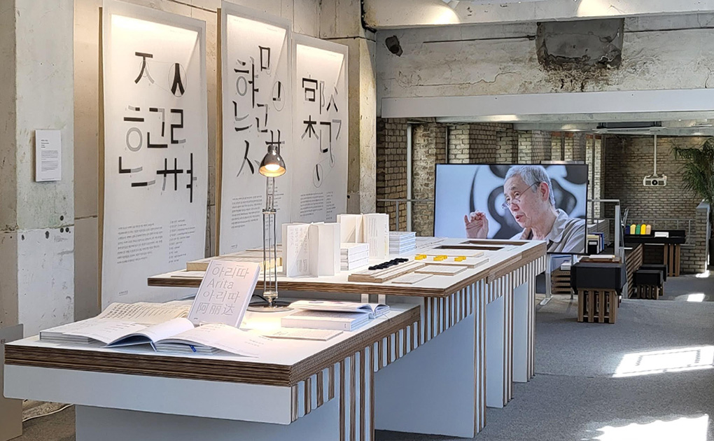
Upon the exhibition's opening, a surge of visitors flooded the space. There was a noticeable influx of foreign attendees and students, and designers intrigued by Hangul typography. Families with children also partook in the experience. Witnessing visitors' delight in extracting literary works from the literary vending machine, all adorned in Arita typography, and their joy in receiving Arita-themed font envelopes, the exhibit's profound impact was palpable. Hearing an artist refer to the Arita exhibit as a long-awaited ‘densely-entertaining exhibition’ brought immense gratification — it felt as though our meticulous attention to every nook and cranny had been recognized and appreciated.
Arita: People
Within and beyond Arita, there are ‘people.’ The Arita Dotum, the archetype for all Arita font families, is a typeface crafted by blending the firmness of a serif font with the soft touch derived from handwriting. This warmth of the touch is consistently applied to every font family developed after that.
Many corporate fonts prominently feature the company's name or, for various reasons, refrain from mentioning the names of planners and designers. However, behind every creation, there is a creator. Arita has always remembered and credited the designers. The meticulous documentation and organization of the journey behind creating each font have been preserved. This archival process made the ‘Arita Font Journey’ and this exhibition possible.
There are individuals I wish to acknowledge in this Arita exhibit. To Jung-won and O-kyeong, who supported and provided direction for the exhibition. To Eun-min, Ji-ye, and Chae-rin, who assisted from the nascent stages when even a title wasn't decided upon. To A-ra and Kyeong-ju, who beautifully decorated the space. To Young-ju and Yang-yang, who crafted the finest Arita video. To Si-a, Na-ri, Sang-woo, Yoon-jin, and Young-hoon, who assisted with design and exhibition operations. To Ang-ko, Woo-ni, Su-bin, and Eun-chan, who helped their mothers. And to Seol-a, So-an, and Yoon-han, who lent their adorable voices to the exhibition. I express my gratitude to everyone who added warmth to this exhibit.
-
Like
1 -
Recommend
0 -
Thumbs up
1 -
Supporting
0 -
Want follow-up article
0