-
-
- 메일 공유
-
https://stories.amorepacific.com/en/amorepacific-the-design-story-of-amore-seongsu-toner
Design Story of the 'Amorepacific Seongsu Toner' Capturing Amorepacific Seongsu's Universe

Written by
Soo-ah Yoo Amorepacific Brand Creative 4 Team

Summary
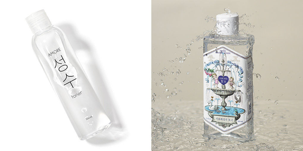
‘Amore Seongsu Toner’ was launched when AMORE Seongsu opened in 2019, and it has a language play that contains the name of Seongsu-dong called “clean and grateful water” and the name of AMORE Seongsu stores. With the meaning of “clean water,” the project has been redesigned and renewed for this product, which has been in operation since the opening of the stores by putting the logo of AMORE Seongsu in a transparent and decorative bottle. As the number of foreign visitors to AMORE Seongsu increases and more customers are looking for exclusive products that can only be bought at AMORE Seongsu stores, we wanted to renew it with a more signature product.
Concept
First, I contemplated the current characteristics of the Seongsu Toner. The first feature is that it is Amore Seongsu’s signature product, developed to commemorate the opening of Amore Seongsu. The second is that it incorporates a playful use of language based on the name Seongsu. The third is that the product is designed using Hangul. The project aimed to enhance the collectible value through a design that maximizes these features. Personally, I found the product’s linguistic playfulness intriguing, yet it wasn’t very reassuring that many customers did not recognize this characteristic. Therefore, I sought to make this aspect more easily identifiable.
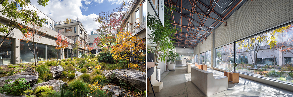
Additionally, infusing the exclusive product with the story of ‘Amore Seongsu’ would enhance its collectible value. Initially, I considered highlighting the transformation of a space that was once an automobile repair shop or emphasizing its tailored environment for cosmetics enthusiasts. However, I decided to focus on a more fundamental aspect: the concept of ‘love’ central to Amore Seongsu.
Amore Seongsu was conceived as a sanctuary for the love narrative, proclaiming the message, "Love makes the world go round," to the world. Embracing the belief that love transforms the individual, connects us all, and propels the world forward, we weave stories of love in harmony with nature—the wellspring and essence of love. Seongsu explores love through diverse lenses: compassion for protecting small and fragile creatures, gratitude towards neighbors and friends, awe for the flowers that bloom each season, and tales of love that move and inspire the world. Thus, we endeavored to encapsulate ‘Amore Seongsu’s love’ within the 'Amore Seongsu Toner.'
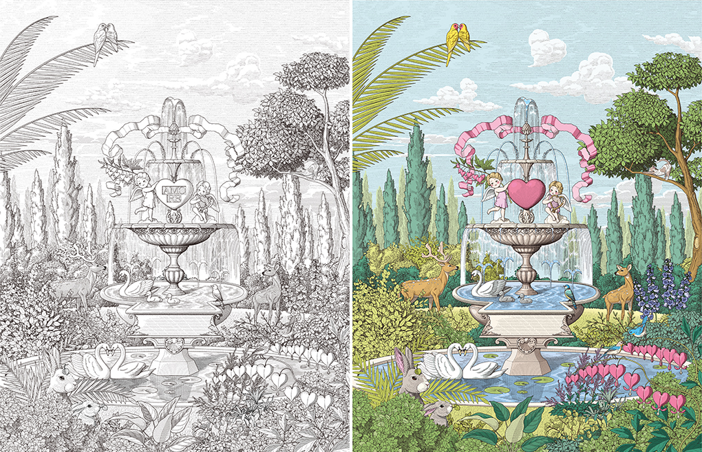
I believed that illustration would be an ideal medium to convey this story. To intuitively capture the wordplay of ‘Seongsu (聖水),’ a pen-drawn fine illustration with mythological style and detailed depiction seemed fitting.
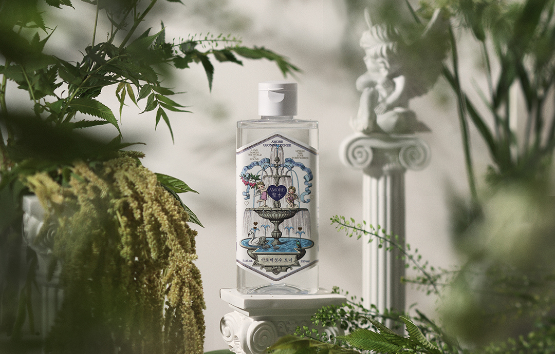
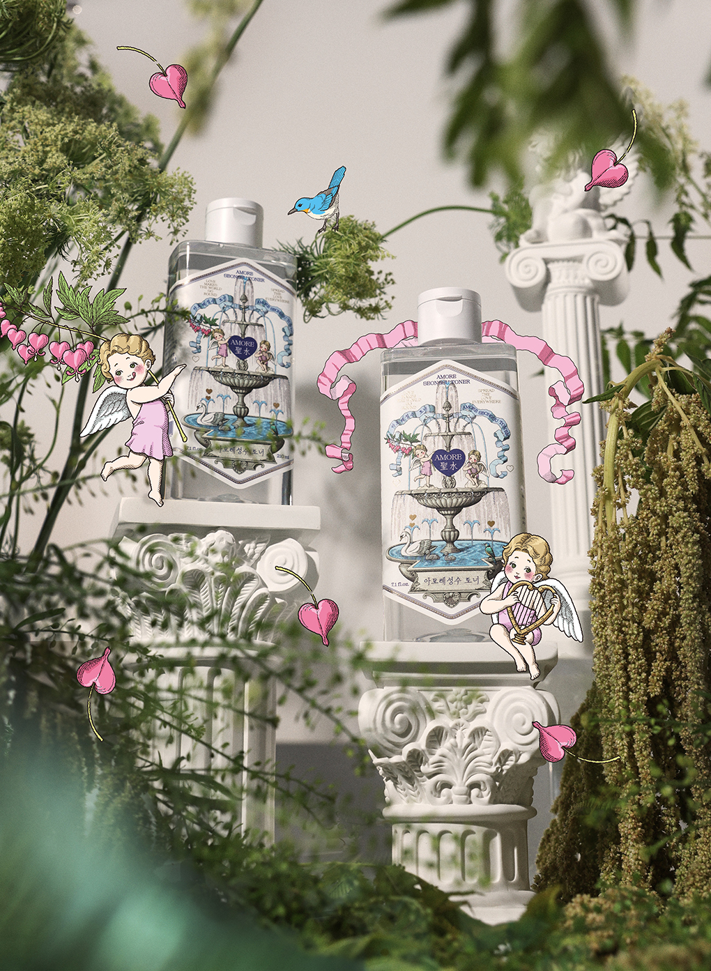
Focusing primarily on the toner product, we selected a fountain symbolizing ‘pure water’ as the central motif, intending to portray the various manifestations of love articulated by Amore Seongsu around it. At the fountain’s core rests a heart motif, surrounded by Cupid bearing a golden narcissus, baby angels performing love songs, a mother bird feeding her chick, a heart-spotted stretching cat, heart-shaped clouds formed by the wind, and swans gazing into each other’s eyes—collectively illustrating a forest of love where the energy of love blossoms in every nook and cranny.
Illustration
When deciding to incorporate fine illustrations, I thought of artist Hwan-uk Choe, whom I had followed for some time. Not only is he adept at fine detailing, but his usual work exudes a fairy-tale-like warmth that perfectly aligns with this concept. As anticipated, his development of the illustrations was exceedingly charming, allowing us to extend from the central motif to background illustrations that effectively captured the Seongsu universe. The artist drew Cupid and baby angels as characters for Amore Seongsu, further enhancing the fairy-tale narrative. Additionally, the use of golden narcissus flowers (bleeding hearts) that evoke heart imagery, cat patterns shaped like hearts, and birds gazing with heart-shaped faces were incorporated throughout, resulting in an even more delightful creation.

Video
The video was produced in collaboration with artist Wan-su Kim. Although Kim primarily works with stop-motion, I admired his approach to embedding stories through simple movements, which prompted me to propose a collaboration. Given the inherently fairy-tale-like quality of Amore Seongsu’s illustrations, it felt natural to create short videos utilizing these illustrations. Moreover, I believed that leveraging video content alongside the product launch would generate synergistic effects. Consequently, we planned three types of videos: a teaser that piqued curiosity about the ‘Forest of Love’ story, a looped video showcasing the continuous flow of the Seongsu fountain for viewers to watch idly, and a story video that depicted various expressions of love as narrated by Amore Seongsu. Particularly in the story video, we meticulously showcased the endearing illustrations to convey the Seongsu universe better.
Package design
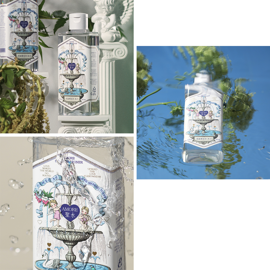
To convey the wordplay inherent in “Seongsu (聖水)” to our customers, we selected a narrow, elongated rectangular container with proportions similar to the Seongsu vessel. However, the rounded areas on both sides of the container’s front were more expansive than anticipated, which would have resulted in the illustrations appearing too small if printed directly. Consequently, we opted for a label specification instead of direct printing. This decision led to extensive deliberation on the label’s shape to ensure it harmonized with the container while allowing the graphics to be prominently displayed. We aimed to balance essential text with the central illustration without making the design feel cramped, carefully considering forms that complemented the illustrative mood. Ultimately, we chose a pointed shape over a rounded one, better accommodating the delicate illustrations. Drawing inspiration from the frames found in Western antique books, we designed the label with thickness and shapes seamlessly integrated with the illustrations. Although we included English and Chinese text on the product, it was imperative to feature Hangul prominently on the front. Finding a Hangul typeface legible and harmonious with the illustrative aesthetic proved challenging. After extensive searching, we selected a serif typeface that emphasized the vertical strokes characteristic of Hangul, harmonizing with the serif fonts used in English and evoking the feel of hand-drawn penmanship. The final consideration was color. We debated between a single-tone blue version, which conveys a calm and holy ambiance, and a full-color version, which projects a lovable and cute image. I favored the single-tone design; however, considering the sales environment, target demographics, and market conditions, we ultimately proceeded with the full-color version.
Visual
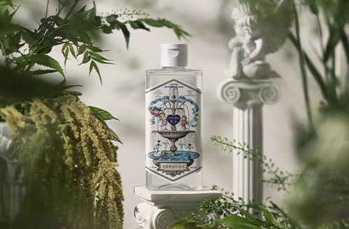
In crafting the visual elements, we prioritized two key aspects: clearly highlighting the product’s defining ‘pure water’ feature and effectively conveying the ‘Forest of Love’ illustration concept. This led us to a photo shoot incorporating water, plaster sculptures, and plants. Given our limited experience with natural materials, I approached the shoot with considerable apprehension. To evoke a forest-like atmosphere, we sourced various materials beyond flowers, including plaster sculptures of baby angels to connect seamlessly with the illustrations. Upon reviewing the results, I felt that arranging the plants naturally was challenging, and I regretted not experimenting with more diverse compositions. Nonetheless, we created a richer visual narrative thanks to Sangwoo’s expertise in utilizing shadows and close-up shots. The visuals featuring water effectively showcased the product’s essence while maintaining a strong focus on the product itself, which I found particularly satisfying.

Amorepacific Creatives
Product Design Soo-ah Yoo
BM Hee-sun Shin
Illustration Hwan-uk Choe
Video Wan-su Kim
Photography Sang-woo Shin
-
Like
0 -
Recommend
0 -
Thumbs up
0 -
Supporting
0 -
Want follow-up article
0


