#Creative Story
2024.06.25
7 LIKE
8,967 VIEW
-
-
- 메일 공유
-
https://stories.amorepacific.com/en/amorepacific-prmr-the-rebranding-design-story
prmr - The Rebranding Design Story
The Development Journey of primera's prmr Wordmark and B.I.
Written by
Ji-hyun Kim, Ye-seul Lee, Mi-jung Shim Brand Creative 1 Team


Powerful Mixology for Sensitive Skin, prmr
In a proactive response to shifting global trends, primera, long an advocate of ‘eco-friendly naturalism,’ has evolved from its gentle image into a nature-based, functional brand designed for sensitive skin.
This project, initiated in 2022, has focused on redefining the brand identity and renewing its products. primera emphasizes its powerful mixology capabilities by combining low-irritant repair solutions derived from seeds with high-efficacy formulation technology.
Two years into the rebranding journey, we are excited to share the story of primera's B.I. design changes.
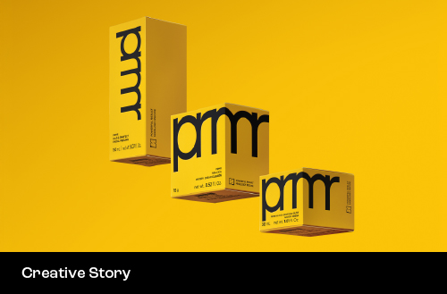
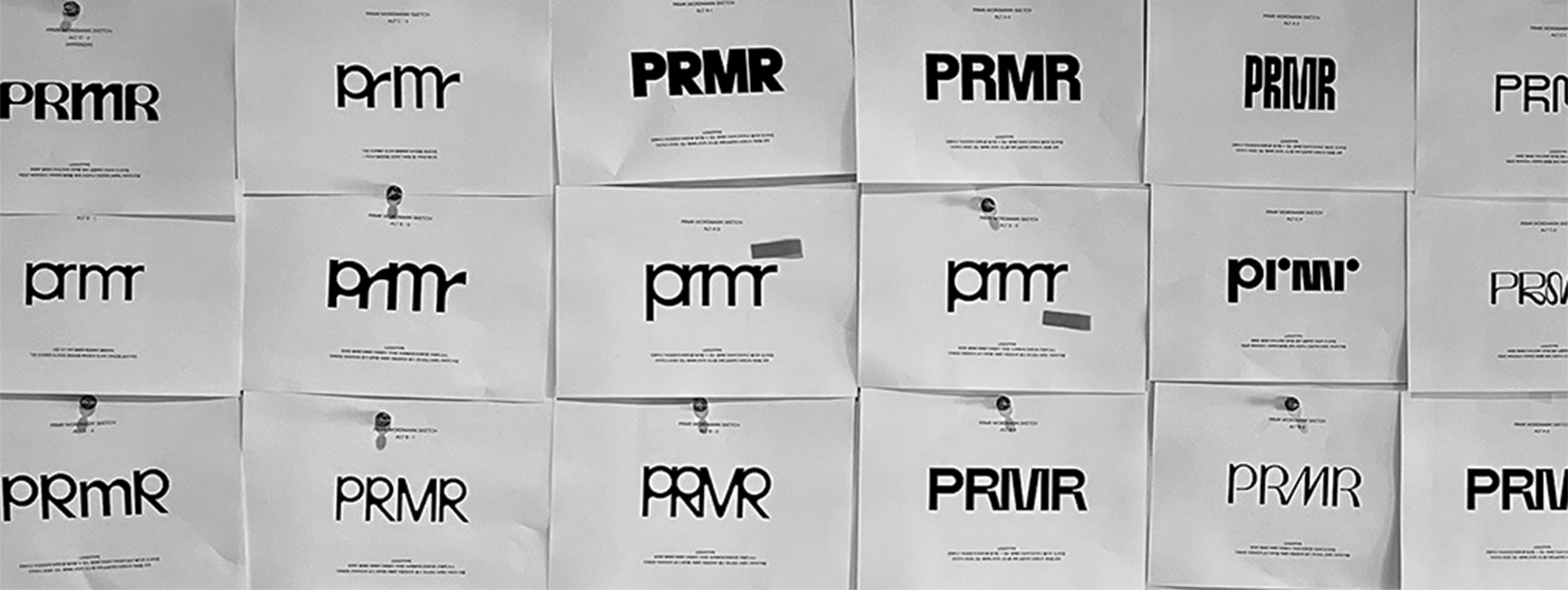
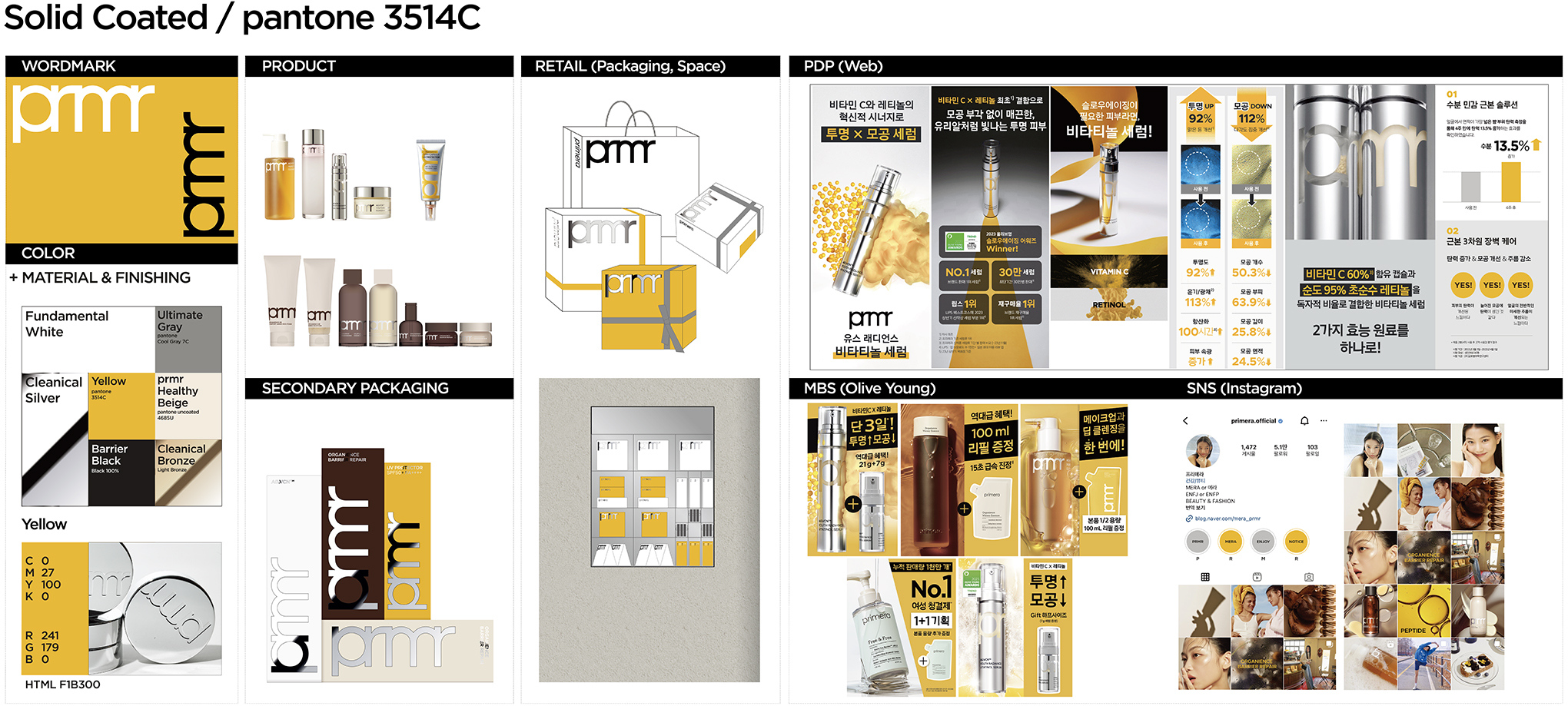
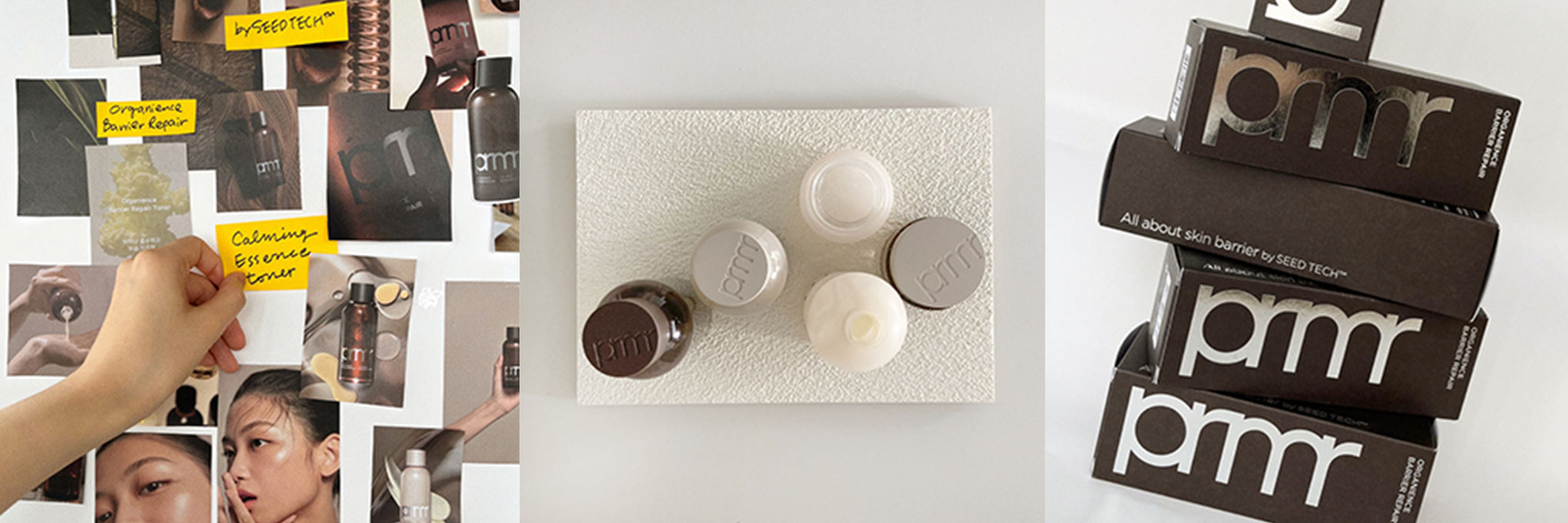
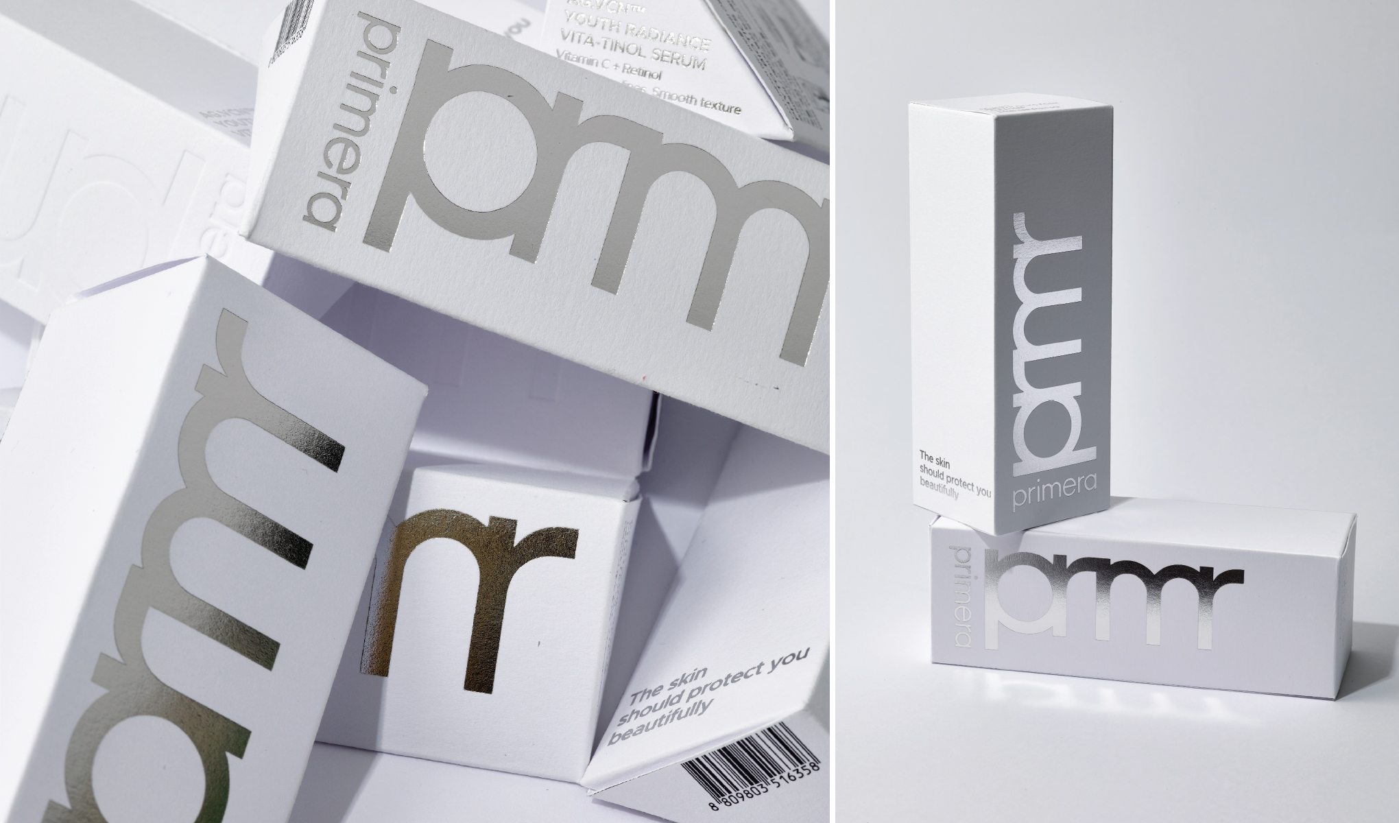
New Wordmark - PRMR
One of the most significant changes in primera's rebranding is the development of the prmr wordmark, a shortened version of the original primera logo.
After 12 years with the Century Gothic typeface wordmark, we boldly condensed the somewhat lengthy 'primera' into 'prmr.' This new wordmark is solid, weighty, and refined.
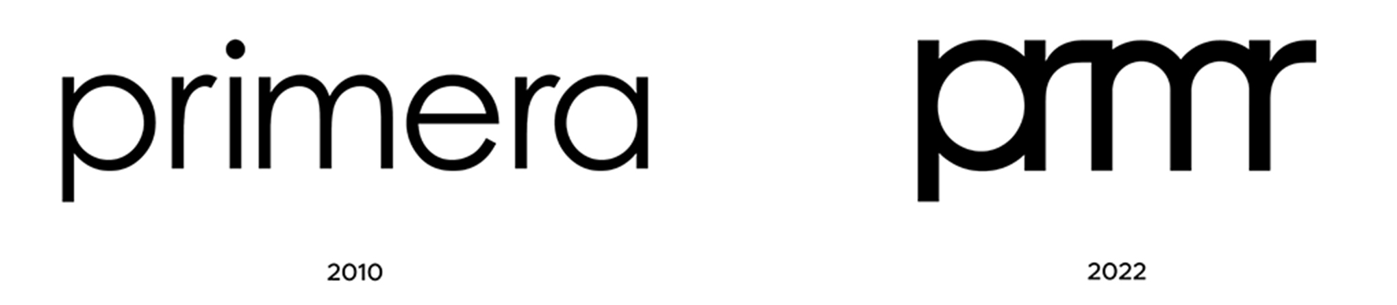
Starting with the goal of making primera's wordmark shorter and more precise, we initiated the rebranding to reinforce primera’s image as a proactive and dynamic skincare brand.
The new wordmark builds on the framework of the original primera wordmark, created with the Century Gothic typeface 12 years ago. We began by straightening the diagonal forms of the 'r' and 'm' and adjusted the tail length of the 'p' to enhance the structure's completion. By reflecting the form of 'm' in 'r' through various tests, we achieved an interconnected, organic character in prmr. This bold and impactful new wordmark is designed to expand as the brand's primary graphic element without size limitations. It retains a connection to the previous logo while being intuitive and effective across all sales environments, including digital platforms. It is boldly applied to product packaging to maintain its iconic status.
Brand Color - Seed Yellow
Another notable change in primera’s renewal is the introduction of its unique ‘brand color.’
Through the use of Yellow (Pantone 3514c), which symbolizes the seed (low-irritant repair), a central element of the brand's powerful mixology technology, customers can visually connect with the brand's core values.
This color is extensively used across current packaging, spaces, and communication domains, and it plays a crucial role in establishing brand recognition among customers.
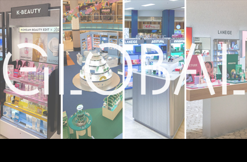
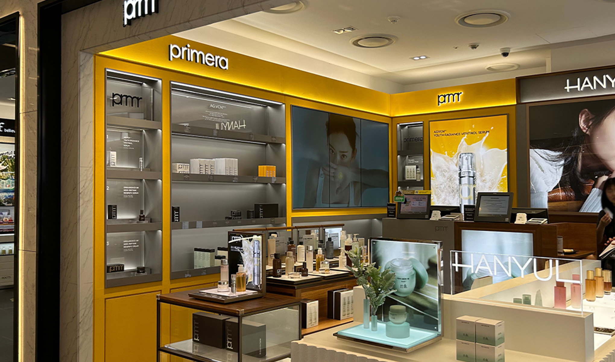
The space where the Seed Yellow color is particularly prominently communicated is through the Olive Young channel.
After deliberating on how to make our brand stand out and appear more attractive among many others, the current Olive Young design was born. We utilized the Seed Yellow color over a large area in the VMD (Visual Merchandising) to create a CMF (Color, Material, Finish) combination that makes an impact from afar.
Olive Young’s planning sets already convey much information on the product box, so we minimized redundant information transmission and structured the VMD to showcase the brand color over a larger area. We minimized using POP and wobblers, employing metal trays to position primera products as premium within Olive Young, enhancing their luxurious and appealing look. We opted for bold and simple designs to prevent the brand from appearing too lightweight due to the yellow color.
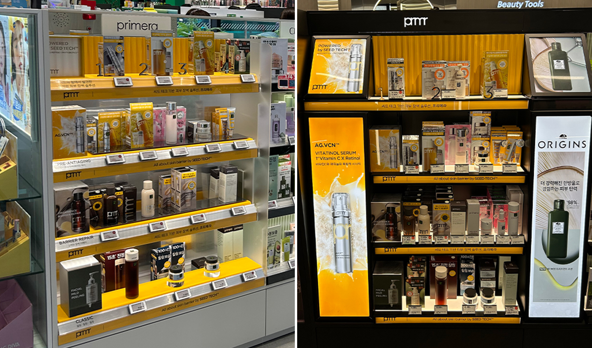
By unifying the use of color across pop-ups and duty-free stores, we ensure coherent communication with our customers.
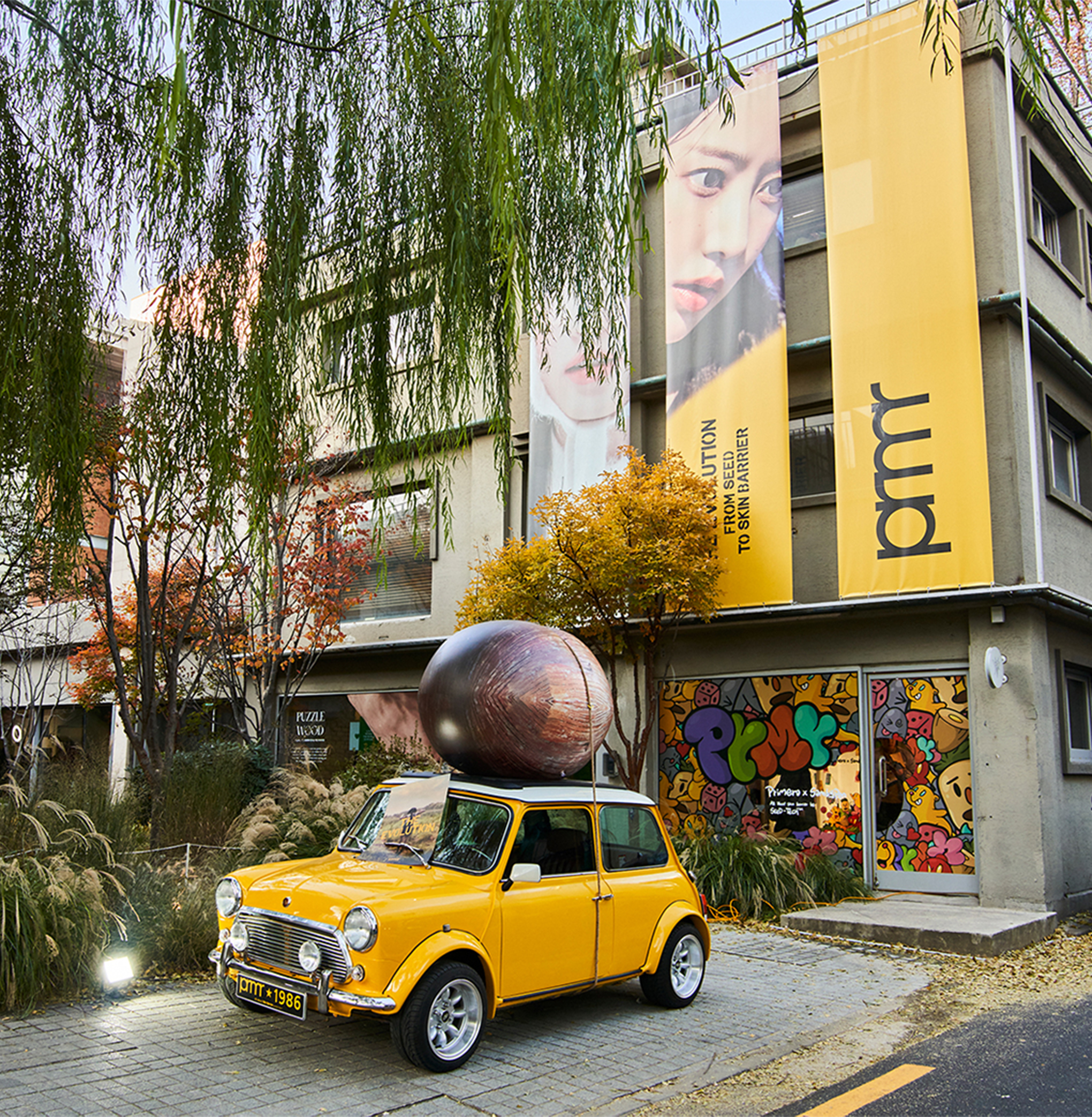
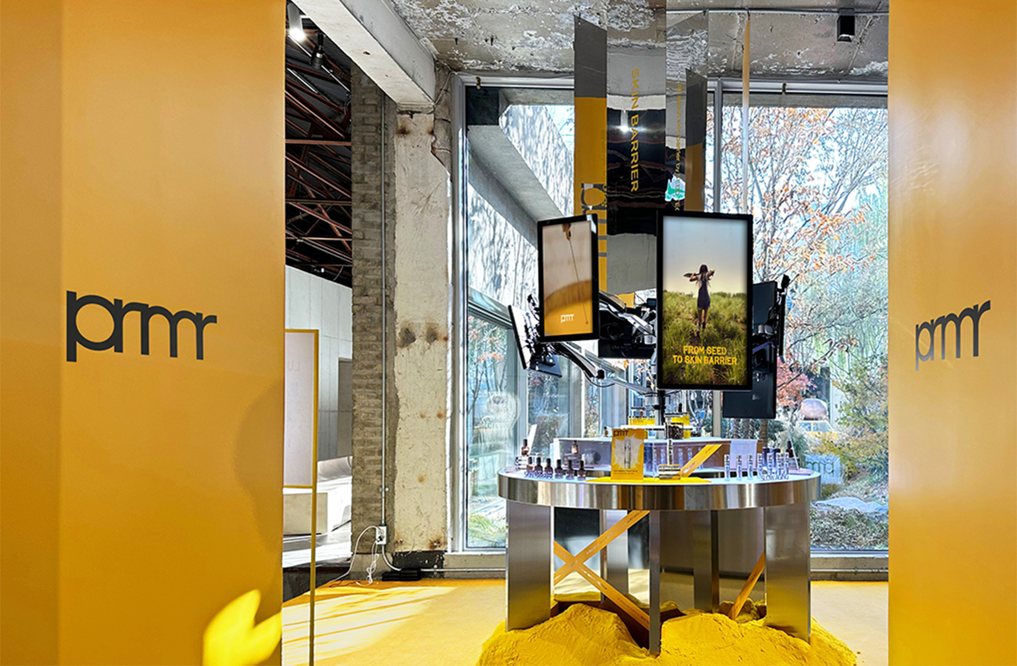
At the primera pop-up event held at Amore Seongsu, visitors were greeted by a primera car in Seed Yellow at the entrance, guiding them through a brand experience infused with this vibrant color. The Gangnam Olive Young popup also prominently featured Seed Yellow, enhancing brand recognition and showcasing the signature product, the Vitatinol Serum.
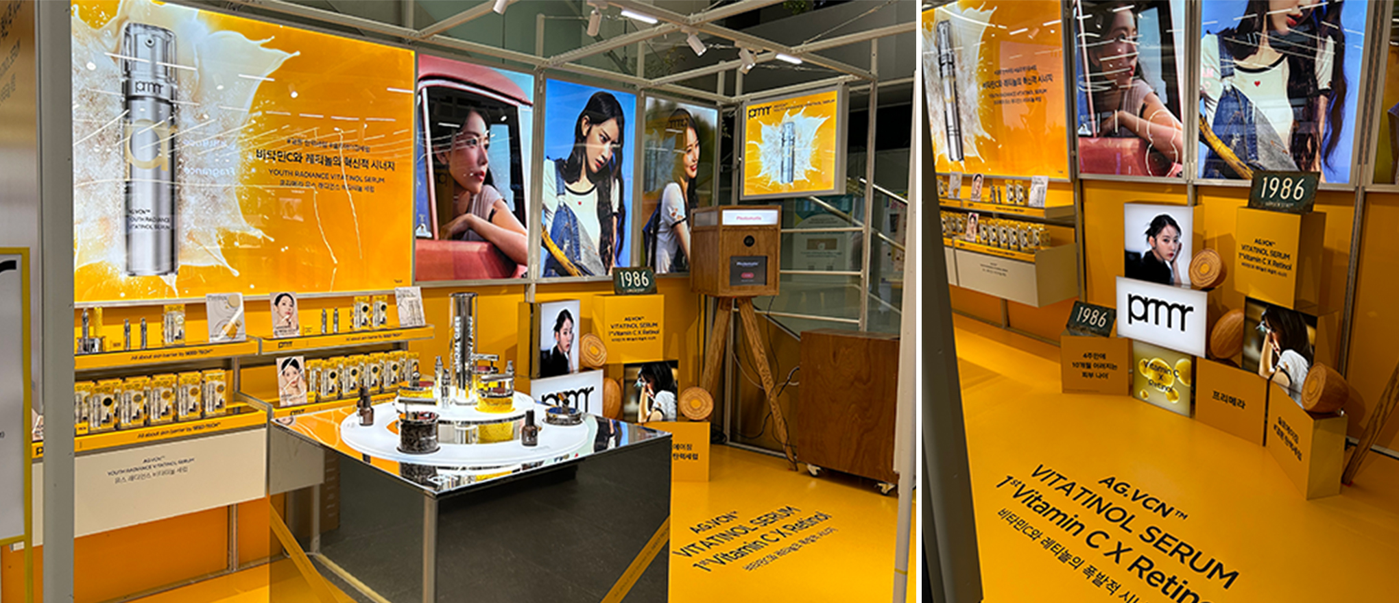
To ensure consistent brand color communication, we boldly applied Seed Yellow across entire walls, not only in MBS(Multi Brand Shop) and popup spaces but also within duty-free areas. This strategic use of color significantly enhances primera’s visibility amidst the multitude of brands in these diverse and bustling environments.
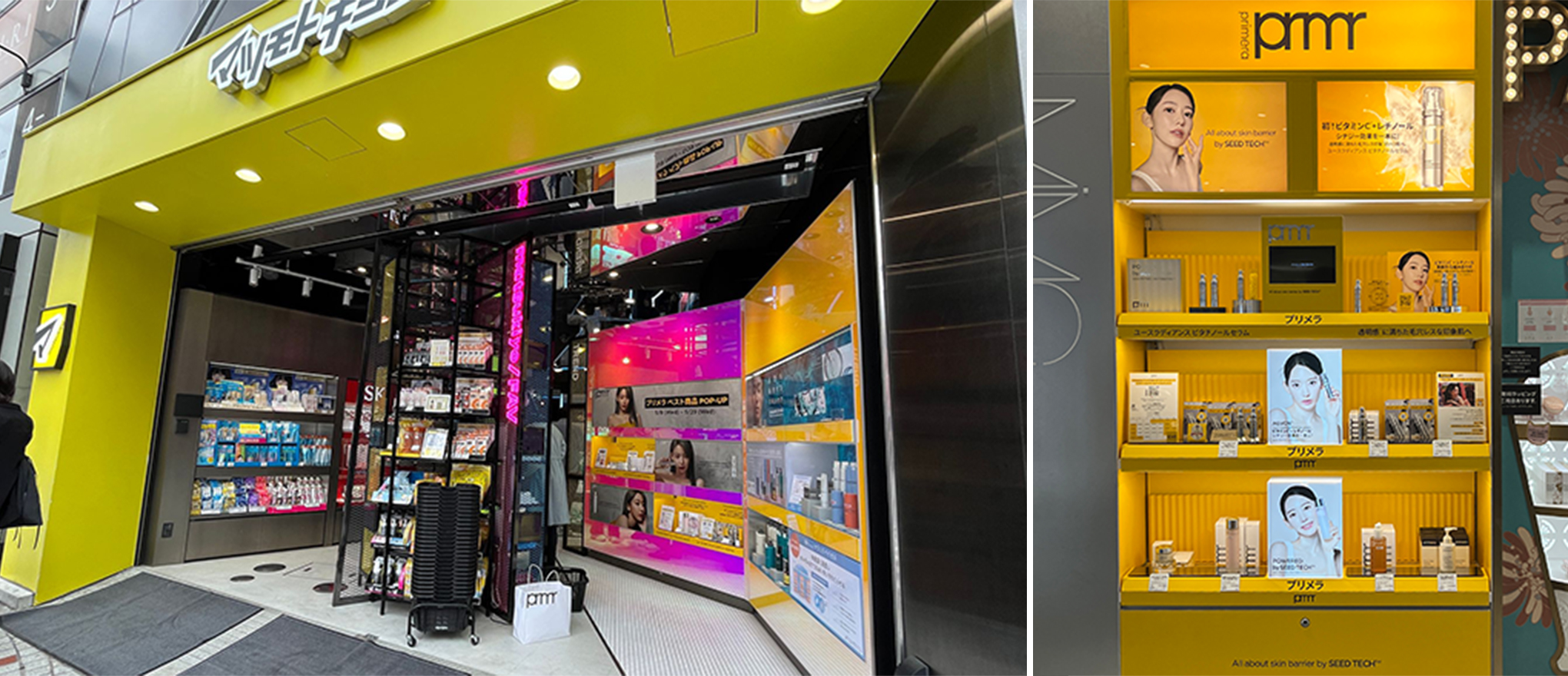
This Seed Yellow color strategy has been actively implemented in various MBS locations in Japan, such as AtCosme, Loft, and Matsumoto Kiyoshi, solidifying Primera’s presence.
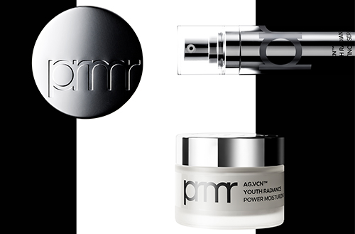
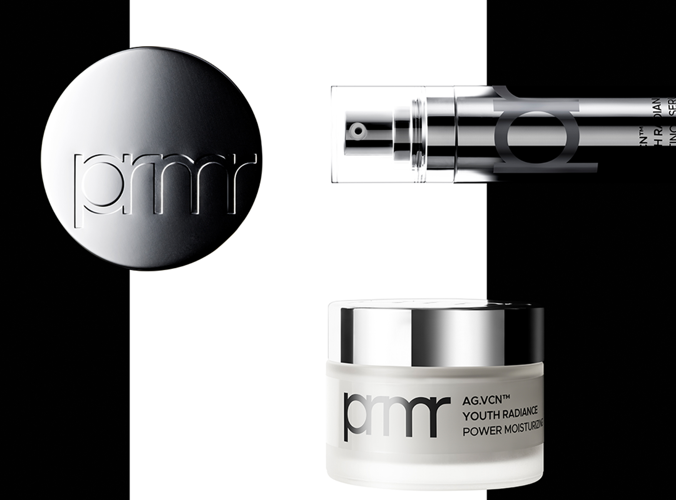
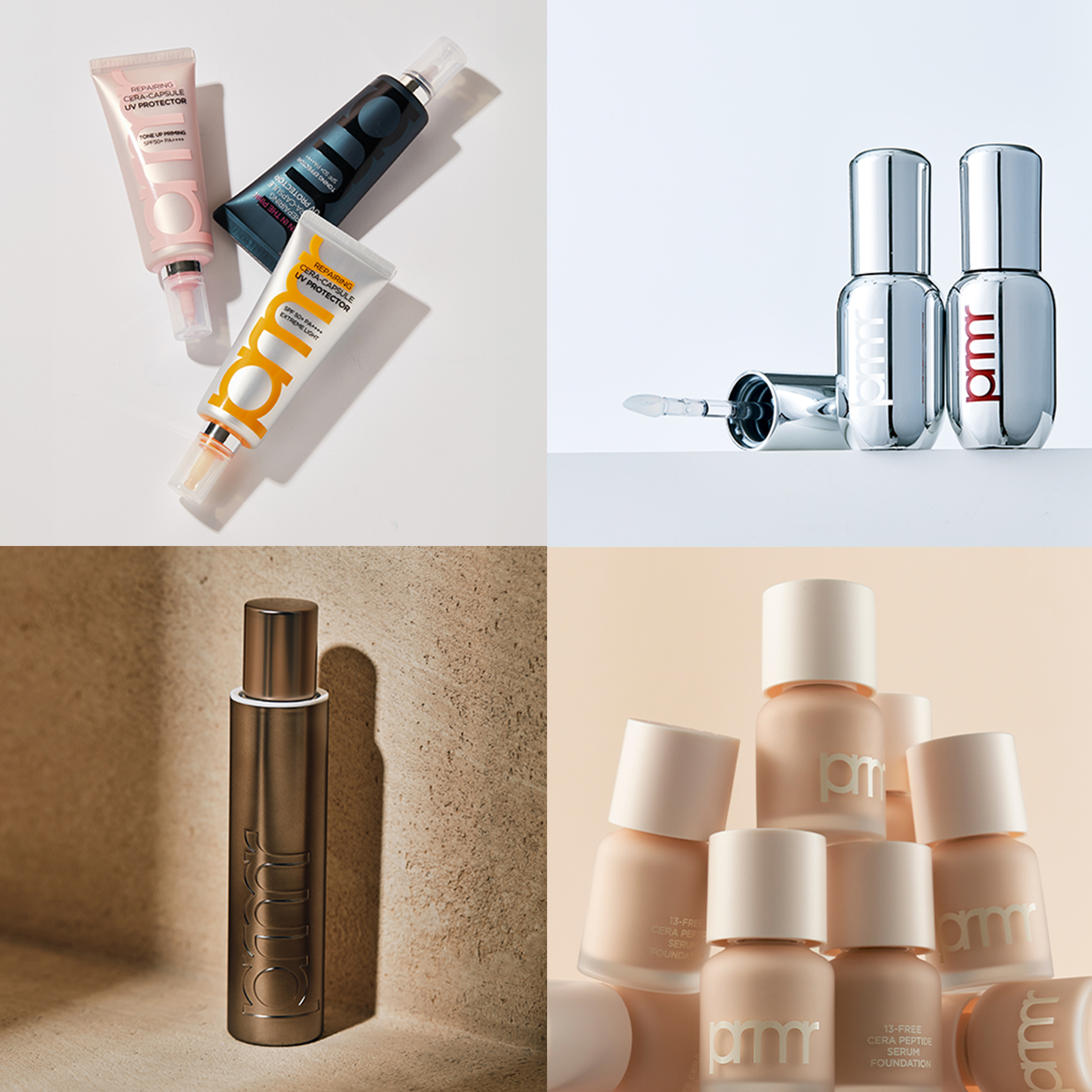
PRMR - Product design
To reflect primera's evolved attitude and advanced technology and efficacy, the new prmr wordmark is confidently displayed on the packaging front, making a striking impression on customers. The wordmark's presence is amplified by minimizing extraneous graphic elements, excluding the logo and product name.
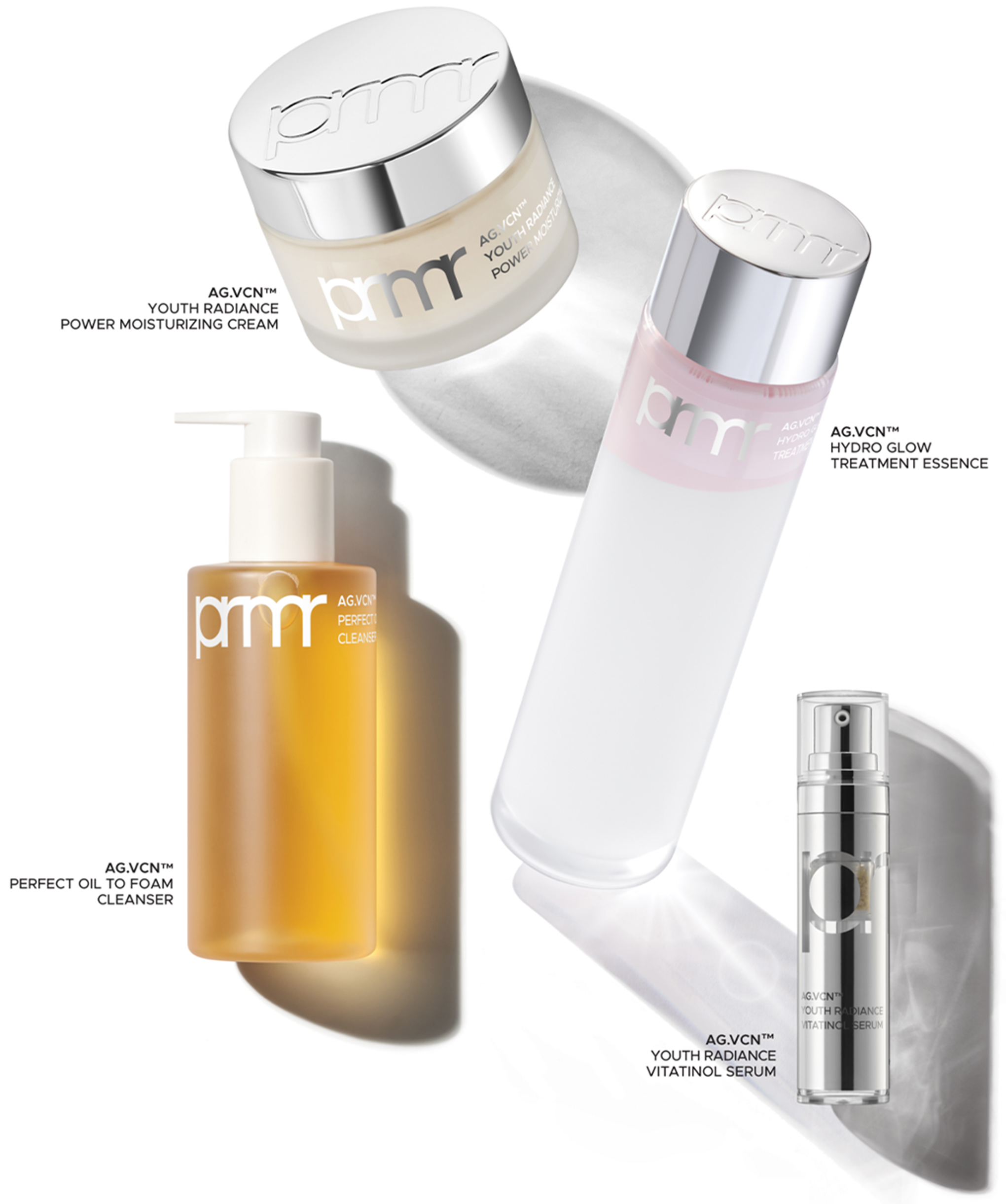
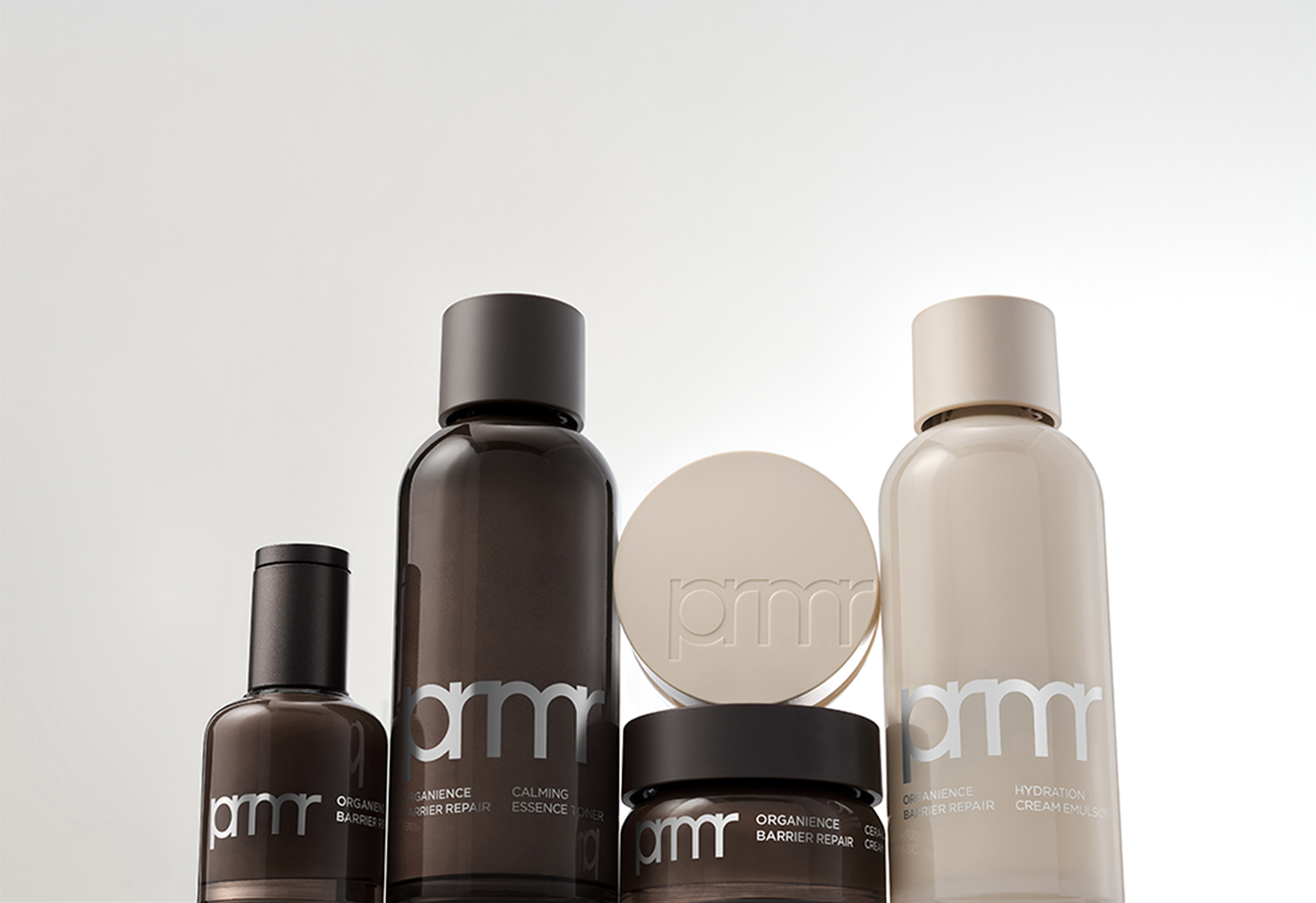
The Gotham typeface, chosen for its compatibility and readability with the new prmr wordmark, conveys the essence of skin barrier protection and potent efficacy with a trustworthy voice.
Each face of the packaging box balances whitespace and text, effectively communicating brand and product information. Arcopack Recycle Paper, produced from 100% FDC-certified recycled pulp, intuitively and sensibly underscores Primera’s commitment to sustainability.
Since 2022, primera's ongoing endeavors have expanded beyond the showcased skincare products to include new product types and skincare-oriented makeup, diversifying its portfolio.
We look forward to primera's continued evolution into a more functional and proactive brand. We sincerely hope that the collective efforts of numerous dedicated professionals will help primera grow significantly and earn greater love and recognition both domestically and internationally.
-
Like
3 -
Recommend
1 -
Thumbs up
1 -
Supporting
1 -
Want follow-up article
1