#Creative Story
2024.05.29
MEDIAN Design Story
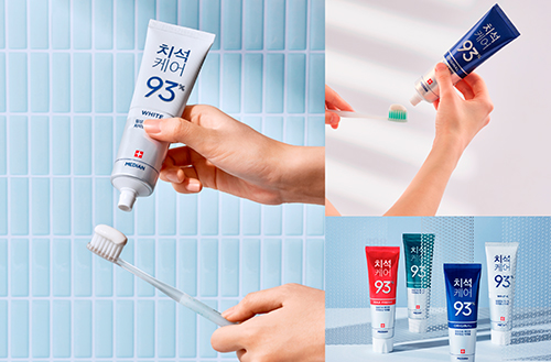
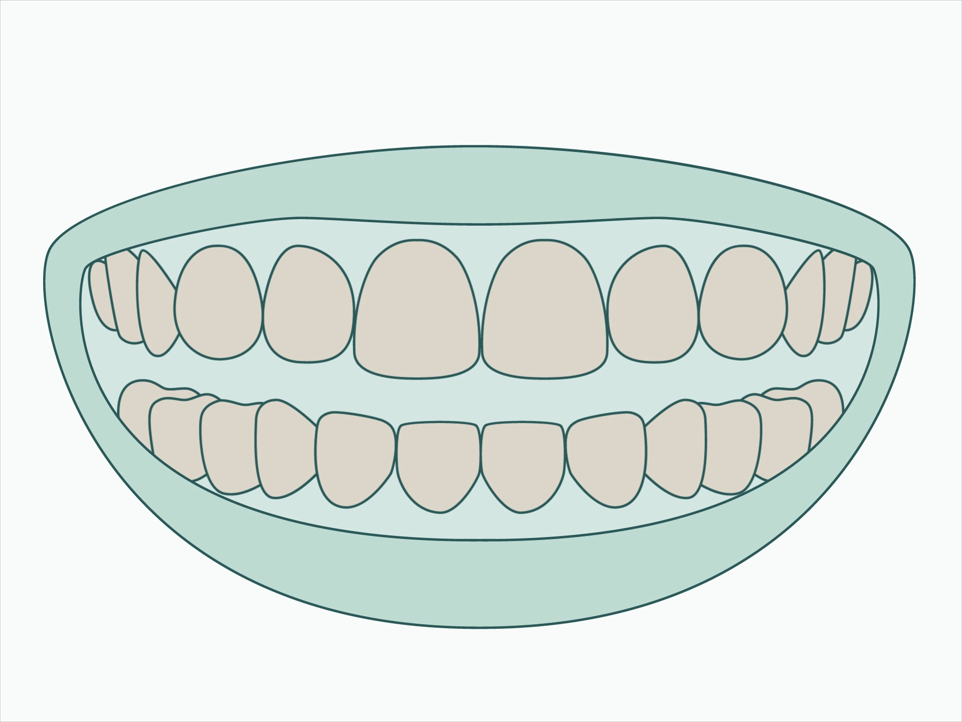
Dental Solution for Whole Family
Written by
Gu Hyewon Brand Creative 1 Team

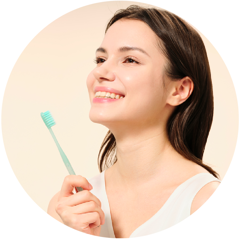
Many of you have likely tried Amorepacific’s MEDIAN toothpastes and toothbrushes at least once. As one of the daily beauty brands that has seamlessly integrated into our everyday lives, we aim to share MEDIAN's story.
MEDIAN has rebranded itself as the number one family dental care brand, leveraging its deep understanding of oral health concerns across all age groups. Insights from customer surveys revealed that MEDIAN is perceived through keywords like "popular," "family-oriented," and "cost-effective." With a safe formulation honed over 40 years, MEDIAN aspires to be a friendly brand that offers solutions to various oral health issues, providing peace of mind for the entire family.
To strengthen its family dental care portfolio, MEDIAN has completely revamped its packaging and visuals to enhance consumer trust and emphasize a modern, sophisticated brand image.
Green Propolis, Science Line, Plaque Care Package Design & Visual Production
Before developing the brand’s visuals, we redefined the brand keywords and studied the positions that Green Propolis, SCIENCE Line, and Plaque Care could occupy within the brand.
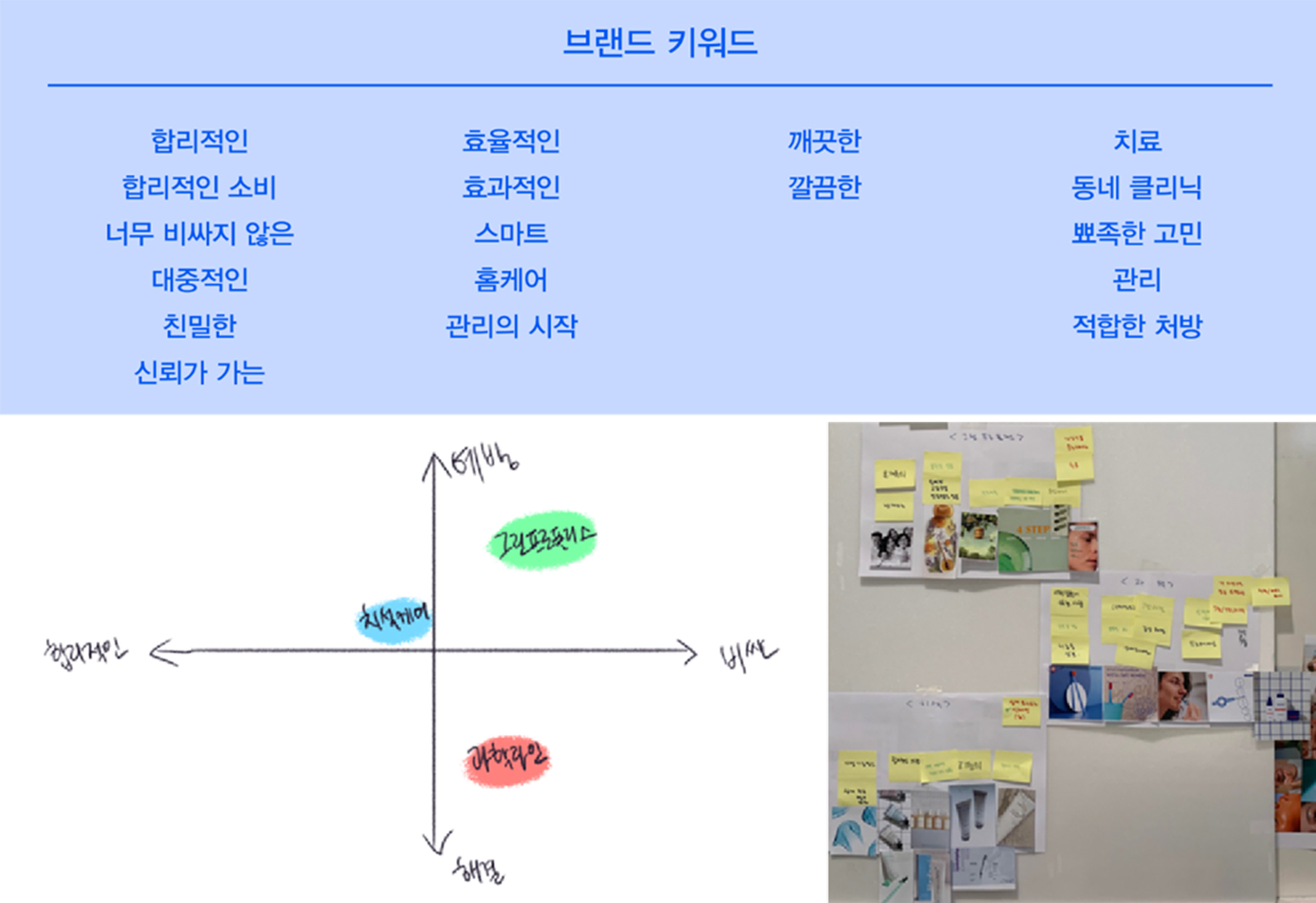
Based on the derived keywords, we established "price axis" and "function axis" to designate the positions of the three lines. Green Propolis, the premium toothpaste for the whole family, focuses on preventive functions; the Science Line offers specialized solutions for specific oral concerns; and the value-oriented Plaque Care provides daily care functions. Throughout the project, we aimed to differentiate by delivering reassuring messages and visuals highlighting each line's efficacy, transforming MEDIAN into a trusted family oral care brand.
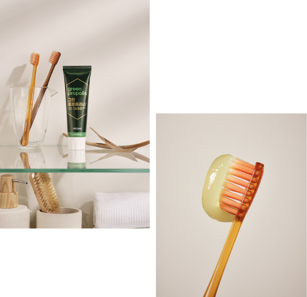
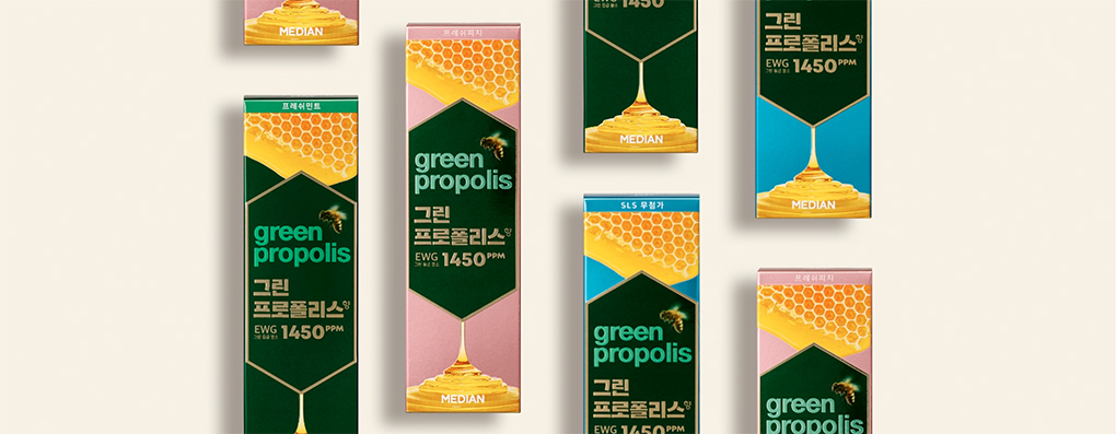
1. Green Propolis Whole Family Toothpaste
Green Propolis toothpaste is a premium dental care product containing green propolis sourced from the pristine highlands of Brazil. It serves as an everyday home care product that caters to the oral health of all family members. To emphasize the natural ingredients and effectiveness, the design incorporates realistic images and graphic elements of honey, bees, and beehives.
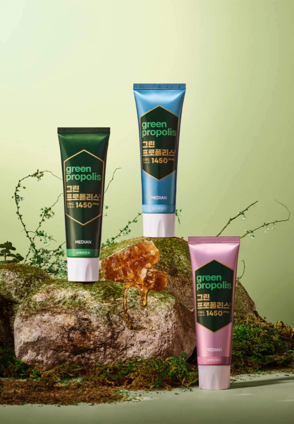
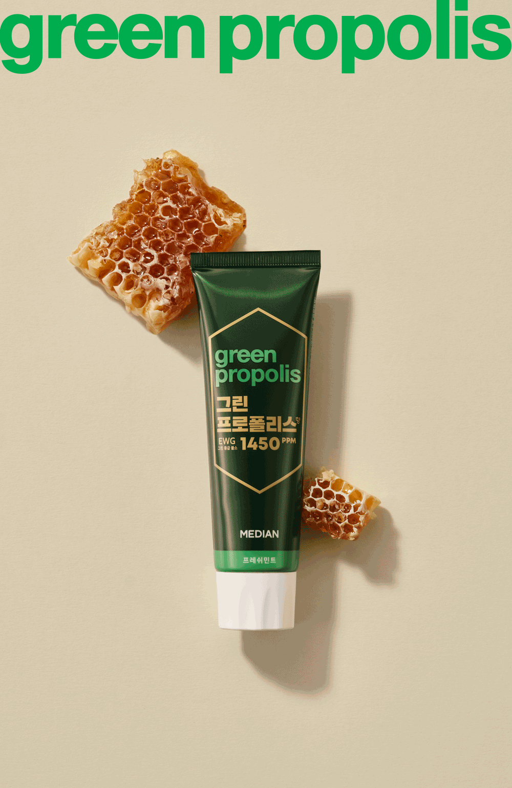
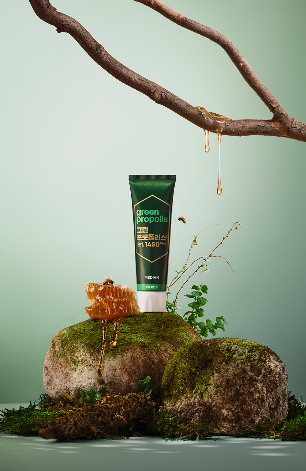
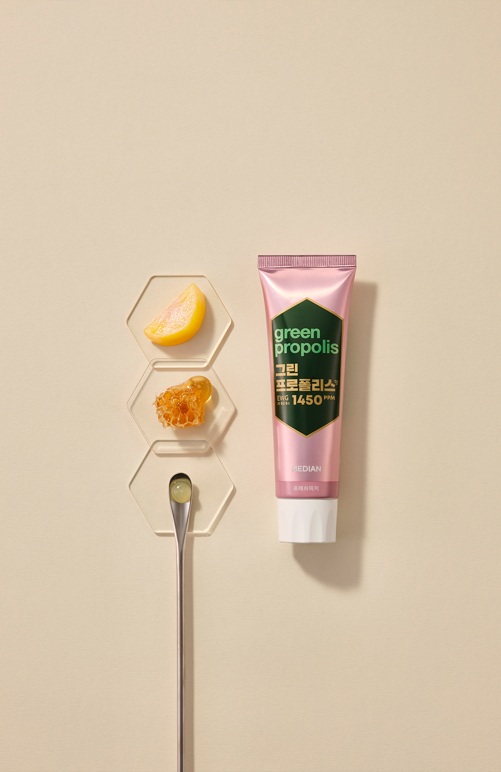
By employing natural light and materials, we aimed to create a friendly tone and manner that adds a sense of everyday life. We used GIF images to highlight ingredients and formulations and expressed the product's various scents and functions through hexagonal glass and raw material combinations, thereby effectively communicating the value of the premium ingredient, green propolis.
2. Science Line
The Science Line is a high-function premium range designed to effectively address specific oral health concerns and symptoms for individuals with concrete dental issues. Aiming to evoke a clinical care concept, the design incorporates medical tool motifs like dental mirrors to convey a professional approach to managing concerns such as 'gums,' 'bad breath,' and 'whitening.'
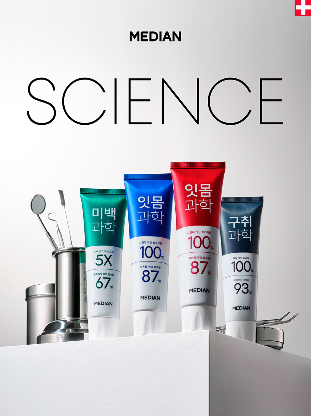
The tone and manner, in white and gray, emphasize the contrast of light, providing a clean, uncluttered feel. Graphic elements combined with metallic and transparent materials further underscore the scientific professionalism of the Science Line.
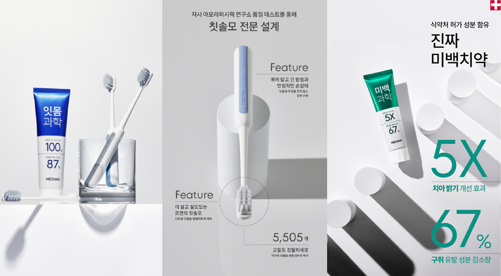
Additionally, we utilized clinical data graphics to highlight efficacy and created 2D motion graphics that visualize technical details in an accessible, textbook-like manner.
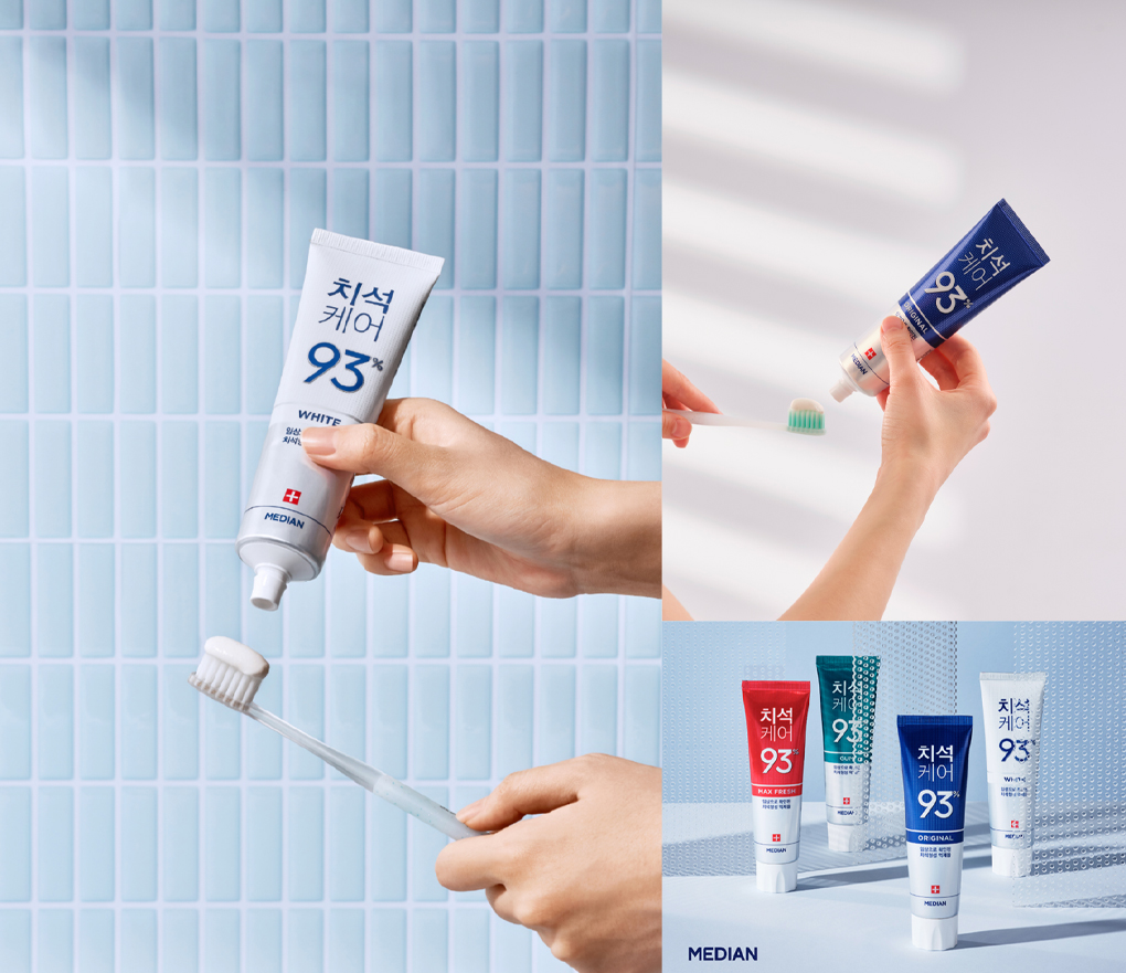
3. Plaque Care
Plaque Care represents the most popular daily function line at a reasonable price point. While retaining the core elements of the original design, we expanded the use of silver, which evokes clean teeth, to emphasize a modern, streamlined look. The design maintains the circular pattern, symbolizing the vital identity of the product, Zeolite granules, enhancing text readability, and highlighting the product's functional characteristics.
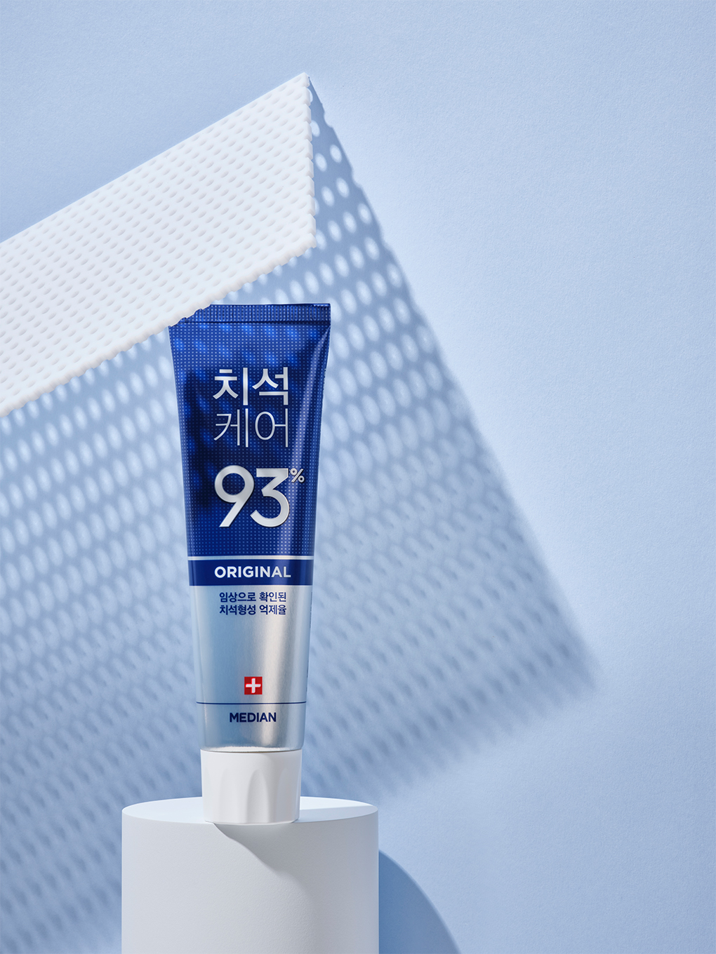
Visual elements express the circular pattern of Zeolite granules, and the overall use of bright pastel tones in the background reinforces the product's daily utility.
-
Like
0 -
Recommend
0 -
Thumbs up
0 -
Supporting
0 -
Want follow-up article
0