
Written by
Noah Shin, Juyeon Oh Restore Business Team

The AMORE YONGSAN renewal project did not begin with the question of how to refresh a store. The first question we asked was: “What role should AMORE YONGSAN, a retail space within Amorepacific’s headquarters, actually play?” The existing space had operated primarily as a sales-driven environment, but, given its symbolic position within the Amorepacific headquarters, it lacked the physical and experiential capacity to fully convey the company’s current direction and future potential. Amorepacific’s diverse portfolio of brands, innovative products, personalized services, and research facilities existed, but there was no pathway for customers and partners to experience them as a unified whole. That gap is precisely where this project began.
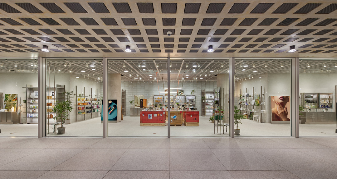
*AMORE YONGSAN before renewal
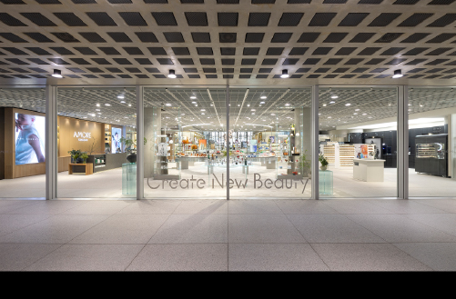
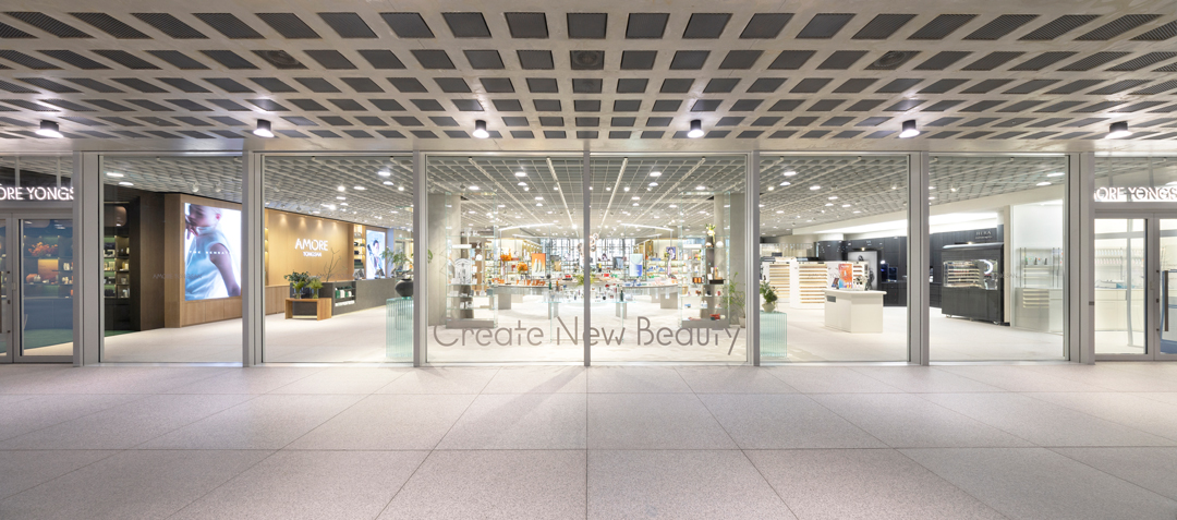
The original approx. 155 m² (47 pyeong) space was fully rebuilt and expanded into an approx. 495 m² (150 pyeong) brand and service-centered environment. By integrating the existing Customer Research Center and CITY LAB diagnosis & consulting and adding a meetup and event space, the total footprint grew to over 1,150 m² (350 pyeong). This was not simply an expansion in floor area: it was a transformation into a House of New Beauty, giving physical and experiential form to Amorepacific’s vision of “Create New Beauty.” Moving beyond a product-selling store, AMORE YONGSAN was reconceived as a platform befitting the headquarters, where brands, future beauty, research, and exchange converge within a single structure. The new AMORE YONGSAN was thus completed not as a collection of functions, but as an integrated experiential structure unified under a single concept.
01. From the Architectural Language of the Headquarters to a Spatial Design Where Experience Flows
In the interior design, a key priority was to naturally carry the identity and atmosphere of the Amorepacific headquarters building into the retail space. The restrained sculptural sensibility, refined materiality, and contemporary structural language of the headquarters architecture were translated into the retail environment, so that the space as a whole would carry a distinctly Amorepacific impression. Through this approach, the AMORE YONGSAN renewal was designed to feel not merely like a store within the headquarters building, but like a continuous scene where brand philosophy and spatial experience are seamlessly connected.
Different Atmospheres in Each Space, One Continuous Journey
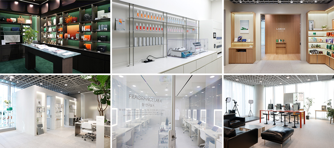
(Photo captions: ① GIFT SELECTION ② LABO-H SCALP BAR ③ AMORE BEAUTY LAB – FRAGRANCE LAB
④ AMORE BEAUTY LAB – CITY LAB diagnosis & consulting ⑤ MEET-UP LOUNGE ⑥ AMORE BESPOKE FACTORY)
Each space in AMORE YONGSAN was designed with a distinct atmosphere suited to its role and the experience it offers, rather than a uniform look across every zone. GIFT SELECTION adopts a warm, enveloping dark-wood tone to create an intimate and weighted impression; AMORE BESPOKE FACTORY, positioned to the right of the façade, uses a bright, clean white palette to project a futuristic, precise image; LABO-H SCALP BAR is finished in a comfortable wood tone that adds a sense of calm and stability; CITY LAB diagnosis & consulting employs glass blocks to create a transparent, experimental atmosphere; FRAGRANCE LAB within AMORE BEAUTY LAB, incorporates smart glass mirrors so that when research sessions are not in progress, the space opens to customers, creating a more approachable, accessible impression; MEET-UP LOUNGE, a space hosting a range of business activities, incorporates recycled furniture to embody sustainability while delivering a sense of both comfort and impact.
Each space thus carries its own distinct material palette and mood, yet all are orchestrated to harmonize naturally within a single overarching order. As customers move through the space, each distinct scene deepens their understanding of the brands and services on offer. Spaces with distinct expressions connect into a single continuous flow, completing a journey that belongs to AMORE YONGSAN alone.
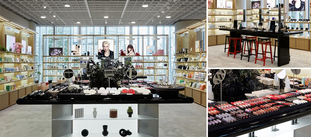
The Central Showroom: Heart of the Space
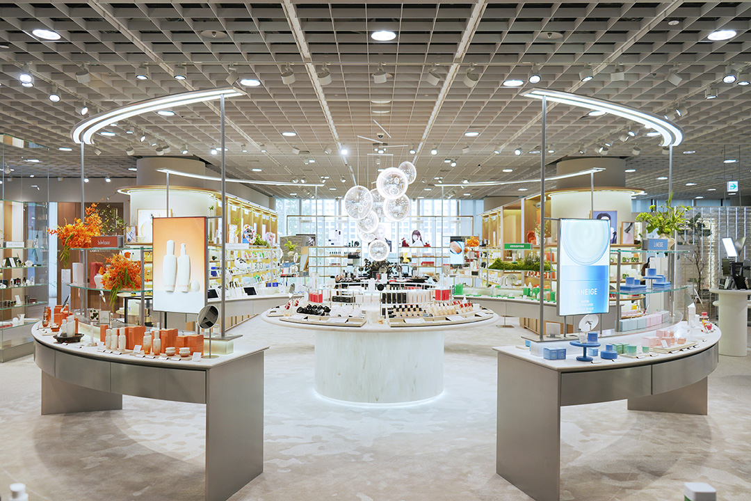
The central showroom is where this design direction is most intensely expressed. As the golden zone of AMORE YONGSAN and the core of the entire project, a circular curation zone was designed within the four-column axis, accessible from any direction. Rather than a showcase for a single brand, it was designed as an adaptable stage that can accommodate a wide range of programs: new product launches, beauty device experiences, participatory content, and more. The circular overhead lighting was also designed to function as more than a lighting fixture; it serves as a key architectural element that imparts rhythm and symbolic presence to the space as a whole. In this way, the central showroom functions not merely as a display area, but as the defining scene by which customers remember AMORE YONGSAN at its most vivid.
The Rear Experience Zone: Designed for Operational Flexibility
The rear brand experience area was designed without commitment to any fixed category, enabling it to be continually updated in response to growing markets and trending products.
A flexible space for makeup demonstrations occupies the center, surrounded by a cabinet structure that holds each brand’s key messaging and hero products, creating an environment where hands-on experience and display work in tandem. Customers are thus invited not merely to look at products, but to test and experience them directly, arriving at a richer, more multidimensional understanding of each brand. Ensuring a structure capable of flexibly adapting to shifting market trends was one of the key design criteria for the AMORE YONGSAN renewal.
Beyond Personalized Service: A Space Redefined as a Personal Beauty Experience
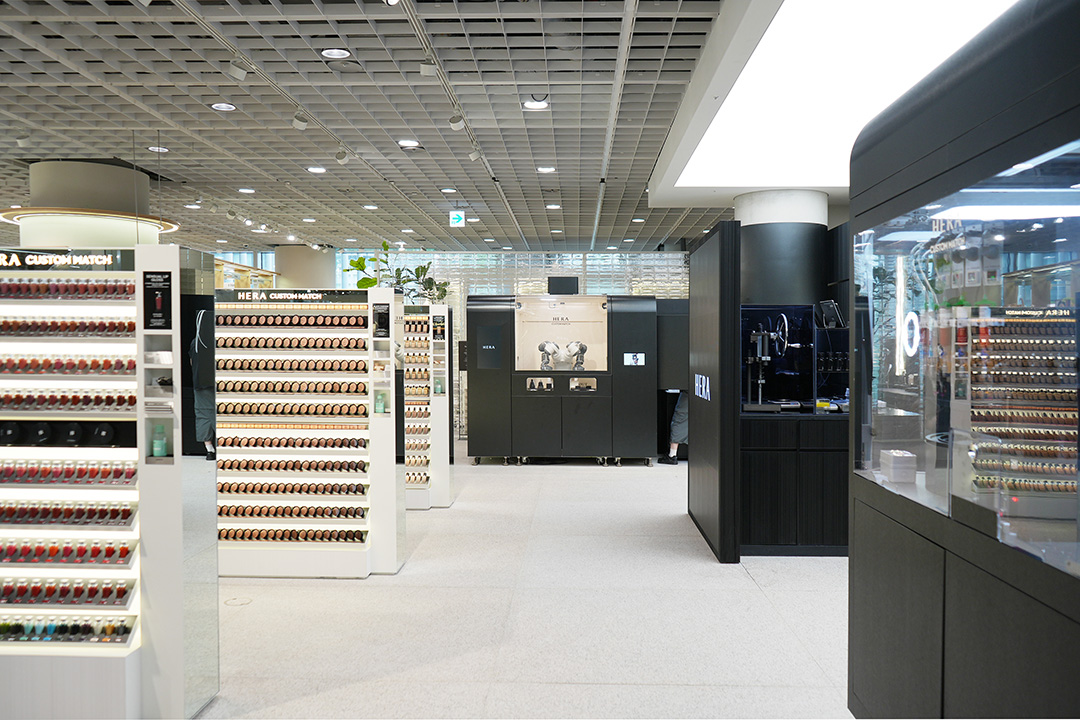
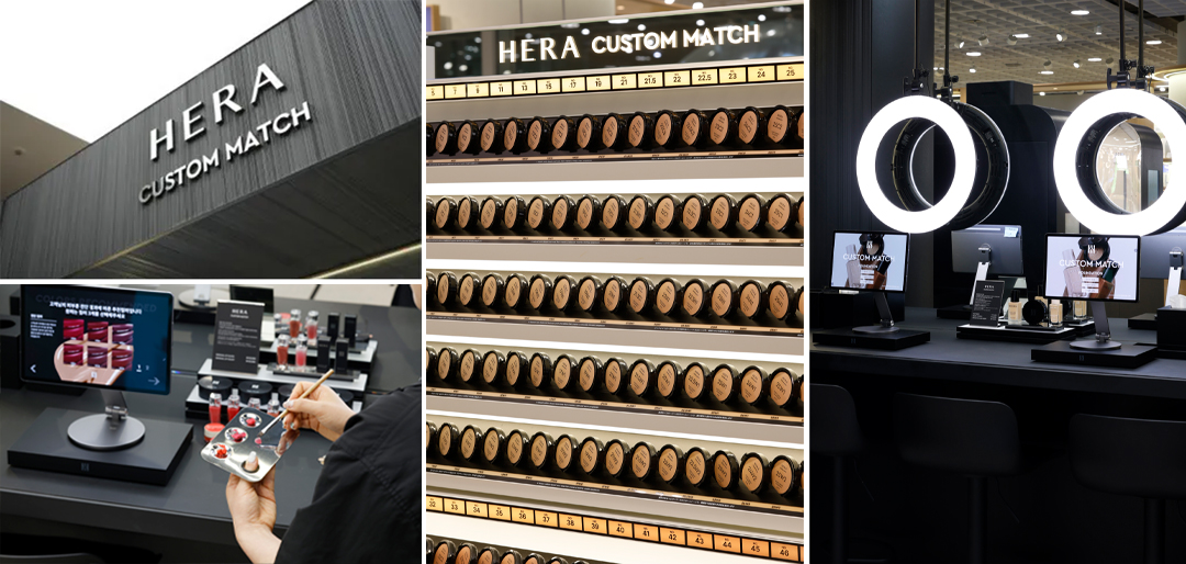
The HERA personalization space was one of the more challenging design problems to solve. Within a constrained footprint, we had to separate the circulation paths for appointment guests and walk-in customers, while efficiently delineating the formulation space from the testing area. The challenge was to uphold the expertise and privacy expected of a bespoke service while designing the space and customer flow to enable visitors to engage naturally with HERA’s technology and products.
The self-tester area in particular needed to present the extensive range of SKUs and color variations across foundation, cushion, and lip categories in an immediately readable way, without becoming overwhelming. Extensive discussion went into determining the fixture proportions and testing environment that would allow customers to perceive products and colors most effectively within a minimal structure. Communicating the breadth of HERA’s color spectrum and technical capability with maximum clarity was a defining criterion throughout.
The HERA formulation equipment was also conceived not as purely functional machinery, but as a symbolic artifact that makes the brand’s technical precision visible. Through the robot’s movement and the live formulation process, customers experience the technology’s precision firsthand; in the self-tester area, they are invited to test products, turning the encounter into a more active and expansive beauty experience. The HERA personalization space at the new AMORE YONGSAN was thus designed with both design refinement and efficient flow in mind, so that the expert bespoke experience of appointment guests and the open self-discovery of walk-in customers connect organically. The intention was for HERA’s technology, color, and service to be conveyed in a more layered and multidimensional way within a single space.
02. Restrained Aesthetics, Responsive Design: The VMD Approach
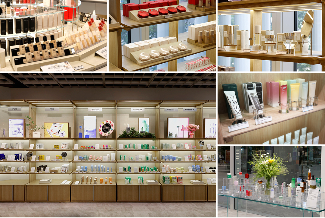
The VMD (Visual Merchandising Design) approach for the AMORE YONGSAN renewal focused less on adding eye-catching decoration than on building an impression that would not easily date, alongside a structure that could respond flexibly to change. The core priorities were to create a stable visual impression through restrained proportions, clean silhouettes, and display compositions centered on negative space; and to design a structure in which individual elements could be easily swapped or supplemented without disrupting the overall impression of the space, even as seasons and product lines change.
This direction was embedded throughout both the forms and the operational logic of the VMD. Rather than staging products theatrically, they are neatly arranged on low, wide plates; the sizes and proportions of trays, bases, and modular display fixtures are kept consistent to maintain order across the space. Elements subject to frequent change are concentrated at the top sections or in small-scale zones, ensuring that seasonal updates or shifts in hero products can be accommodated with minimal disruption.
The CMF (Color, Material, Finish) palette was similarly aligned with this direction. Transparent materials enhance openness and visual clarity; wood tones introduce natural warmth and balance. Light stone tones alongside charcoal, black, and restrained metallic textures lend the space a sense of stability and structural order; finishes were centered on low-gloss, matte textures rather than high sheen, keeping the overall impression calm and refined.
Ultimately, the VMD for the AMORE YONGSAN renewal was resolved in a direction that builds trust in both the brands and the space through the rigor of proportion, material, structure, and operation, rather than through decorative assertiveness.
Extending Brand Sensibility Through Sculptural Objects: The VMD Staging
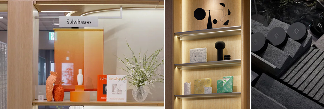
In the brand cabinet displays, the product remains the protagonist; sculptural objects at the top sections are layered in to evoke the brand and create more striking visual moments. Creative Center-produced objects, upcycled pieces, and artist-collaboration objects were explored to naturally embed Amorepacific’s sensibility and perspective on sustainability into the space, rather than through mere decoration.
The display fixtures on the makeup table were finished in a matte black tone that harmonizes with the high-gloss black surface while allowing the colors of the various makeup products to stand out more clearly. Paper trim waste generated during in-house packaging production was used as raw material; in collaboration with Artist Woojai Lee, this trim waste was reimagined as display fixtures, giving rise to objects that are distinctly AMORE YONGSAN’s own. A modular system that combines sculptural form and practical function was also newly designed to suit the multi-brand, multi-product nature of the space, making it easier for customers to test products and improving operational efficiency.
Cube Display Fixtures as an Extension of the Headquarters’ Architectural Language
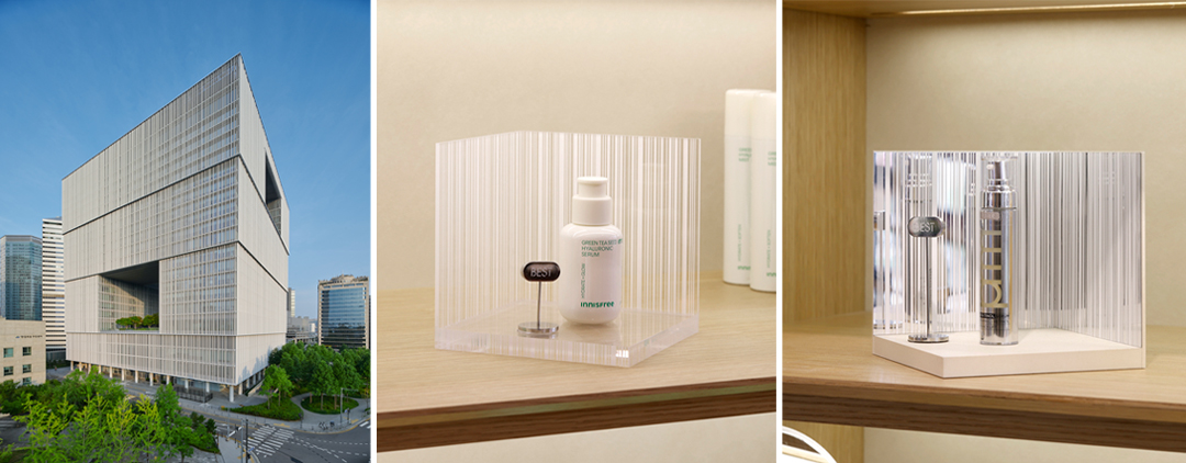
The cube display fixtures used across brands, as shared highlighting units were designed as an extension of the Amorepacific headquarters’ architectural language into the retail space. The rhythm of the vertical louvers on the headquarters' façade and the building’s refined cubic massing were reinterpreted as small-scale objects, allowing the architecture’s impression to continue naturally into the product displays. Transparent and mirror-finish acrylic were used to enhance light reflection and transmission; the structure, with its repeated vertical lines, serves as a backdrop that simultaneously highlights the products and creates visual depth and rhythm. The base plate can also incorporate each brand’s color, allowing brand-specific character to be expressed flexibly while enabling easy replacement and rearrangement, further enhancing the operational versatility.
VMD Composition for the Central Table
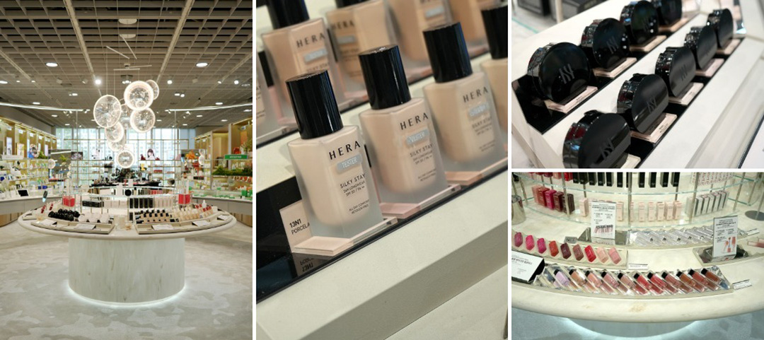
The central circular table was also designed not merely as a sales surface, but as a key VMD device to guide customers’ attention and decision-making. For categories where comparison and selection matter, such as cushion and base products, the arrangement allows product groupings and tonal distinctions to be read at a glance, with the composition drawing the eye naturally along the curved surface. This enables customers to compare and select products more intuitively.
03. Graphic Design as the Grammar of Space, Beyond Function
Signage, graphics, and packaging were treated not as peripheral elements separate from the space, but as core language that constitutes the brand experience as a whole. A flagship space is a complex environment where brand, service, product, and information operate simultaneously; if naming conventions, information hierarchy, materials, and forms are inconsistent, the overall impression can quickly become fragmented. The focus was therefore on building a system that helps customers quickly and easily understand the space, while maintaining a composed, distinctly Amorepacific impression throughout.
Signage
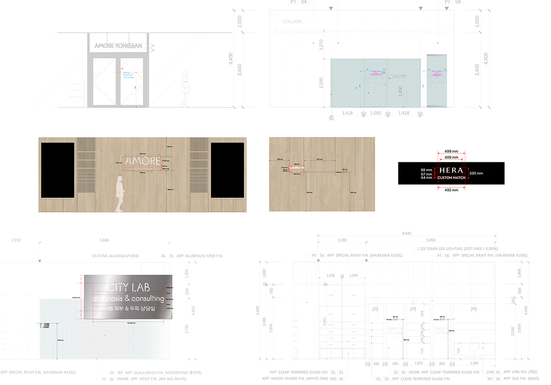
Brand and category-name signage was designed to respond flexibly to operational changes. Recognizing that brand positions may shift over time, hanging-type signage, which can be easily repositioned, was applied to the tops of the cabinets, while freestanding signage, which can be placed as needed, was used on tables and shelves.
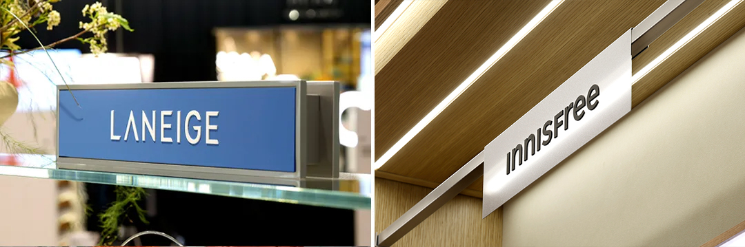
Freestanding signage designed for shelf use can be displayed as either a single-face or double-face unit; the center plate is replaceable, allowing brand and category names to be updated flexibly as operational needs change. Hanging-type signage was designed to hook onto the metal rail of the cabinet shelving in an L-bracket configuration, enabling easy installation and replacement; a metal frame with a router-cut finish gives it a light, refined appearance. Brand name signage was thus conceived not as a simple labeling device, but as a system designed to preserve consistent order and impression even within an ever-changing operational environment.
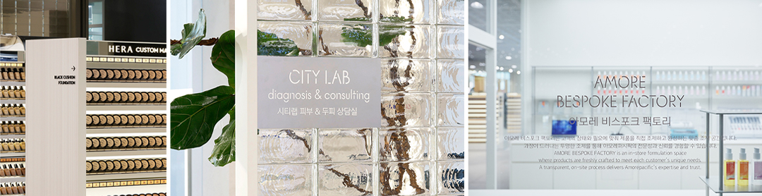
Built on restrained typography and a composed layout, the signage system never shouts within the space, while keeping all necessary information clearly legible. Materials and expression differ by zone, each calibrated to the character of the space it serves. CITY LAB diagnosis & consulting uses metal-plate signage that harmonizes with its glass-block wall, reinforcing the transparent, experimental image of a research and diagnostic space; AMORE BESPOKE FACTORY applies typography directly to the glass surface, conveying the openness and trustworthiness of the formulation process. Service zones such as HERA Custom Match are treated so that the brand’s identity and expertise are clearly communicated; directional signs and room labels are resolved to guide customers intuitively without interrupting the overall flow of the space.
A POP System Built for Multilingual Operation
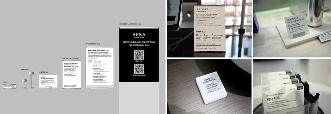
POP (Point of Purchase) materials were categorized by type: price tags, NEW/BEST markers, purchase guidance POP, product description POP, service description POP, and standing POP for service and store information. Size, format, and material were systematized for consistent application throughout the space. All POP materials were planned with a metal base to maintain a clean, uncluttered impression, while the printed inserts were designed for convenient replacement and operation. A four-language framework — Korean, English, Japanese, and Chinese — was applied throughout, enabling global customers to access the information they need during their shopping experience with ease.
Packaging and Shopping Bags
Packaging and shopping bags were approached not as disposable commodities, but as elements that complete the final impression of the brand experience.
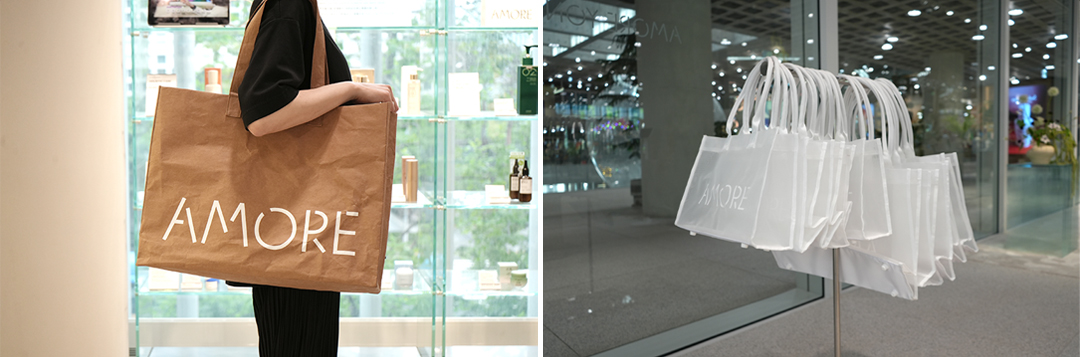
The design of the reusable bag takes its cues from the existing kraft paper shopping bag, preserving AMORE YONGSAN’s distinctive identity while adding a touch of wit for more enjoyable everyday use. The transparent mesh shopper bag allows the products inside to be naturally visible, while its lightweight, easy-to-carry construction enhances usability.
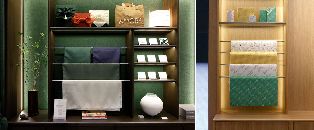
To meet a range of gifting needs, several packaging formats were developed: structured gift envelopes, paper wrapping, and bojagi wrapping (traditional Korean wrapping cloth). This goes beyond simply conveying a product; the intent is to allow customers to choose the presentation format that best suits the purpose and occasion of their purchase. A selection of more than ten message card designs was also prepared, allowing customers to choose according to their taste and occasion; this range will continue to be expanded and updated.
From a Single Store Renewal to a Benchmark for the Flagship Model
The goal of this renewal was never to open a new store. What mattered more was establishing a benchmark for how an Amorepacific flagship should connect brands with customers. Our conviction was that a flagship space achieves a stronger message and greater completeness when brand, space, VMD, graphics, and service do not operate in isolation, but connect organically under a single direction. Through this integrated approach, the AMORE YONGSAN renewal was completed as a space that reflects Amorepacific’s present and proposes the new beauty experiences yet to come.
The question we held on to the longest was: “Are we making a good store, or are we making a space that shows the direction Amorepacific is headed?” The answer was never in doubt. The new AMORE YONGSAN is not simply a well-executed store — it is Amorepacific headquarters’ House of New Beauty, a place where research, personalization, curation, gifting, and exchange come together. Not a space you wander into by chance, but one you come to with intention: to experience Amorepacific’s present and its future. That is the creative story of AMORE YONGSAN we set out to tell.
Creators
Jeongwon Heo Creative Center
Restore Business Team Creative Center
-
Like
1 -
Recommend
1 -
Thumbs up
1 -
Supporting
0 -
Want follow-up article
0