#Creative Story
2024.09.20
0 LIKE
1,689 VIEW
-
-
- 메일 공유
-
https://stories.amorepacific.com/en/amorepacific-amorebasic-the-design-story-of-amorepacifics-beauty-tool-brand
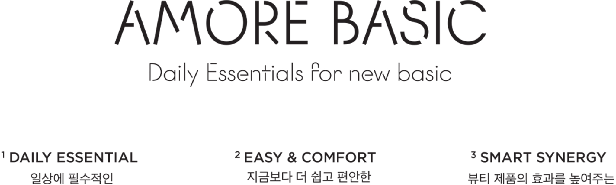
AMOREBASIC - The Design Story of Amoremall's Beauty Tool Brand
Daily Essentials for New Basic
Written by
ChaeHyeon Min, Sohee Park, jisun Han Brand Creative 4 Team


AMOREBASIC is a private brand (PB) beauty tool line offered by Amorepacific’s official online store, Amore Mall (www.amoremall.com), providing a range of affordable products. This project was initiated in response to customer complaints about finding items such as cotton pads, swabs, and brushes on the site. To address this inconvenience, Amorepacific sought to fill the product gap in the beauty tool category, prevent customer churn, and attract new users through differentiated offerings.
The Amorepacific creative team, in collaboration with the Amore Mall team, conceptualized the brand name and direction through a task force. They envisioned AMOREBASIC as a brand closely tied to daily beauty routines, designed to enhance the effectiveness of personal cosmetics while encouraging smarter beauty habits. With this in mind, they launched AMOREBASIC under the concept of "Daily Essentials for New Basic.”
After the release of the [Basic Line] in 2023, featuring products like cotton pads, sponges, and cotton swabs, the project expanded in 2024 to include the CRUSH ON YOU Beauty Brush [Limited Line]. Here, we explore the comprehensive design process and the story behind building the AMOREBASIC brand, from conceptualization to packaging design and visual content creation.
BASIC LINE
Essential Beauty Tools
PACKAGE CONCEPT
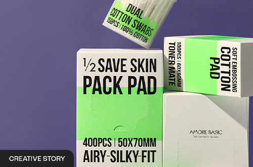
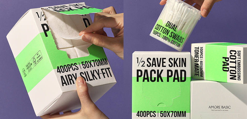
The packaging design of AMOREBASIC aims to make a bold, vibrant impression by focusing on the most fundamental elements—typography and color—without unnecessary embellishments. Bold typography highlights vital product details, such as name and specifications, on the front of the package, effectively and concisely conveying the end benefits. The black and neon green color scheme helps AMOREBASIC products stand out in thumbnail images and grid arrangements. In contrast, simplified graphics of product shapes (e.g., cotton pads, sponges, cotton swabs) are placed centrally to reflect product characteristics and create a modern, refined aesthetic.

VISUAL CONTENT
The visual content for AMOREBASIC emphasizes the coherence and directness of the packaging design while vividly showcasing the essence of beauty tools. Sharp close-ups and dynamic motion graphics bring the brand’s vitality to life.
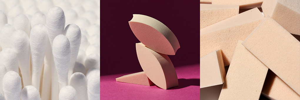
1) Visual Image
The imagery for AMOREBASIC centers on the products’ inherent forms and textures. Familiar beauty tools are arranged in unusual compositions. The clean, soft textures—especially those that touch the skin—are accentuated to evoke a sense of purity and comfort.
2) Motion Graphic
AMOREBASIC’s motion graphics were developed in two types: concept motion and thumbnail motion.
The concept motion focuses on embodying the material qualities of the products, beginning with the soft, light imagery of pure cotton and transitioning through processes of compression, use, and renewal.
This animation conceptually expresses the brand's ethos. The thumbnail motion captures the distinct characteristics of each product’s packaging. For example, the [1/2 SAVE SKIN PACK PAD], which features a front seam for easy use, conveys practicality and lightness, while the [DAILY MAKEUP SPONGE], known for its wedge shape and ample quantity, is represented to emphasize its volume, shape, and sponge texture.
LIMITED LINE
CRUSH ON YOU - Limited Collection "CRUSH ON YOU"

PACKAGE CONCEPT
The AMOREBASIC limited collection, "CRUSH ON YOU," embraces the heart motif to encapsulate themes of love and excitement, set against the backdrop of Apricot Crush, the 2024 color of the year selected by WGSN. This apricot shade symbolizes the pursuit of a warmer and more vibrant future after a period of uncertainty. We crafted a slogan, product story, key visuals, and content that amplify the brand's striking imagery to go beyond a simple color palette. By embedding this playful and energetic hue into beauty accessories, the collection conveys a bright, positive message of love in today’s world.
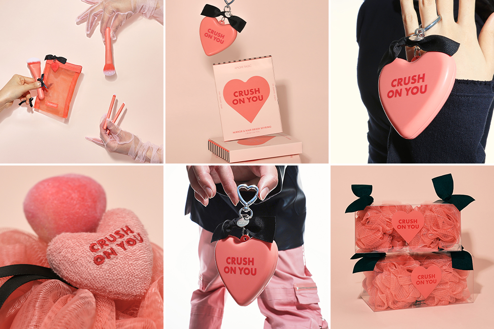
The goal is to infuse positive energy through the apricot color. Still, instead of opting for a traditionally feminine style, we chose a trendy and unconventional heart design to subvert expectations.
1) Visual Images
We aimed to enhance the visual appeal by accentuating the background and objects with bold, vibrant colors while incorporating elegant decorations and poses. This intentional approach created a striking, audacious aesthetic that deviates from the conventional look of beauty tool brands, resulting in fresh compositions.
2) Video
The objective of the motion video was to enhance customer understanding of the collection’s story and to stimulate their imagination regarding the products. The narrative illustrates how the apricot transforms into the Apricot Heart, tying the concept of “crush” (to collide, to encounter) into the storyline and motion effects. The tone and manner of the products are translated into an engaging, lively motion video, leaving a memorable impression on the viewer and increasing the collection’s viral potential.
In Conclusion
The AMOREBASIC design project ventured beyond conventional cosmetic packaging layouts, introducing bold typography and color combinations that raised the brand's online and offline visibility. This sensory-driven approach captured attention and resonated with customers, as evidenced by a wave of positive reviews.
Since the collection's launch in July 2023, Amore Mall has seen significant customer engagement, filling the product gaps in the beauty accessory category and addressing key marketing points. The brand successfully attracted 36,000 new customers, a testament to its original mission. As the AMOREBASIC project was born from customer feedback, we hope to continue developing essential, differentiated products that become a staple in everyday beauty routines. We look forward to Amorepacific’s growth as a leading beauty tool brand rooted in the needs and voices of its customers.
-
Like
0 -
Recommend
0 -
Thumbs up
0 -
Supporting
0 -
Want follow-up article
0