#Creative Story
2025.02.12
3 LIKE
4,052 VIEW
-
-
- 메일 공유
-
https://stories.amorepacific.com/en/amorepacific-a-transparent-heritage-embracing-light
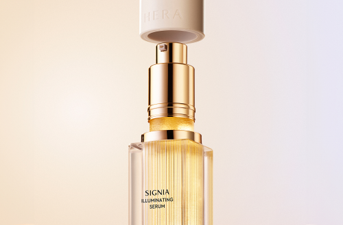
The Design Story of HERA SIGNIA ILLUMINATING SERUM
A High-End Serum That Embodies HERA Skincare’s Identity
Written by
Jiyoung Kang Brand Creative 2 Team

Launched in 2015, SIGNIA represents HERA's luxury as a high-end skincare line, preserving an exquisite beauty that harmoniously blends heritage and contemporary elements. In 2025, the SIGNIA line introduced a new high-end serum embodying HERA skincare's identity.
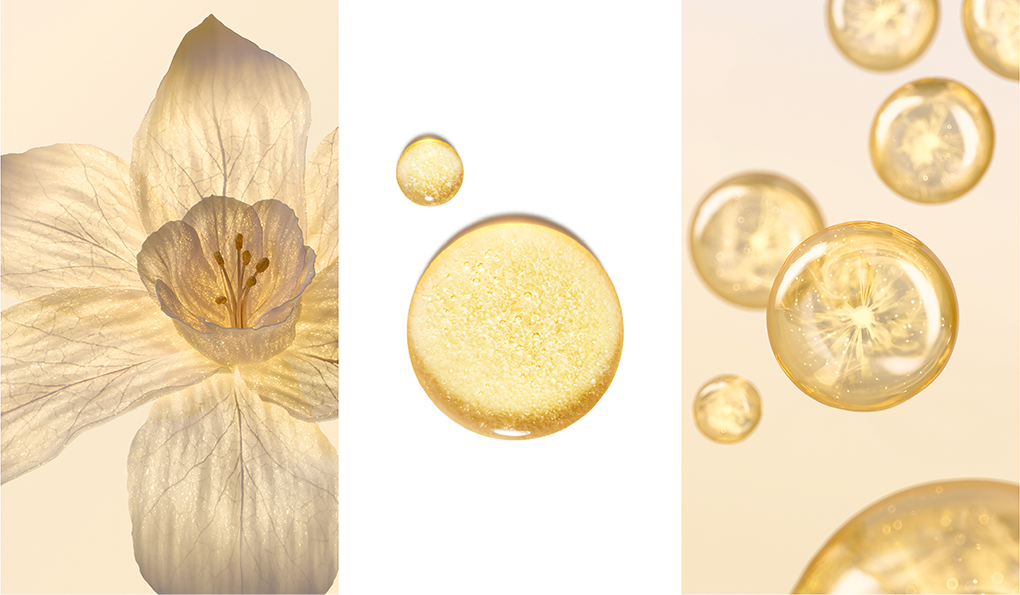
SIGNIA ILLUMINATING SERUM is a firming and radiance-enhancing serum that awakens deep skin energy through powerful active ingredients extracted from white flowers and an innovative dual illuminating capsule formula. We present the design development journey of this new high-end serum that combines cutting-edge technology with HERA's identity.
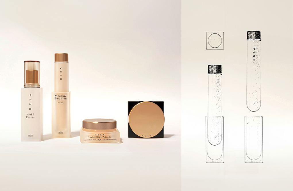
Have you ever seen this product in person or photographs? This was one of HERA's early products, launched in 1995, that received much love. The current design originated from a picture I had long kept in the corner of my laptop folder, even before taking charge of HERA's design. I gained inspiration by referring to the vintage product borrowed from an art museum archive. The harmonious blend of circular and square forms remains appealing even after a decade, and the remarkably innovative refill system of that time–these two elements became the core of the SIGNIA ILLUMINATING SERUM design.

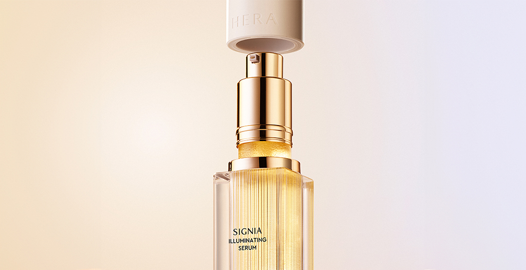
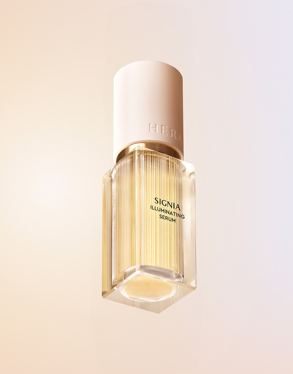
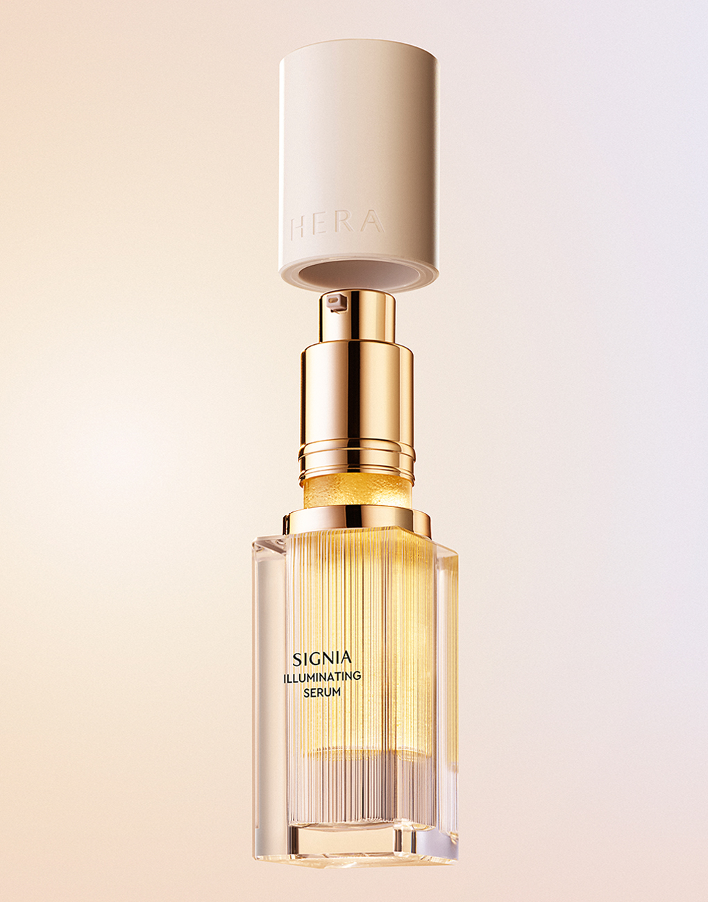
HERA's Distinctive Form: Circle and Square
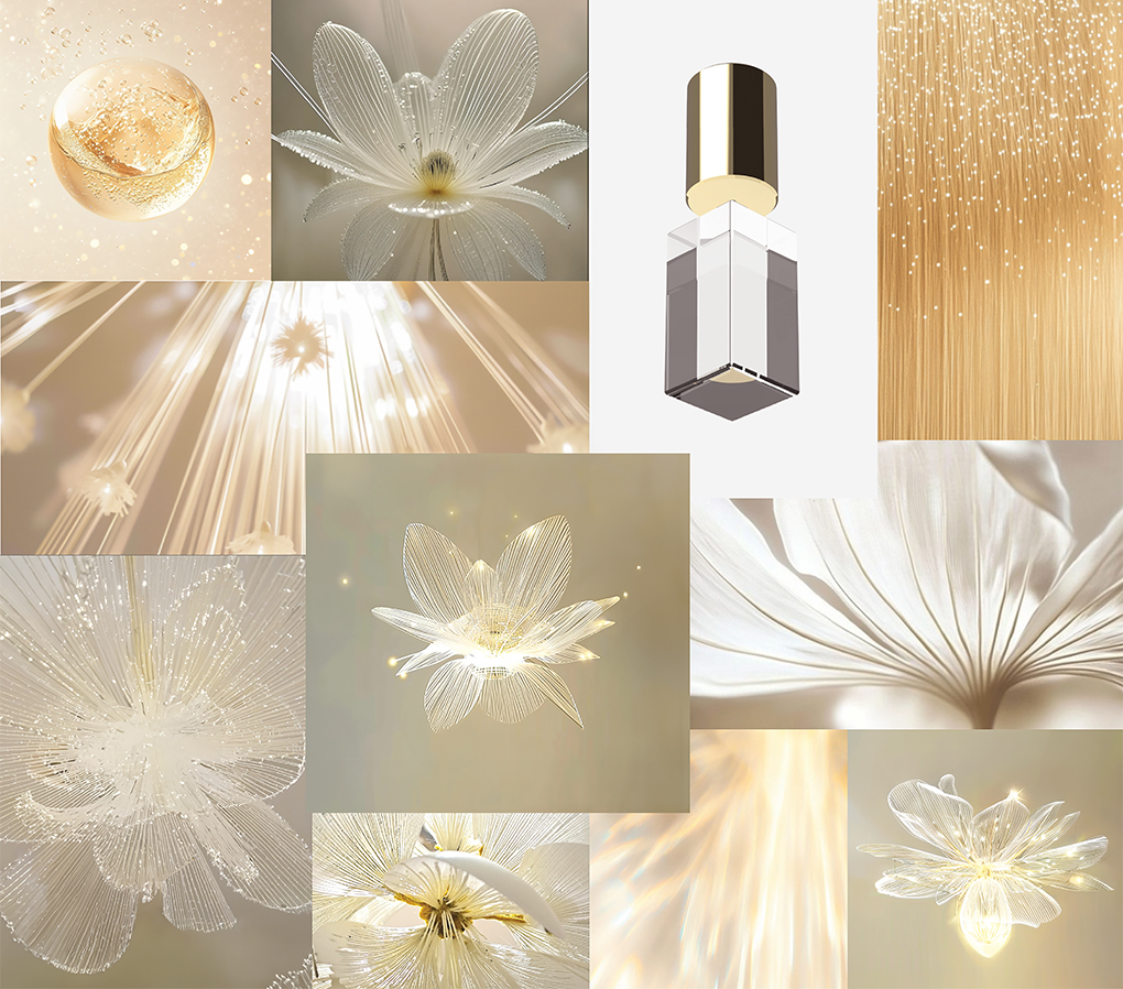
Creating a timeless yet iconic form using HERA's signature circular and square shapes was the most crucial aspect of this project. Rather than adding squares as decorative elements to circles, we aimed to create a new silhouette where circles and squares maintain equal presence. While the combination of squares and circles might convey a sense of weight, we captured the unique mood of SIGNIA ILLUMINATING SERUM that appeals to bright and gentle luxury through the harmony of light-embracing transparency, pristine white, and connecting gold elements.
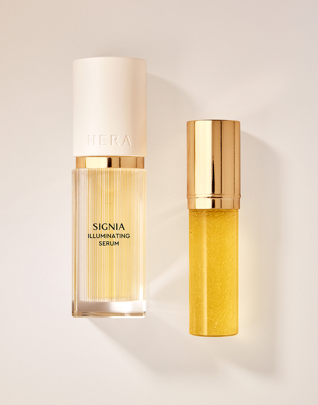
HERA: Pioneer of Refill Systems
We reinterpreted HERA's heritage as the company's first adopter of refill containers into a modern and functional system. We proposed a simple and contemporary usage method allowing refill container attachment and detachment without turning or removing any pieces. We meticulously adjusted the proportions of the outer container, refill container, pump, and cap, considering grip comfort when holding and pumping the container. When assembled, the overcap1) features a sturdy built-in magnet, enhancing the luxury feel through smooth, resilient engagement and a solid ‘click’ sound. This refill system embodies HERA's philosophy of pursuing luxury while contemplating sustainability.
1) An overcap is a container lid primarily used for pump-type containers. It prevents pump depression during distribution and keeps dust and foreign substances from entering between pump nozzles. Overcaps can also provide cleanliness and aesthetic effects.
SIGNIA's Assets: Light and Texture
We sought to inherit SIGNIA's existing sophisticated beauty. Maximizing the light-filled texture in transparent materials, we aimed to harmoniously incorporate existing SIGNIA's splendor within the new SIGNIA's modernity. The white cap, stripped of decorative elements and retaining only a basic circular form, further emphasizes the container's presence when it meets light.
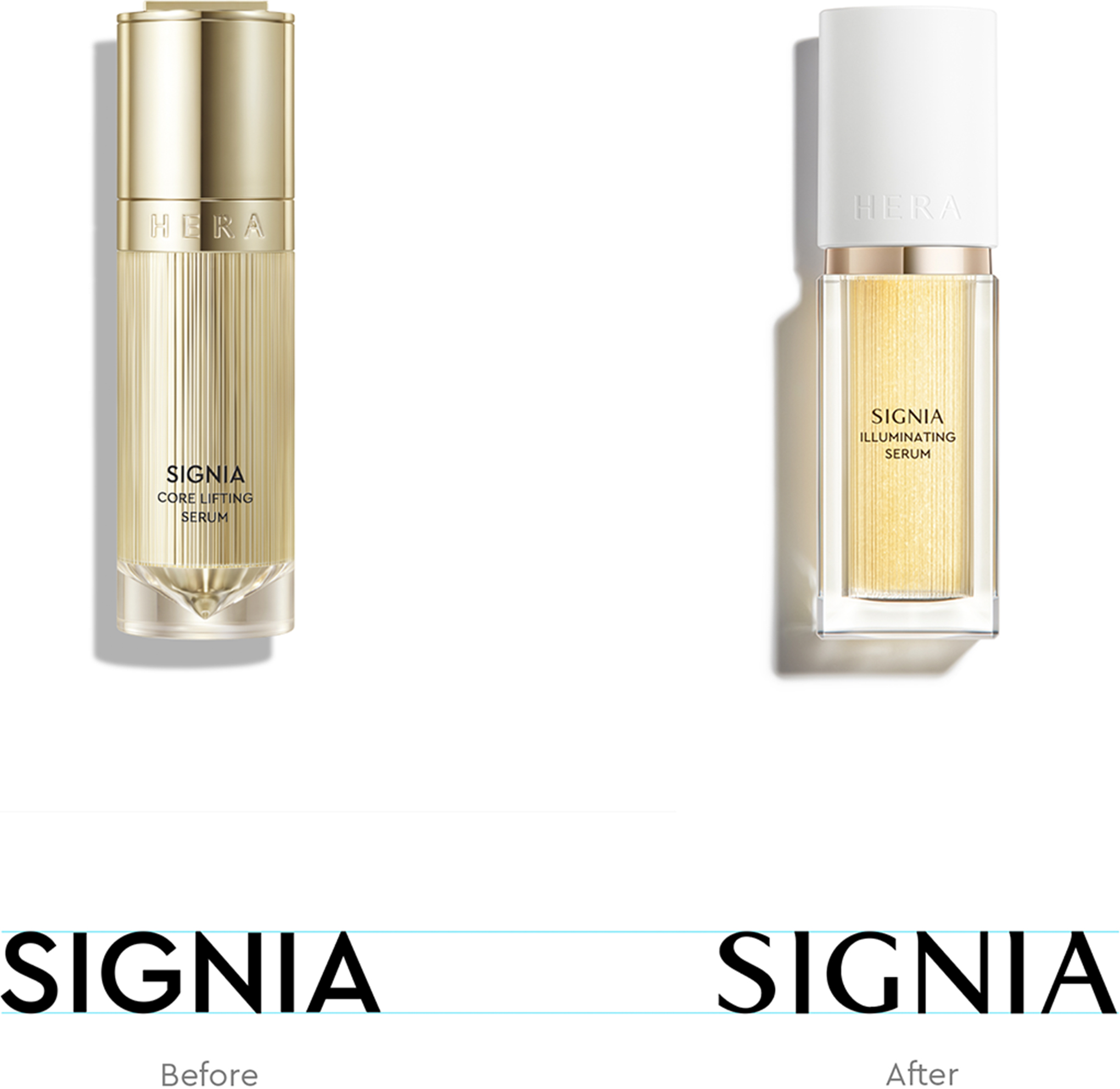
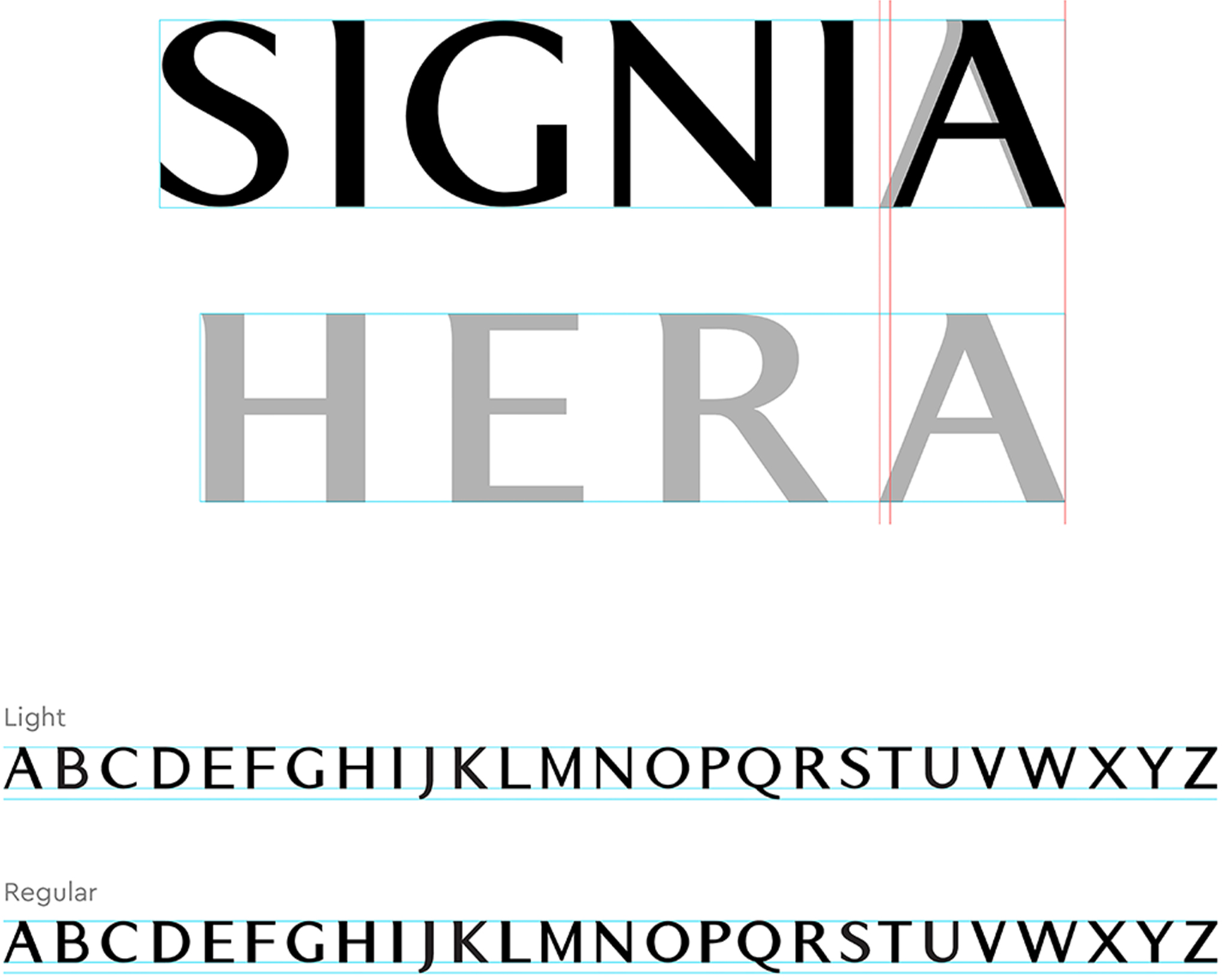
Enhancing Luxury Boldness: Development of HERA's Custom Brand Typography
Beginning with SIGNIA ILLUMINATING SERUM, we developed a unified brand typography aligned with HERA's logo to enhance our standing as a luxury brand and strengthen communication impact. While maintaining the delicate serif forms derived from the varying thicknesses of the HERA logo, we applied an overall thinner weight compared to the logo to establish a clear hierarchy between the logo and line names. This typography comes in two variants – Regular and Light – and will be gradually implemented across HERA's significant lines, starting with the SIGNIA line. The Regular type will be applied to the REFLECTION and HOMME lines, reflecting HERA's crisp and modern core. In contrast, the Light type will be used for the SIGNIA line, embodying HERA's refined and elegant luxury. These typefaces will be actively utilized in products, global campaign key visuals, and major online and offline content headlines.
*Typography Design: Jiyeon Kwon, HERA Designer
Using the newly launched SIGNIA ILLUMINATING SERUM in 2025 as our foundation, we leverage AI to generate images of SIGNIA's white flower, light, and texture, visually expanding SIGNIA's universe. Through this, we aim to successfully inherit and extend the luxury embedded in the HERA SIGNIA line's unique beauty.
-
Like
3 -
Recommend
0 -
Thumbs up
0 -
Supporting
0 -
Want follow-up article
0