
Written by
Damee Hong, Bitnuri Kim Brand Creative 1 Team


Have you noticed primera’s yellow cartons in stores lately? If you have a keen eye, you’ve probably already spotted that something looks different. This carton redesign project was launched in response to the rapidly evolving retail landscape and primera’s push into global markets. For years, primera had followed a design approach that gave each product its own distinct personality, but that very diversity made it difficult for the brand to register as a single, cohesive presence on the shelf.
To address this, we rethought our design strategy from the ground up, with the goal of projecting a sharper brand image and ensuring that ‘primera’ products are instantly recognizable in any environment. The defining objectives of this renewal were to strengthen shelf clustering through a unified color and design language and to build unmistakable brand recognition in global markets.
Here’s a look at the thinking and process that shaped the final result.
Bringing Fragmented Individuality into a Single Brand Voice
This primera carton redesign had a clear sense of purpose from the outset.
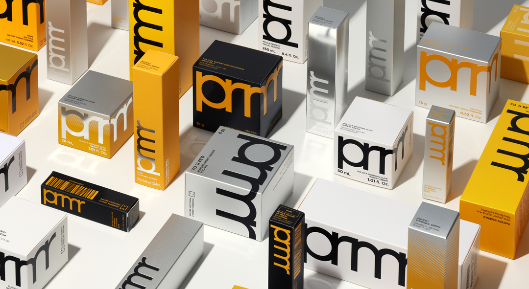
The previous cartons were designed to spotlight the efficacy and personality of each product, with colors and finishes tailored to each line’s character. Viewed product by product, the differentiation was sharp; displayed together, the overall packaging created a vivid, varied impression.
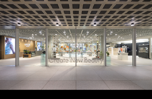
As the retail environment shifted and the brand’s expansion ambitions grew, however, it became necessary to redefine what the carton was meant to do. Brick-and-mortar retail has been moving rapidly toward the multi-brand store (MBS) model. In those spaces, what matters most isn’t how well a single product speaks for itself, but how powerfully a brand coheres and registers as a unified whole on the shelf.
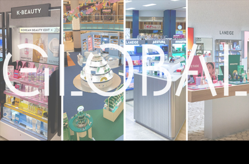
At the same time, with global expansion now in full swing, overseas stores are increasingly carrying only a limited number of SKUs or displaying cartons and products front and center without the benefit of dedicated VMD support. For a brand that hasn’t yet built deep familiarity with local consumers, a visually fragmented packaging lineup can work against clear brand recognition.
Against this backdrop, primera made the strategic decision to move away from design ‘diversity’ toward ‘unification,’ strengthening brand visibility and recognition by bringing all cartons under a consistent color and design language.
A Carton Design Strategy Built for Brand Recognition
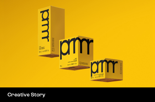
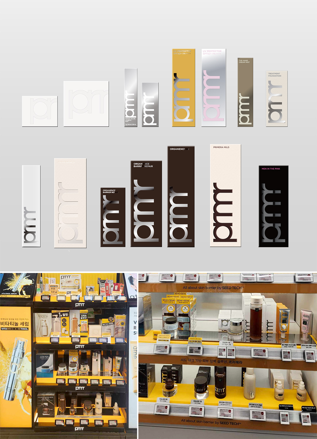
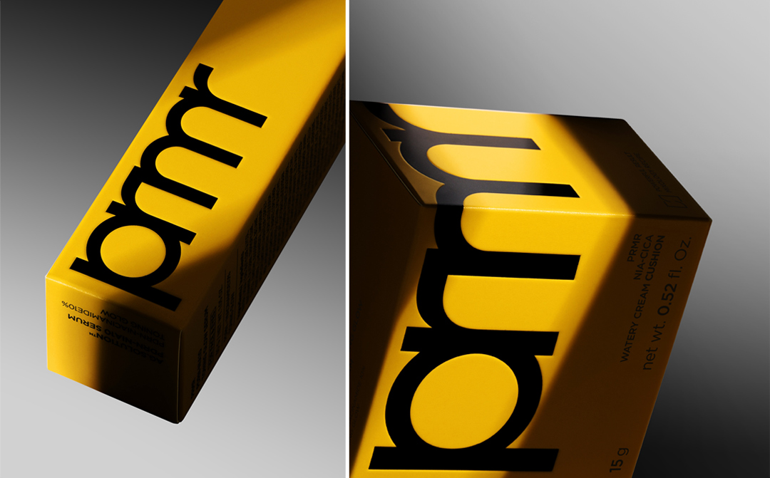
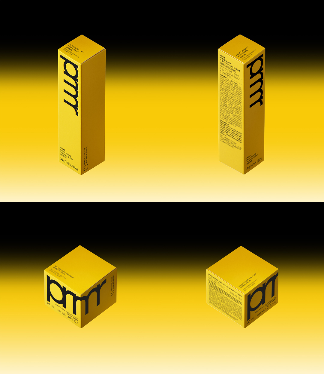
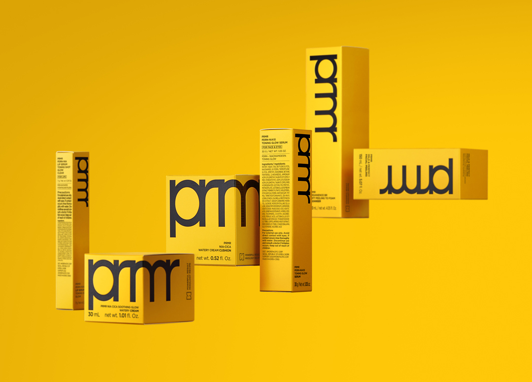
The final design for the renewed primera cartons leads with the brand’s signature prmr Yellow. The color’s high visibility makes it a powerful vehicle for the brand’s identity, giving primera a clear, confident presence in both physical retail and global distribution environments.
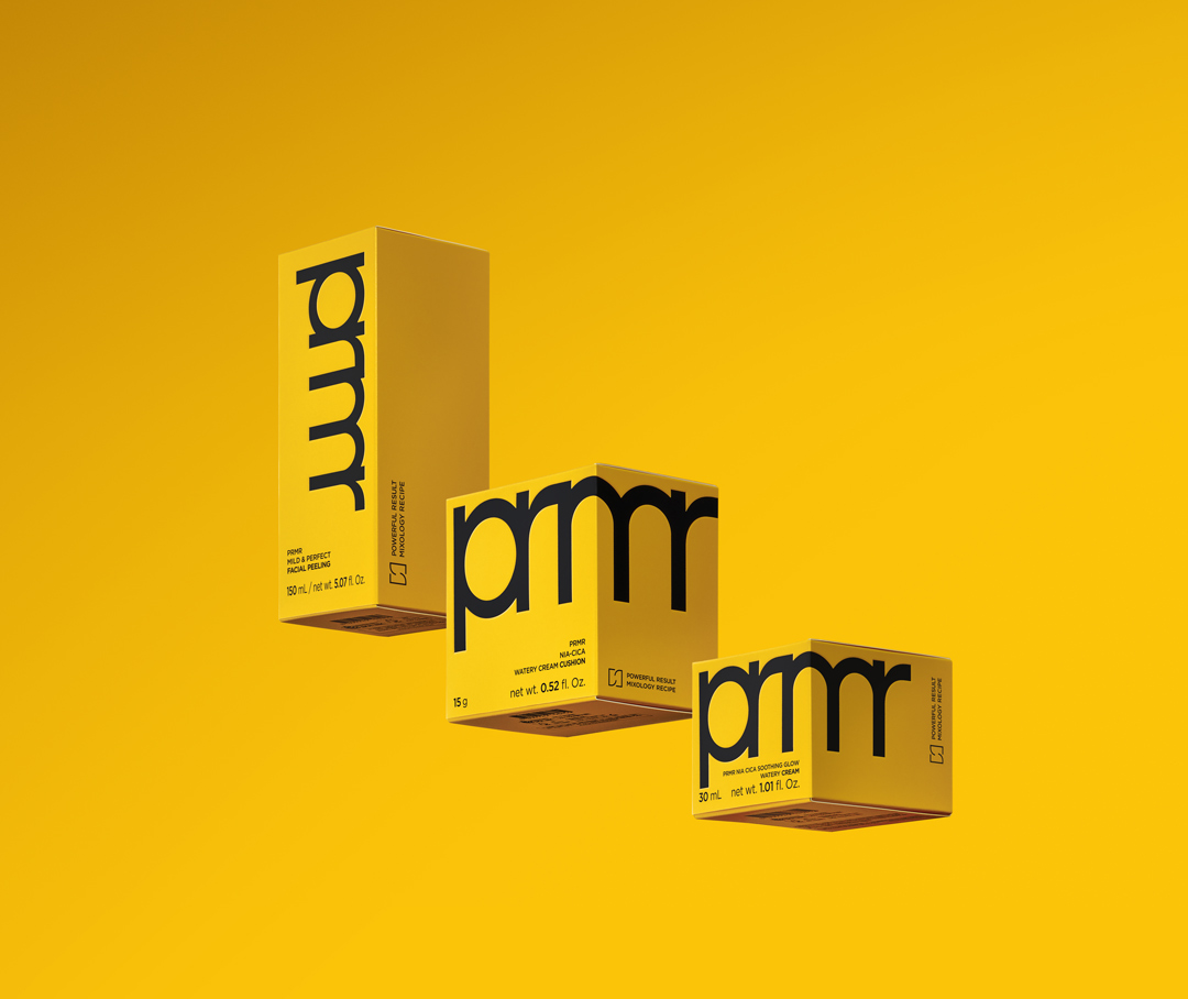
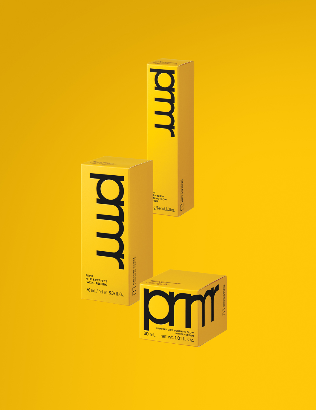
The bold prmr logo reinforces immediate brand legibility, while all text is rendered in black for clarity of information and a polished overall impression. A bilingual Korean-English layout has also been adopted to streamline SKU management across different markets and distribution channels, ensuring consistent execution wherever the products appear.
Before arriving at the final design, a range of directions was explored in the early stages of the project: concepts that differentiated the skincare and makeup lines, a weightier design built around black, and an approach that translated primera’s mixology philosophy into a visual pattern.
Each concept had its own merits, but all were ultimately evaluated against two critical benchmarks: clustering impact in offline MBS environments and brand legibility in global markets. The design that communicated the brand most immediately and intuitively was selected as the definitive direction for the renewal.
Building the Design Logic and Guidelines
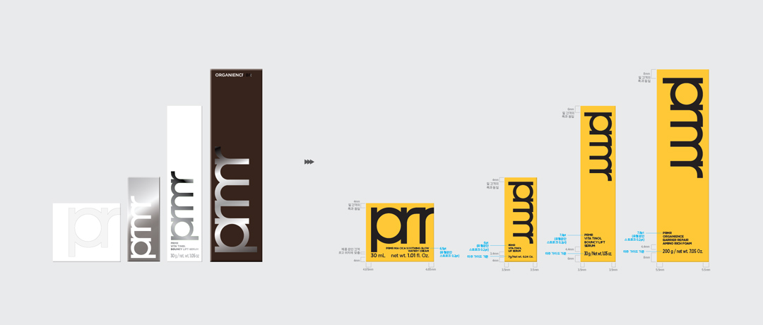
Given the wide range of carton sizes and proportions across the lineup, the renewal called for a design logic that would ensure consistent brand recognition across formats. The system was built so that the bold prmr logo is perceived as large and impactful as possible on each carton, while still maintaining visual cohesion when the full range is displayed together.
This logic was formalized into a set of guidelines and distributed across the organization, to accommodate any future SKU additions within the same framework. The goal was not a one-time redesign, but the creation of a packaging system built to scale.
When the cartons are displayed side by side, the clustering effect created by prmr Yellow makes primera’s brand presence impossible to miss. Making the brand register before the individual products do, and ensuring the entire lineup is perceived as one on the shelf, was the core ambition driving this renewal.
More than a visual refresh, this primera carton redesign was a strategic statement about how the brand should be seen and recognized in a retail landscape that has fundamentally changed. We hope it marks a meaningful step toward primera delivering a clearer, more consistent brand experience in new markets and across every distribution environment it enters.
Creators
Ohkyung Lee
Brand Creative 1 Team 
Damee Hong
Brand Creative 1 Team 
Bitnuri Kim
Brand Creative 1 Team 
Jeongmin Han
Creative Strategy Team 
If you found this story interesting,
discover more behind-the-scenes insights on Amorepacific Creatives.
-
Like
2 -
Recommend
0 -
Thumbs up
0 -
Supporting
0 -
Want follow-up article
0