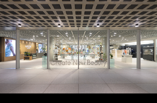

Written by
Sungyub Lee Brand Creative 3 Team

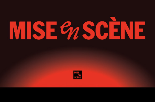
MISE-en-SCÈNE, launched in 2000 as a hair coloring brand, has since evolved into a total haircare brand encompassing the full spectrum of haircare and styling. Through countless styling moments over the years, the brand has remained true to its core philosophy: “Hair styling is self-expression.” This brand identity renewal began with redesigning the wordmark to make “mise-en-scène” more legible—an effort to build a visual structure that communicates more effectively in digital environments and global markets.
While preserving the brand’s unique philosophy and identity, we carefully recalibrated the brand’s visual presence around the new wordmark to reach more customers with greater clarity. Here, we introduce MISE-en-SCÈNE’s refreshed brand identity and its first application: the design of the PERFECT SERUM line.

MISE-en-SCÈNE’s New Wordmark
As the marketplace shifted from offline-centric to digital and global communications, a new approach became essential—one that would ensure the brand name and logo could be clearly conveyed across diverse touchpoints. MISE-en-SCÈNE needed to rethink its visual system to respond flexibly to this changed environment while maintaining the distinctive sensibility and meaning embedded in the brand name. The goal was to refine the visual language around the wordmark so that brand recognition could be sustained across any environment, particularly for customers across different language markets and mobile-first touchpoints. The result is a brand identity system that communicates the brand’s direction and message more intuitively.
Cinematic Identity
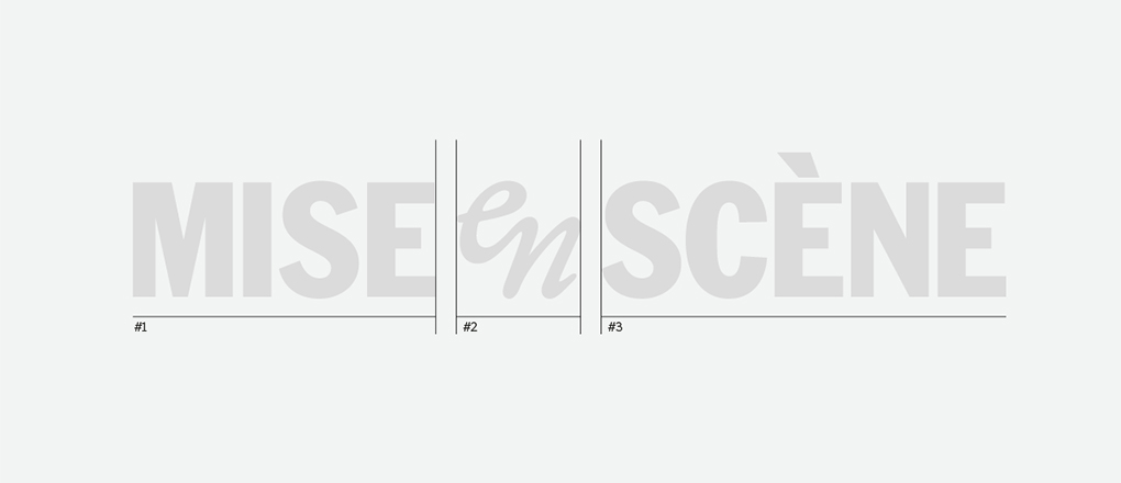
The name MISE-en-SCÈNE comes from the French term “MISE-en-SCÈNE,” meaning to stage a scene in film. To embed MISE-en-SCÈNE’s message—”Styling is self-expression”—into the brand identity, the brand name was reinterpreted as a cinematic structure, composed like a scene itself. The three words ‘MISE,’ ‘en,’ and ‘SCÈNE’ are rendered in different weights, sizes, and typeface styles, designed to be read naturally as the eye moves across them. The ‘en’ positioned at the center takes on a curved form that evokes the flow of hair, visually expressing the fluidity and rhythm inherent to a haircare brand. This asymmetrical composition naturally draws the eye toward the final word, ‘SCÈNE,’ intuitively connecting the brand name to the English word ‘scene.’ Ultimately, “MISE-en-SCÈNE” functions as more than simple text—it becomes recognizable as a scene in itself, embodying the brand’s philosophy and worldview.
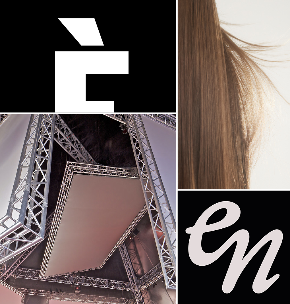

Symbol Design – A Modern Evolution of Brand Equity
MISE-en-SCÈNE’s black square logo has been a visual asset symbolizing the brand for years, serving as a central element that delivered strong visibility and cohesion in offline retail environments. In this brand identity renewal, as we shifted to a wordmark-centered system more conducive to communication, it was crucial to maintain the brand recognition established by the existing logo. The resulting new symbol honors the emotional resonance and awareness of the past while serving as a visual bridge that carries the brand’s identity and message forward in a more flexible structure.
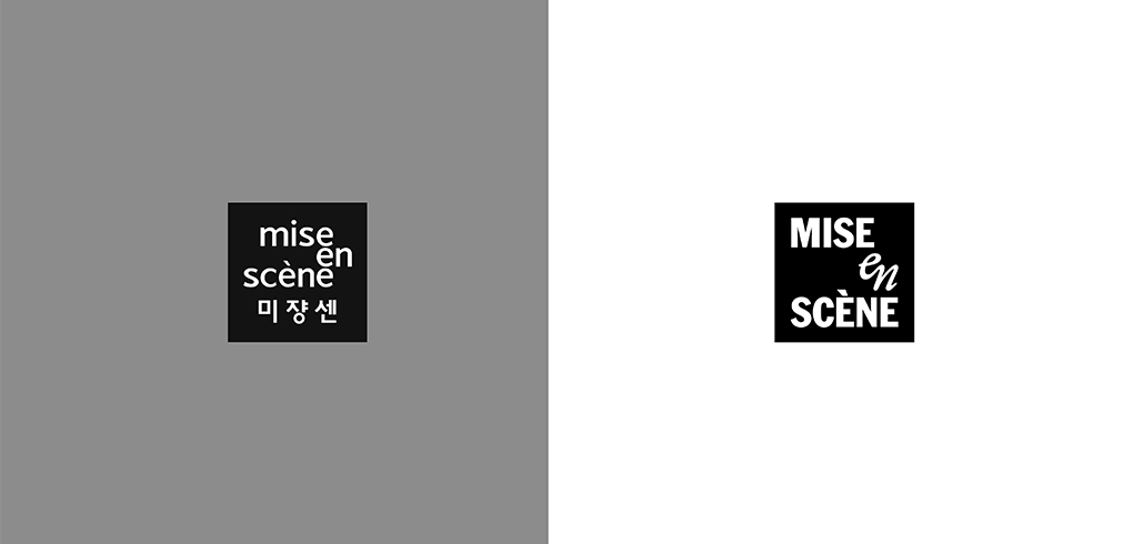
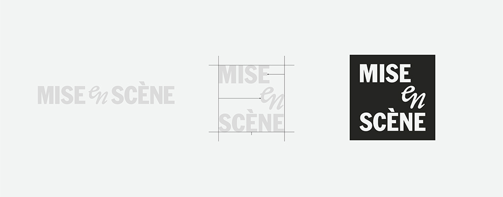
The newly designed symbol condenses the visual structure of the wordmark, placing ‘SCÈNE’—the core of the brand message—at its center. This allows the brand’s narrative and identity to be communicated intuitively through the symbol alone and ensures a consistent impression, whether used alongside the wordmark or independently, depending on the touchpoint.
MISE-en-SCÈNE’s New Brand Concept
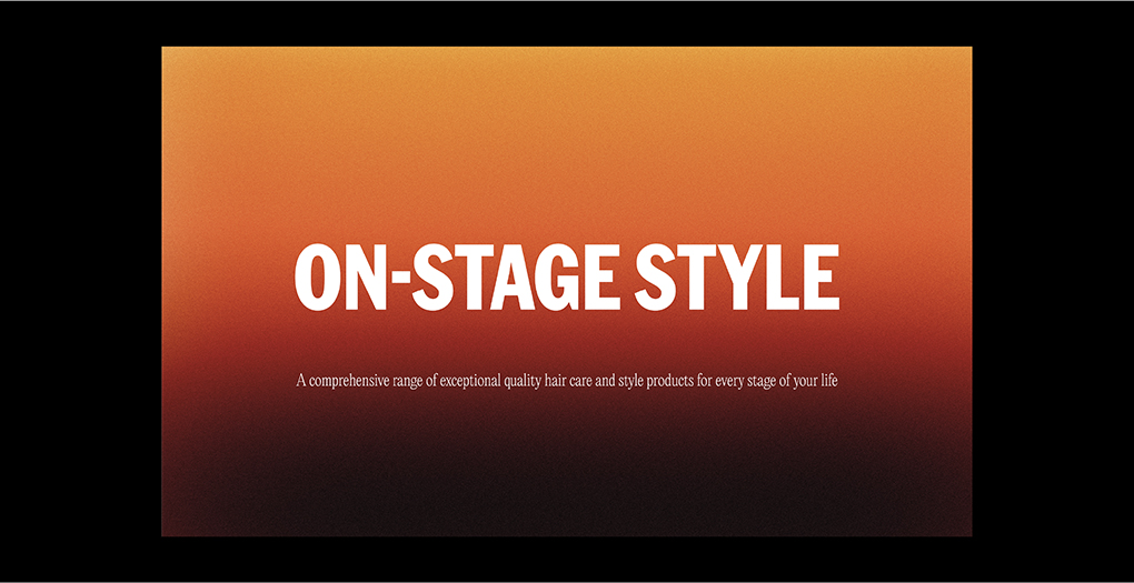
MISE-en-SCÈNE has long upheld the brand philosophy that “Styling is self-expression,” accompanying customers as they style their everyday lives with their own unique looks. To communicate this philosophy more intuitively and consistently, this brand identity renewal distilled the brand concept into “ON STAGE STYLE.” The brand’s stage, once created through styling for special moments, now expands to encompass every stage of life.
First Application – PERFECT SERUM
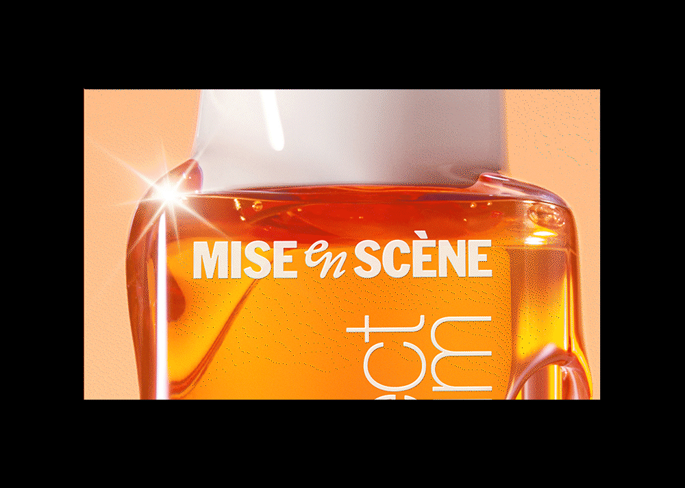
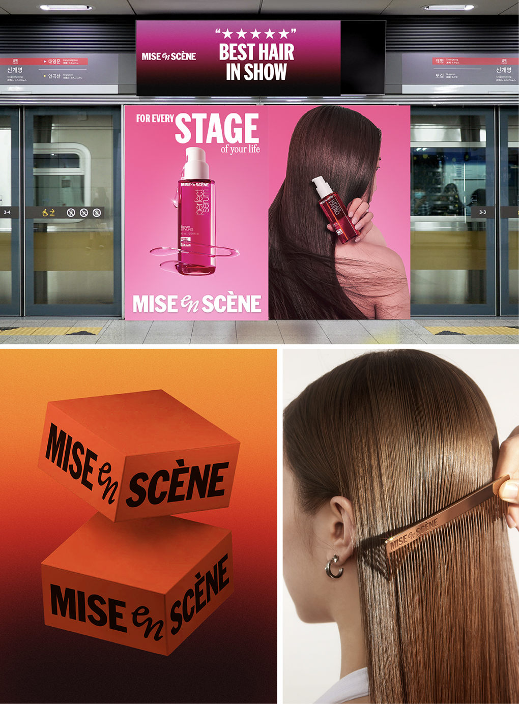
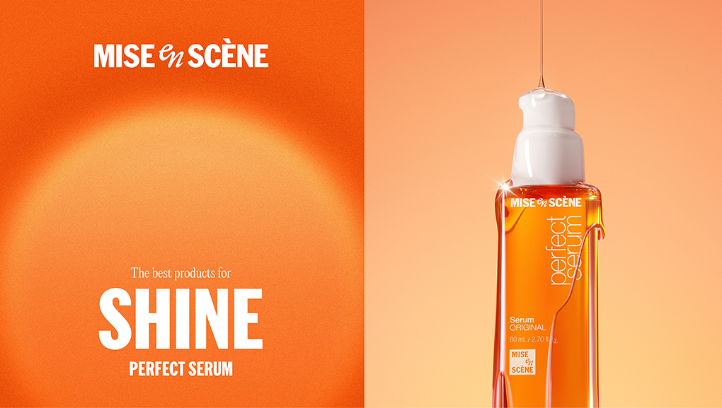
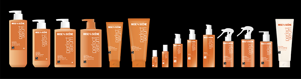
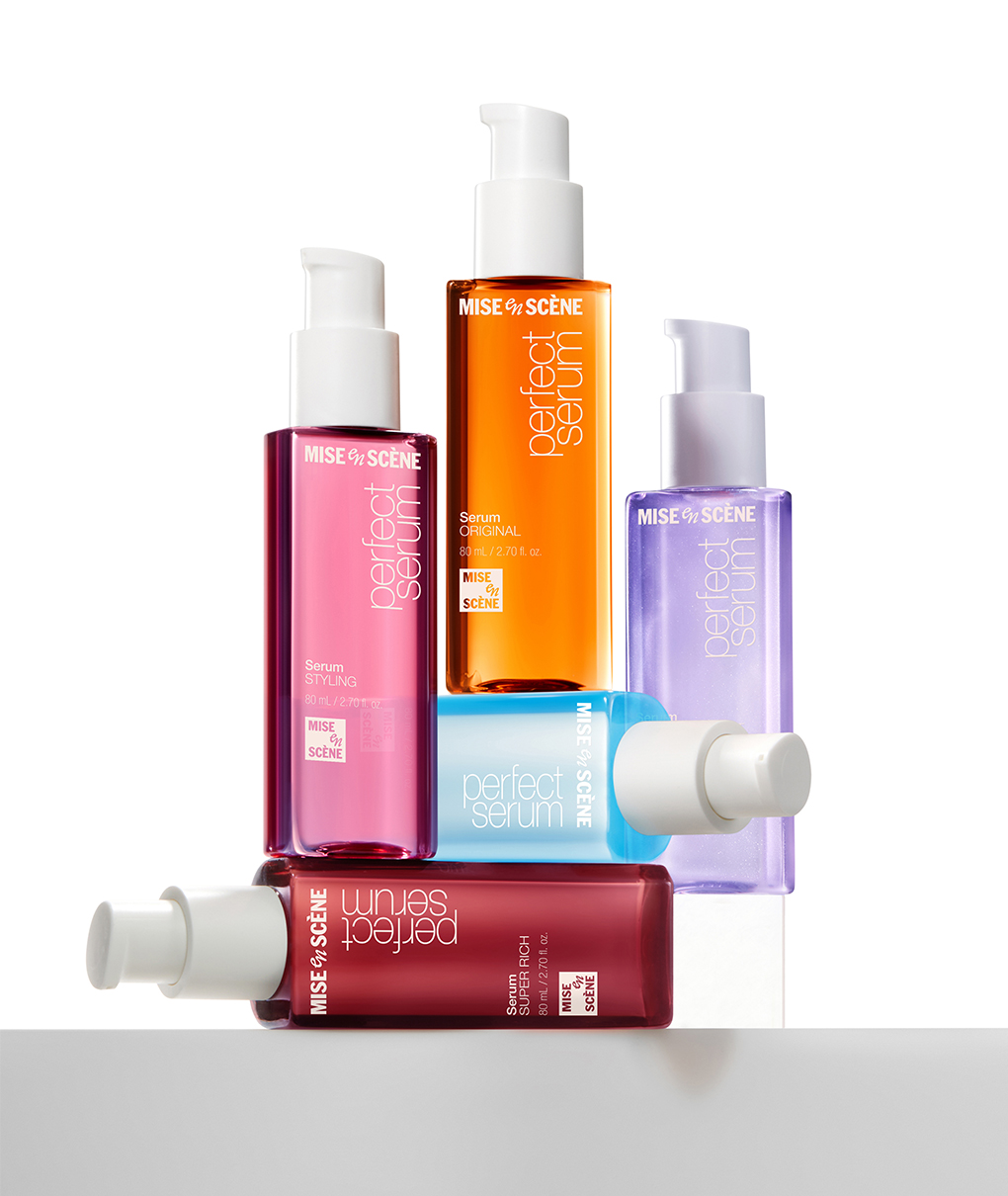
The first application of the new brand identity system is PERFECT SERUM, MISE-en-SCÈNE’s signature bestseller. This line comprises 75 product variations centered on hair serums, including wash-off and leave-in cleansers and conditioners, spanning diverse packaging formats and mold structures from 3ml sample pouches to 990ml large-capacity bottles. With such product and format diversity, the key challenges of this project were maintaining brand consistency while ensuring familiarity for existing users, and clearly conveying MISE-en-SCÈNE as the master brand even within the PERFECT SERUM sub-brand. Restructuring the brand architecture so that the global market would recognize ‘MISE-en-SCÈNE’ as a whole brand rather than ‘PERFECT SERUM’ as a single product was both the essential purpose of applying the brand identity and a necessary foundation for future brand expansion.
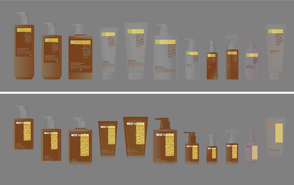
Design principles spanning the entire lineup were applied to the full PERFECT SERUM range to establish a consistent brand look. The proportions between the existing ‘PERFECT SERUM’ typography and the new wordmark were adjusted so the two elements read as a single visual flow, creating a distinctive lockup identity for PERFECT SERUM. This same proportional system was applied from 15ml samples to 990ml pump-style large-capacity bottles, achieving consistent visual balance across the entire lineup. Additionally, the package color of the wash-off treatment product line was changed from the existing white to pearl orange, strengthening the visual connection with hair serum, PERFECT SERUM’s flagship product.
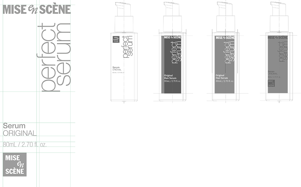
Information Architecture and Global Application
The information layout on product fronts follows this common logic:
[Product Type] – [Product Line] – [Capacity] – [Symbol]
This structure helps consumers quickly grasp product functionality while delivering a balanced impression by preventing brand elements from being overemphasized.
To address global markets, all domestic and international packaging was unified under a single layout, incorporating legal labeling requirements for each country to ensure versatility for application across diverse markets.

Closing – The Beginning of a New Scene
The Perfect Serum design update marks the first realization of MISE-en-SCÈNE’s brand identity renewal and serves as the starting point for visually embodying the brand philosophy. The wordmark that gives concrete form to the meaning of ‘staging a scene’ embedded in the brand name, the symbol that carries forward long-standing brand equity in a contemporary way, and the “ON STAGE STYLE” concept together offer a way to encounter the new MISE-en-SCÈNE within the familiar, while charting the direction for the brand journey ahead. We look forward to MISE-en-SCÈNE continuing to bring scenes to more customers’ everyday lives through styling.
Creators
BI Design
Minhee Kang
Brand Creative 3 Team
 Hyewon Koo
Brand Creative 3 Team
Hyewon Koo
Brand Creative 3 Team
 Soyoung Kim
Sulwhasoo BD Team
Soyoung Kim
Sulwhasoo BD Team
 Inwoo Baek
Brand Creative 3 Team
Inwoo Baek
Brand Creative 3 Team
 Sungyub lee
Brand Creative 3 Team
Sungyub lee
Brand Creative 3 Team
 Eunhye Choi
Brand Creative 3 Team
Eunhye Choi
Brand Creative 3 Team

Product Design
Minhee Kang
Brand Creative 3 Team
Sungyub lee
Brand Creative 3 Team
If you found this story interesting,
discover more behind-the-scenes insights on Amorepacific Creatives.
-
Like
2 -
Recommend
0 -
Thumbs up
1 -
Supporting
0 -
Want follow-up article
0