
Written by
Nari Cheon Creative Strategy Team

Beauty Point has been delivering benefits to customers as Amorepacific’s integrated membership program under the slogan “The more you earn, the more beautiful you become.”
We embarked on a membership overhaul to expand the long-standing membership benefits beyond simple point accumulation into meaningful experiences. This is the story of the Beauty Point rebranding project, designed to help customers better perceive the evolution of our communication message.

The original Beauty Point was a system centered on practical benefits, where accumulated points could be used like cash. However, with this renewal, we’ve expanded its meaning beyond simple monetary value to become a touchpoint where customers can experience the diverse benefits and moments of inspiration that Amorepacific offers.
We hope that points will no longer be just a means of consumption, but rather a journey where customers discover and experience new beauty together with Amorepacific.
Here are the various directions we explored to achieve this vision.
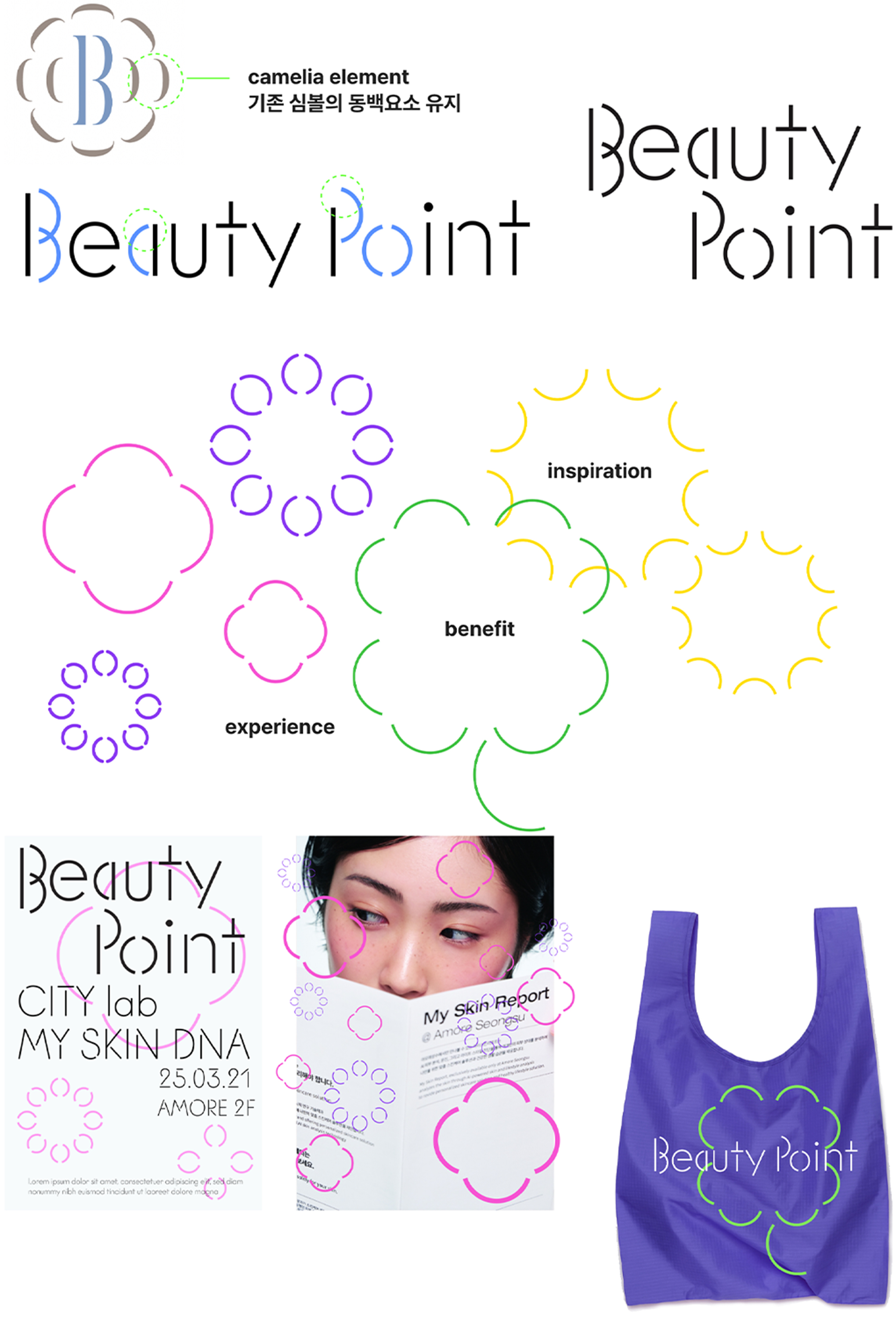
concept 01
Beauty ‘points’ that create diverse benefits, experiences, and inspiration
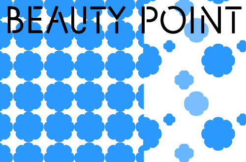
The camellia leaves in the existing symbol represent ‘beauty.’ By expanding this symbolic meaning, we aimed to express how various elements of beauty are recombined through Beauty Point, leading to new forms of benefits, inspiration, and experiences.
The leaf elements are rearranged into new visual structures, which can extend into a visual identity applicable to various customer touchpoints, such as posters and merchandise.
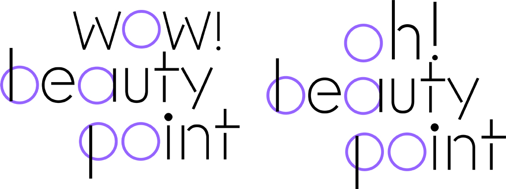
concept 02
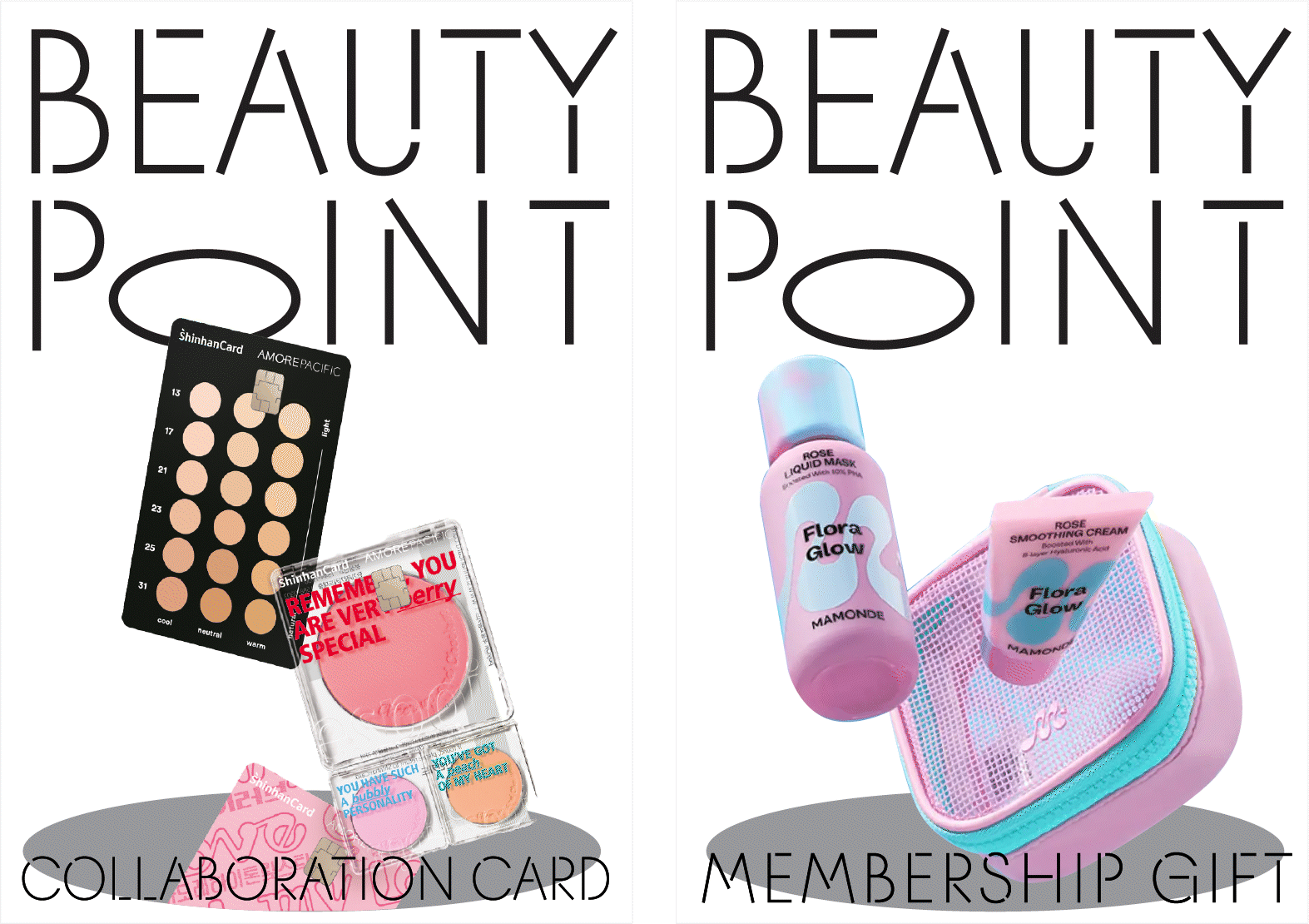
Beautiful ‘points’ emerging everywhere
To express the concept of beautiful points emerging in various places through diverse experiences, we represented the ‘o’ in the Beauty Point typography as multiple points.

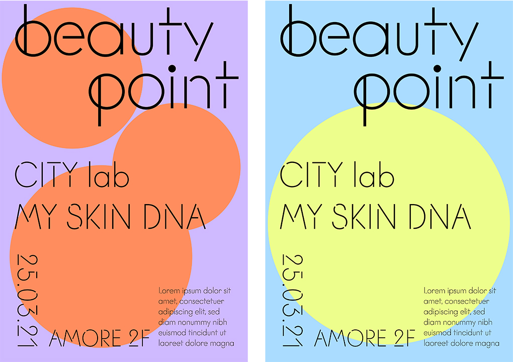
An example of a membership promotional poster

An example of a membership welcome kit
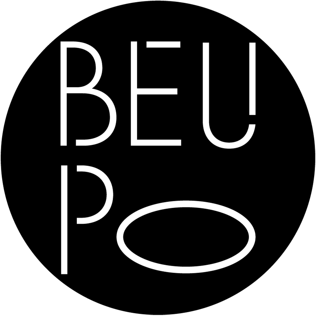
concept 03
The point where beauty begins
Conveying the idea that beautiful experiences can begin through Beauty Point, we designed it to reflect the form of a pin placed on a map location. For mobile environments requiring enhanced readability, we shortened it to “Beau-Po” so it could be used as a nickname.


An example of a social media symbol application
An example of a membership promotional poster
The final design prioritized visibility in mobile environments where most customers engage with us. As the membership brand representing Amorepacific, we applied honest typography and designed the point symbol to be expandable into patterns, allowing flexible use across various brand touchpoints.
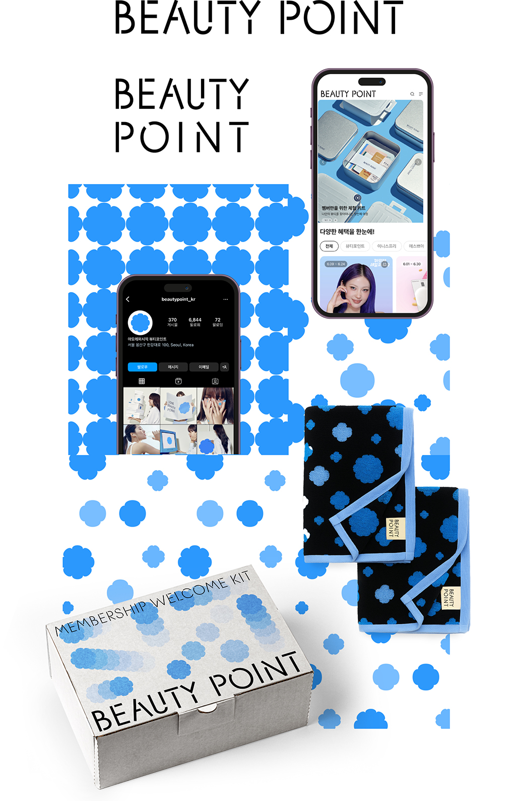
We designed it with a clean and simple form to ensure high readability and recognition even when used as icons for KakaoTalk or social media accounts.
While maintaining the core elements of the existing camellia symbol, we expanded it into a pattern form that can visually capture various points of experience, allowing it to naturally integrate into diverse environments such as merchandise and applications in the future.
We look forward to Beauty Point becoming a brand remembered by customers not just for its benefits, but as a ‘beautiful experience.’
Amorepacific Creatives
Design Creative Strategy Team Nari Cheon
BM Customer Strategy Team Jihye Kang
-
Like
4 -
Recommend
1 -
Thumbs up
2 -
Supporting
1 -
Want follow-up article
2