#Creative Story
2025.02.19
8 LIKE
5,149 VIEW
-
-
- 메일 공유
-
https://stories.amorepacific.com/en/amorepacific-mimo-by-mamonde-brand-design-story
MIMO BY MAMONDE Brand Design Story
“MIMO BY MAMONDE” Brand Design Launch Story
Written by
Jisun Han, Ahin We Brand Creative 4 Team


In September 2024, Mamonde launched its sub-brand ‘MIMO by MAMONDE’ to target consumers from early teens to early 30s who are beginning their skincare journey through the ultra-low-price retail channel ‘Daiso.’ The brand mainly focuses on the trendsetting Gen Zalpha (Z +Alpha) demographic while expanding opportunities for brand experience.
This article introduces the brand identity (BI), packaging, and Visual Merchandising Design (VMD) story of ‘MIMO by MAMONDE.’

Design Concept
MIMO by MAMONDE is a sub-brand that inherits Mamonde’s floral heritage, incorporating the meaning “My Minimal Mamonde.” The design maintains connectivity with Mamonde’s design elements - including BI, symbol, and color - while effectively utilizing the floral heritage motif to ensure eye-catching visibility even in Daiso’s complex retail environment.
While Mamonde’s BI uses an uppercase ‘M’ motif, MIMO applies a lowercase ‘m’ to distinguish itself as a sister brand. MIMO’s BI combines Mamonde’s wordmark and symbol characteristics, infusing the logo with character to express a youthful and vibrant brand personality. The consistent use of floral forms maintains connectivity with the brand’s heritage flower story and concept.
Package Design
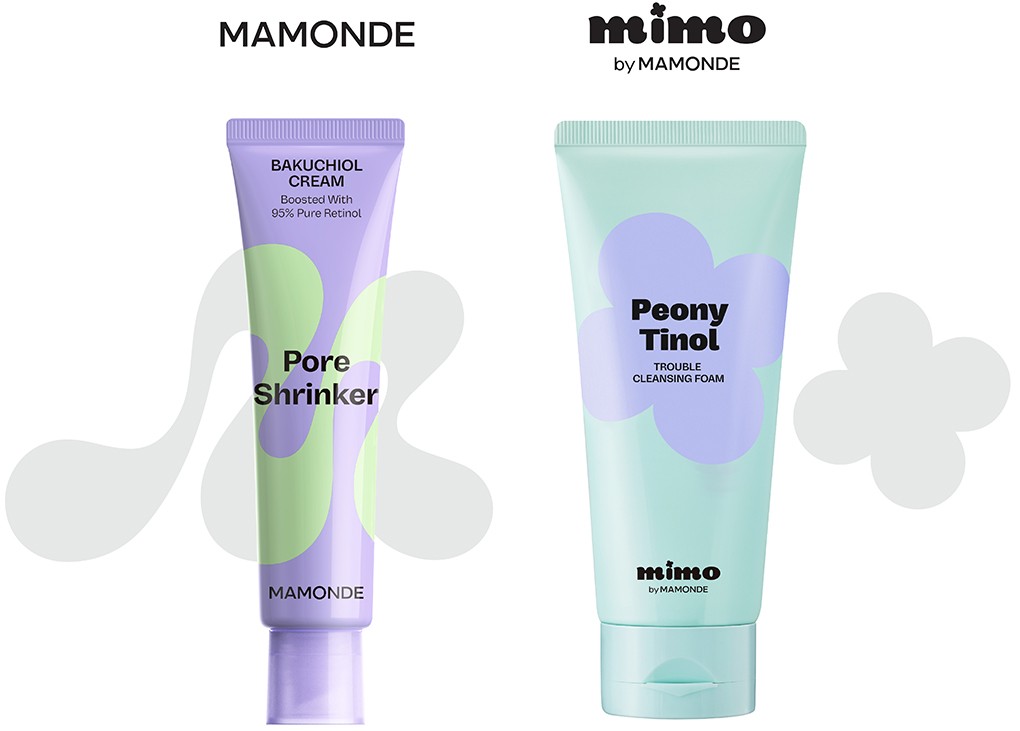
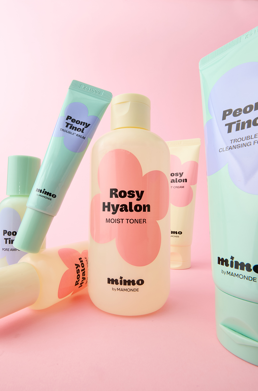
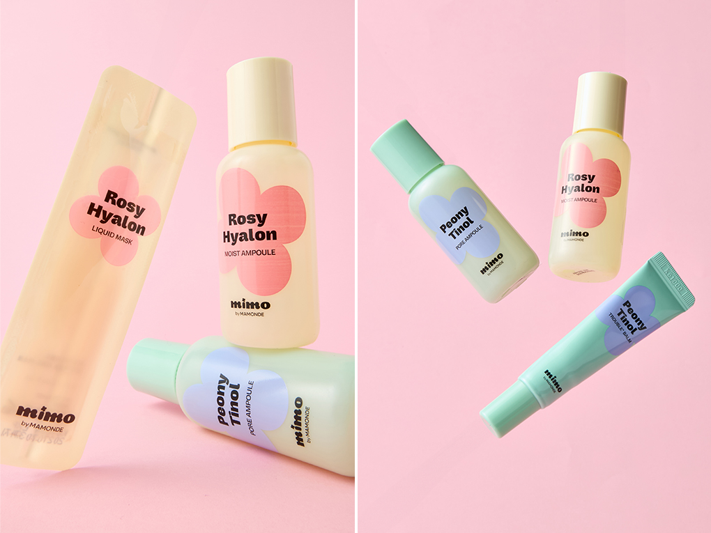
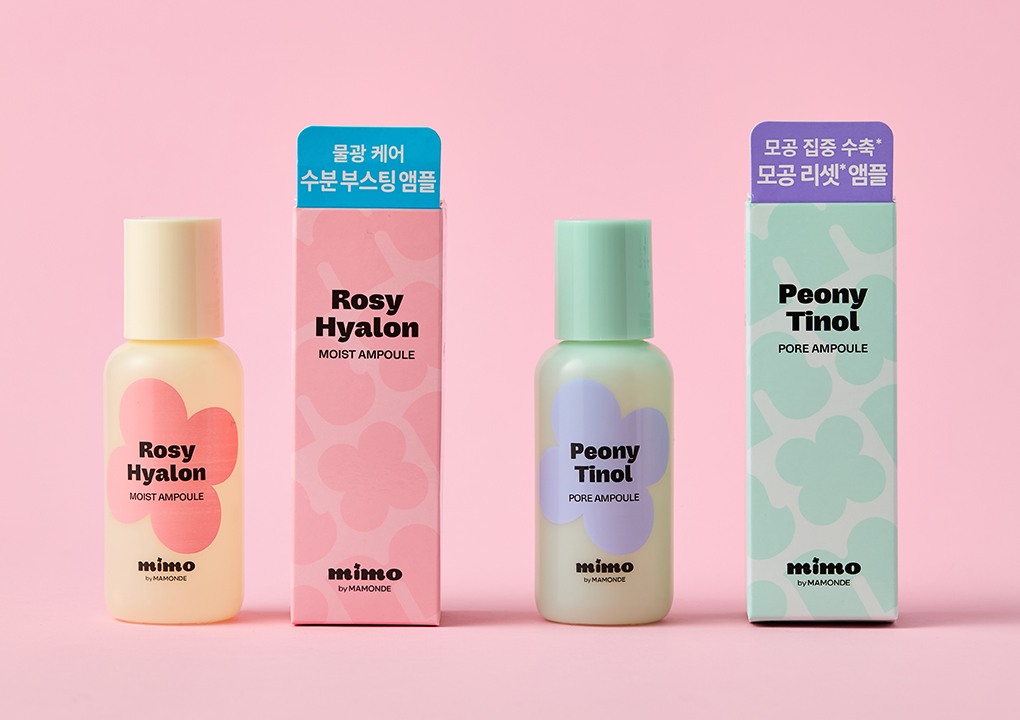
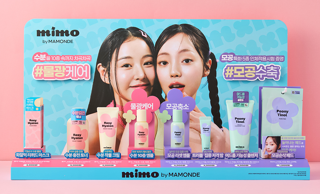
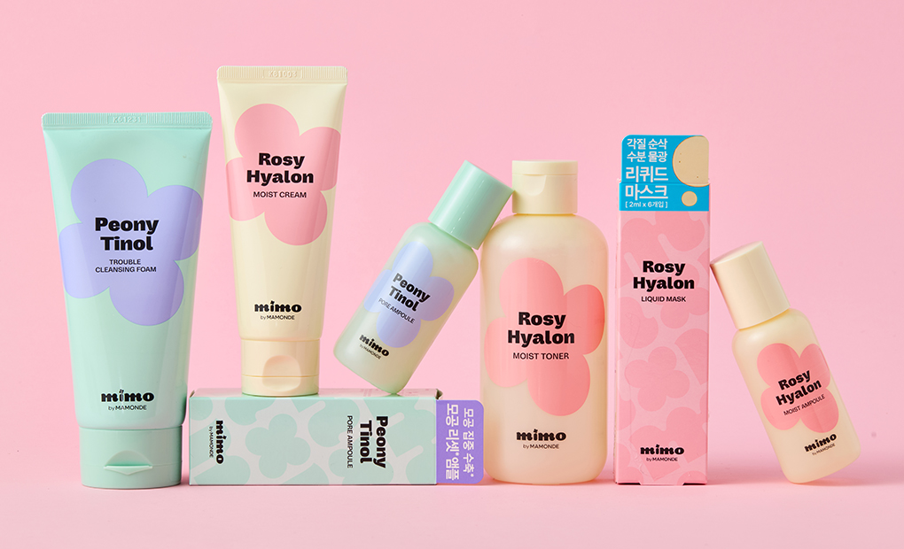
The MIMO by MAMONDE product lineup centers on entry-level items, including the Rosy-Hyalon line for combination skin (a primary skin concern among teenage customers) and the Peony-Tinol line for pore troubles and cleansing caused by excess sebum.
In color selection, while maintaining a connection with the Mamonde brand, we incorporated the vibrant and light sensibility unique to Gen Zalpha Daiso shoppers, considering harmony between skincare and main floral ingredients. The Rosy-Hyalon line features yellow and pink, while the Peony-Tinol line uses mint and purple combinations.
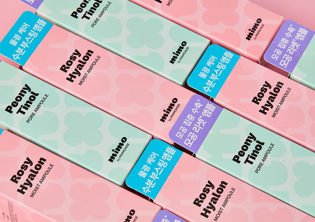
The secondary packaging visualizes the synergy between MIMO and flowers through pattern play, combining the ‘m’ symbol with floral forms. Various two-tone color contrasts were used as accentuating points to project a youthful image.
VMD Design
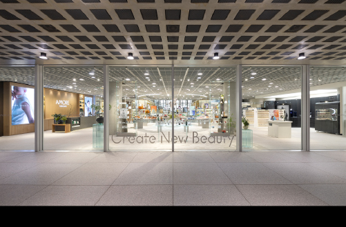
Given Daiso’s characteristic of housing numerous brands and products, we needed a distinctive VMD design strategy for the MIMO brand.
We enhanced visibility in the back wall design with dual model cuts aligned with our hydrating and pore care product lines. Using blue as the primary VMD color to tie together pink and mint colors, we conveyed the mood of a bright, vibrant, and clean beauty brand.
Ultimate Teamwork, MIMO Avengers
The MIMO by MAMONDE project launched eight product lineup brands within six months, from kickoff in March 2024 to launch in September.
Department representatives had practical meetings every Thursday at 10 AM, actively following up on their assigned responsibilities. The project carried special significance as the team worked in perfect unison to achieve a swift launch without compromising quality.
We sincerely hope to establish ourselves as a brand that resonates with this positive response and becomes part of customers’ daily beauty routines!
-
Like
7 -
Recommend
0 -
Thumbs up
1 -
Supporting
0 -
Want follow-up article
0