

#Digital Design
2018.06.29
Edition No.5 From Design Language to Digital Language ~ New Material Design

In 2014, Google released a new design language – Material Design. Companies had their own design philosophy or policies, but the launch of Material Design was groundbreaking. Since Steve Jobs passed away, Apple shifted away from its skeuomorphism design to flat design. But it shied away from mentioning design language itself. Microsoft made a huge announcement unveiling its Metro design language at an earlier date, but as we all know fell short following Windows 8's failure.
-

iOS's skeuomorphism and flat designs
-
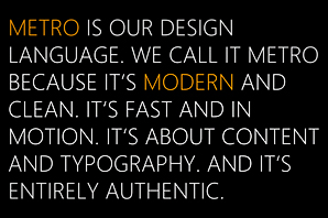
Metro UI
-

Metro UI, the philosophy behind Windows 8
Previously, Google was not praised for its design. You will understand if you remember Google's search page or its Gmail service in the past. Compared to iPhone, which ran on a bold and strong design philosophy of skeuomorphism, Android design was merely a part of technical realization. And so, its designs were awkward, ugly and often did not make sense – that is, until Material Design. With the release of Material Design, Google successfully reversed its reputation by changing all its design with the same one philosophy.
-

History of the Google logo
Basic concept & structure of Material Design
Let's briefly touch on the history of design language. The term 'skeuomorphism', which is a compound word of the Greek words "skéuos" (meaning tool) and "morphê" (meaning shape or form), refers to design that mimics their real-world counterparts. Emulating the shape of a clock, stereo or a switch on a machine was a way to express the object in a friendlier way than using a virtual digital screen interface. Skeuomorphism was the core philosophy behind digital UI design for a long time.
-

UI with its motif from stereo
However good the design may be, it is difficult to overcome the physical limitations of a screen made up of pixels (dots). It is the same as not referring to a panel furniture with printed wood patterns as hardwood furniture. Expressing and developing the design is also high maintenance. These were the reasons for the debate over whether skeuomorphism is suitable for digital design.
-

Is it really necessary to recreate the drooping lines...?
It was around this time when flat design led by modernism and minimalism came into surface. Flat design refers to a style of colors, lines and typography on a flat surface without decorative elements that have no relevance to function, such as texture or reflection of light mimicking the actual object. This was thought to be the most suitable design on a flat surface. In fact, Apple declared its transformation into flat design introducing it from iOS7. There were fierce controversies over this change because of users' familiarity with previous designs, but soon the scale tipped towards flat design.
-

Changes of the iPhone calculator app
Excessive minimalism, however, led to another conflict. Too much focus on the aesthetic form of designs created visual confusion between the informative aspect and functional aspect like the buttons, and the excessively simple and refined styles made designs too similar. Material Design adds the effect of 'paper' responding to 'light'. Objects on the screen form paper-like layers, visually clarifying the relationship between each layer. The fact that Material Design is based on the visual implication of the actual world bears similarity to skeuomorphism in philosophy.
Making Material Design
Android pursues openness unlike iOS's exclusiveness. This allows major manufacturers such as Samsung and LG as well as small and medium-sized companies to make millions of smartphones. This, however, leaves the challenge of optimization to designers and developers. Adaptivity, which was emphasized from the beginning of Android, is inevitably the core value of Material Design. By following the guidelines, you can create a relatively consistent and balanced design, providing consistent experience through various devices.
In May 2018, the latest update to Material Design was announced at Google's annual developer conference Google I/O. According to the announcement, this update is a shift towards a "adaptable design system." Collaboration between design and development was key in every step. Therefore, narrowing the gap between the two in order to realize the intention of the design completely is crucial. The new Material enables closer communication and collaboration. The design resources and code were further refined and various tools to utilize the resources and code were launched as well. Google announced that the updated Material Design will reduce wasting time and effort and enable users to focus on the essence of the product. Now, let's look at how Material Design changed.
In May 2018, the latest update to Material Design was announced at Google's annual developer conference Google I/O. According to the announcement, this update is a shift towards a "adaptable design system." Collaboration between design and development was key in every step. Therefore, narrowing the gap between the two in order to realize the intention of the design completely is crucial. The new Material enables closer communication and collaboration. The design resources and code were further refined and various tools to utilize the resources and code were launched as well. Google announced that the updated Material Design will reduce wasting time and effort and enable users to focus on the essence of the product. Now, let's look at how Material Design changed.
1. Material Theme Editor

The new Material Theme Editor is a tool that allows you to easily apply and adjust Material style designs in Sketch, the most used tool among current digital designers. What used to be simply referred to via General Compose is now available through the Material Plugin. It is also now possible to easily make and use your own branded symbols based on the types provided in Material. You can apply changes to the shape and corner rounding of icons, or color tones at one go without having to apply each and every change separately. You can also test out various fonts that Google optimized aside from its basic system fonts, Roboto. The Material Theme Editor also includes sending your designs to Gallery, which is explained below, making the process of sharing much simplified. There have been similar programs before, but the utility and the level of stability of Material Theming are highly anticipated as a standard tool.
2. Gallery

The way designers communicate and collaborate with partners involved in development, planning, PM and others has become quite complex. For a designer to share a draft, he or she must convert the file format to png or jpeg and then insert the image in a PPT file or compress the attachments to send via email. The recipients traditionally (?) would communicate back via email reply or over the phone, which tends to lead to miscommunication. There are various ways of sharing or communication services such as Dropbox, Trello or Slack to resolve these issues, but there still exists inconvenience in sharing as they are separate software programs.
Material Gallery integrated the whole process of sharing through Google Cloud. Designers can upload their designs they worked on Sketch and have colleagues leave feedback and comment. Gallery tracks each concept, design document and results as one, allowing users to easily manage the history per screen. Changes and adjustments made on Sketch can be applied immediately, eliminating the need to manually manage documents in different versions for each progress made.
Material Gallery integrated the whole process of sharing through Google Cloud. Designers can upload their designs they worked on Sketch and have colleagues leave feedback and comment. Gallery tracks each concept, design document and results as one, allowing users to easily manage the history per screen. Changes and adjustments made on Sketch can be applied immediately, eliminating the need to manually manage documents in different versions for each progress made.
3. Icons

The icon styles, which were until now recommended in one style 'Solid', are subdivided into 5 types. These are, in fact, all styles that exist. Now, Material Icons offer these styles as a guide and archives the icons according to style and function. Users can simply search and download icons to use as design resource.
4. New Components
App bar : Bottom
-

The previous top app bar (above) / The new bottom app bar (below)
It used to be an unspoken rule for the app bar to be at the top of the screen. It goes the same for PC operating systems such as Windows or MAC OS, not just for mobile phones, to have minimize or close buttons on the top of the screen. However, in mobile devices, where one needs to consider one-handed operation, navigation buttons are sometimes located on the bottom of the screen where the thumb can easily reach. This time, the app bar, which used to be fixed on the top of the screen, can be displayed on the bottom as well. In theory, it is understandable. However, there is no specific explanation on any conflicts with other components on the bottom area or how the bottom app bar will apply in different environments, such as the web or tablet PCs. This part seems to require further case study.
Backdrop

The basic philosophy behind Material is a concept of space made of paper. The top title was located at the top of all layers, securing the screen. However, the updated changes reversed this to have the top title area located at the bottom back layer, while the below content is shown on the front layer. This means that actions and option adjustments or information is entered and controlled on the back layer, which changes the content displayed on the front layer. This allows the top title to have more scalability and can be customized.
Extended FAB
-

The previous FAB (above) / The new Extended FAB
The First Action Button (FAB), which executes the most primary action on screen, is provided as floating action button. The button must visually stand out as users should be able to use it immediately whenever they need to, while at the same time, it should not cover any content in the background. So FABs were limited in their colors and icons, but there was some confusion around its function and meaning. Therefore, the updated version includes a text label that can be used together.
Epilogue
There is still a spirited debate over design style and language. Some criticize that standardizing design and listing Dos and Don'ts lead to binary thinking, killing creativity. But isn't it up to the user on how to utilize any given tool? It is up to the user to choose to create something just enough by following the trend or to focus on the essence of the product by using the available tools.
Material has expanded the role of the tool that enables collaboration among planners, designers and developers. The designer's perspective is still strong, but design language no longer stays with only the designer. I cautiously predict that the experiences of all digital makers will be shared through a common language, much like connecting the experiences of different users.
Material has expanded the role of the tool that enables collaboration among planners, designers and developers. The designer's perspective is still strong, but design language no longer stays with only the designer. I cautiously predict that the experiences of all digital makers will be shared through a common language, much like connecting the experiences of different users.
[ Stories to read along with the article ]
- Material Design
https://material.io/
- Evolving the Google Identity
https://design.google/library/evolving-google-identity/
- What is the Point of Material Design?
https://designmodo.com/material-design/
- Build great Material Design products across platforms (Google I/O '18)
https://youtu.be/Ty6VjgVHiko
- Customize Material Components for your product (Google I/O '18)
https://youtu.be/3VUMl_l-_fI
- Flat design 101 for designers
http://ppss.kr/archives/80638
- Material Design is Different, Not Better
https://brunch.co.kr/@blackindigo-red/20
- Design systems will replace design jobs
https://brunch.co.kr/@designforhuman/28
- Design guidelines will replace designers??
https://brunch.co.kr/@sangster/92
-
Like
0 -
Recommend
0 -
Thumbs up
0 -
Supporting
0 -
Want follow-up article
0